The New York Comics & Picture-Story Symposium is a weekly forum for discussing the tradition and future of text/image work. Open to the public, it meets Monday nights at 7-9pm EST in New York City. Presentations vary weekly and include everything from historical topics and technical demonstrations to creators presenting their work. Check out upcoming meetings here.
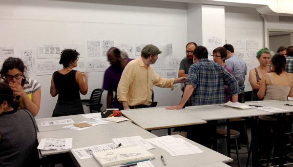
Seasoned cartoonist Tom Motley led a Panel Sequence Workshop at Parsons The New School for Design on Monday night as part of the NY Comics and Picture-story Symposium. The event produced a great turnout, packing the classroom with a varied group of both the usual suspects—comic artists, illustrators, caricaturists, fine artists—and the not-so-usual, like an audio storyteller and a memory artist. Also in attendance were a number of teachers, perhaps hoping to pick up a trick or two from Motley, who teaches the long-running Cartooning Basics course at the School of Visual Arts, in addition to various other courses throughout the city.
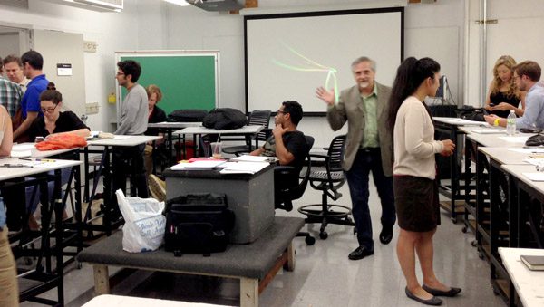
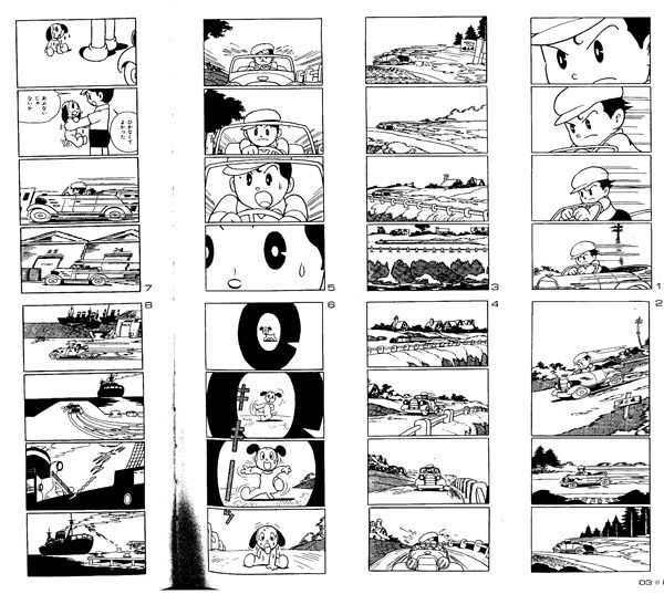
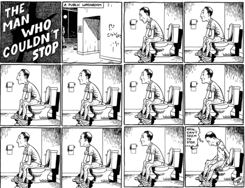
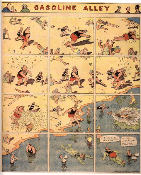
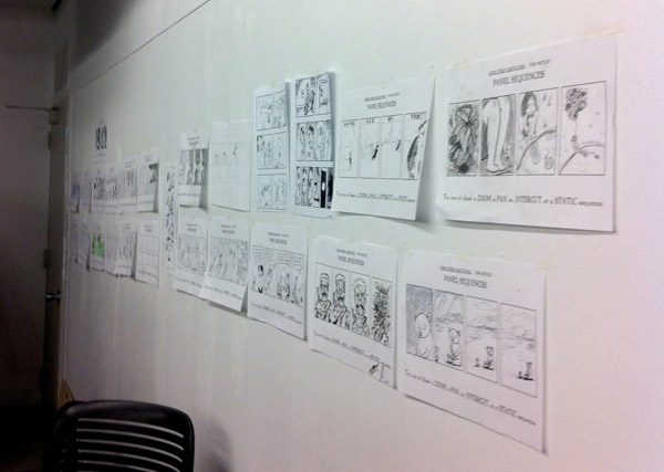
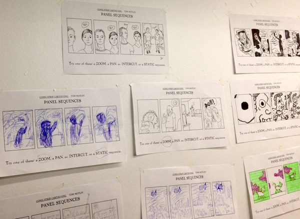
Before presenting, Tom distributed a few worksheets to the class. The first contained visual examples of four basic structures of the comic story form: Zoom, Pan, Intercut, and Static. Most comics, he explained, feature one or more of these elements over a series of panels. The second worksheet simply contained four blank panels with which we were to give it our best shot. Before we started, Motley presented a slideshow with samples of these techniques used by various comic artists spanning from the 19th century to the present day.
We saw how numerous visual cuts lend a cinematic effect to much of Stan Lee’s work and how Harry Lyrico’s fragmented pieces give the impression of a channel selector stuck “on.” In his book, Understanding Comics, Scott McCloud talks about mood and argues that the comic approach to storytelling focuses on aspect-to-aspect, whereas film or the novel might put more weight on scene-to-scene.
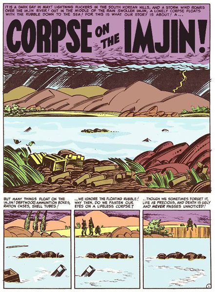
Some slides touched on the natural inclination (for English readers) to read a page from left to right. Motley noted how a few artists have disrupted or challenged that rule, like Harvey Kurtzman with Corpse on the Imjin.
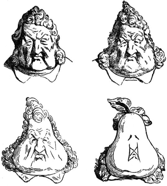
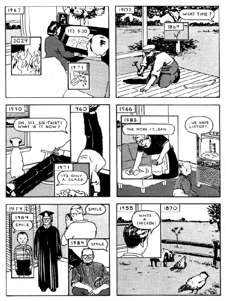
The various structures that comics can take on were explored as well. There was a single-panel transmorphic piece of Henri Daumier’s, architectural fragments from Warren Craghead, and work from Richard McGuire that redefined the limits of panels. Also shown were works from comic veterans like Mark Siegel, Chris Ware, Frank Miller, and Jack Davis.
After the slideshow, we were invited to use what we’d learned and make our own short comic. The four-panel worksheet is an actual assignment that Tom gives to his students around week 5 of his Cartooning Basics class. The exercise has little to do with drawing ability, and is more a vehicle in which to explore sequential art and the technical challenges that come with representing a space and time.
While we worked on our panels, Tom offered additional techniques we could utilize to conceal and reveal the story’s information, such as the three kinds of writing involved in comic storytelling: narrative captions, dialogue, and sound effects (or “display language”). Though not on the list he’d handed out to us, Tom also talked about the “tracking sequence” technique, through which a story is told by following one character wherever they go. We could even toggle back and forth between techniques if we wished, as is common in film.
In fact, the conversation hovered around the correlations between comics and film throughout the evening, culminating in an interesting wrap-up discussion of the crossovers that have occurred thus far between the two storytelling mediums, as well as what the future might have in store. It was noted how film is largely a reactive experience, putting the viewer at the mercy of the director, while comics require interaction—there is a sense of Creator allowed in the reader. Tom offered his final thoughts, stating that comics are “an active interactive medium” that possess a decorative, intimate quality which he loves, though he thinks that comics miss out on the sound element that film gets to have. “A comic is a static object that creates the illusion of time,” Motley mused, “I find it fascinating.”
______________
Image credits:
1. Tom Motley Panel Sequence Workshop, photo by Andrea Tsurumi, 2013
2. Osamu Tezuka, Shintakarajima (New Treasure Island), 1947, revised 1984
3. “The Man Who Couldn’t Stop” from September 1985 issue of Yummy Fur by Chester Brown
4. A page from Corpse on the Imjin by Harvey Kurtzman, 1950–1953
5. “Les Poires” by Honoré Daumier, Le Charivari, 1834
6. Sequence from “Here” by Richard McGuire, originally published in Raw Vol. 2, No. 1, 1989
7. Twelve-panel pan sequence from Gasoline Alley by Frank King, August 24, 1930
8. Panel Sequence Workshop, photo by Andrea Tsurumi, 2013
9. Panel Sequence Workshop, photo by Delaney Gibbons, 2013
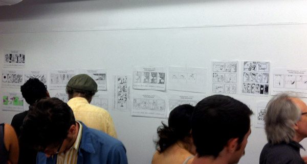
10. Panel Sequence Workshop, photo by Andrea Tsurumi, 2013
11. Panel Sequence Workshop, photo by Delaney Gibbons, 2013
______________
About the author: Delaney Gibbons is a NY-based illustrator, graphic designer, and recent graduate of Parsons The New School for Design, where she studied illustration and writing. She works at a publishing house and chronically searches for a new apartment. See her recent projects or follow her on twitter.


One response
it was fun. i’m in photo #8.
Click here to subscribe today and leave your comment, or log in if you’re already a paid subscriber.