The New York Comics & Picture-Story Symposium is a weekly forum for discussing the tradition and future of text/image work. Open to the public, it meets Monday nights at 7-9 p.m. EST in New York City. Presentations vary weekly and include everything from historical topics and technical demonstrations to creators presenting their work. Check out upcoming meetings here.
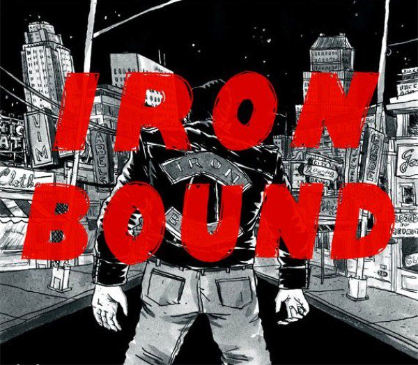
The 68th meeting of the NY Comics Symposium featured two presentations: cartoonist Brendan Leach showed images from his latest book, Iron Bound (Secret Acres), intercut with music written for the book by Lucas Gutkowski. Scholar Nick Sousanis went second, presenting his doctoral thesis, Unflattening, which he is making in comics-form.
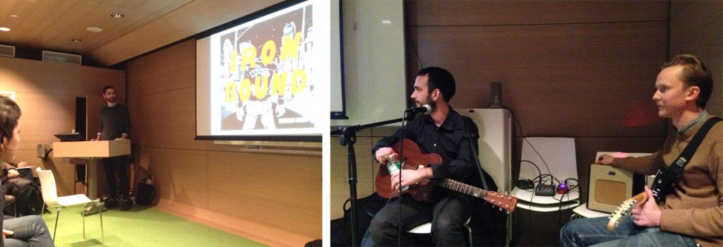
One of the best things about symposium line-ups is that the juxtaposition of different speakers often emphasizes interesting themes. Leach spoke about the semi-collaborative process of creating Iron Bound. Not only was Iron Bound designed to incorporate music into its story and physical pages (the book features a flexi-disc), but it was also created through a back-and-forth interaction between Leach’s comics and Gutkowski’s songwriting. Gutkowski and Alex Obercian played the songs live while Leach showed images from his book, creating a unique way for the listeners to interact with reading the book and hearing the music.
Sousanis’s Unflattening, his dissertation at Columbia’s School of Education, explores the ways people perceive text and image simultaneously in comics, as well as how they conceptualize and communicate knowledge. Sousanis presents ways to broaden our perceptions and expectations of how we think, learn, and teach.
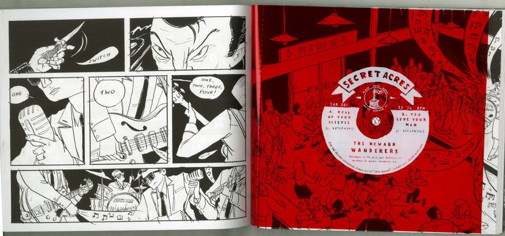
Leach would speak about making Iron Bound and show pages from the book, then there would be intervals where Gutkowski and Obercian played songs from what became a full album for the book. The flexi-disc has two songs, “Roll Up Your Sleeves,” and “You Love Your Man,” but the rest of the music is also offered online (if you wish to listen to it while reading this post, click here).
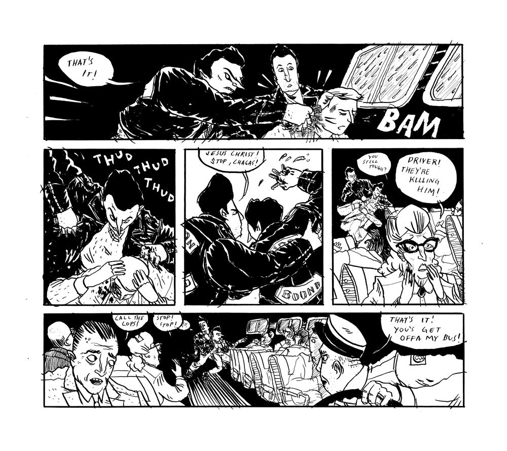
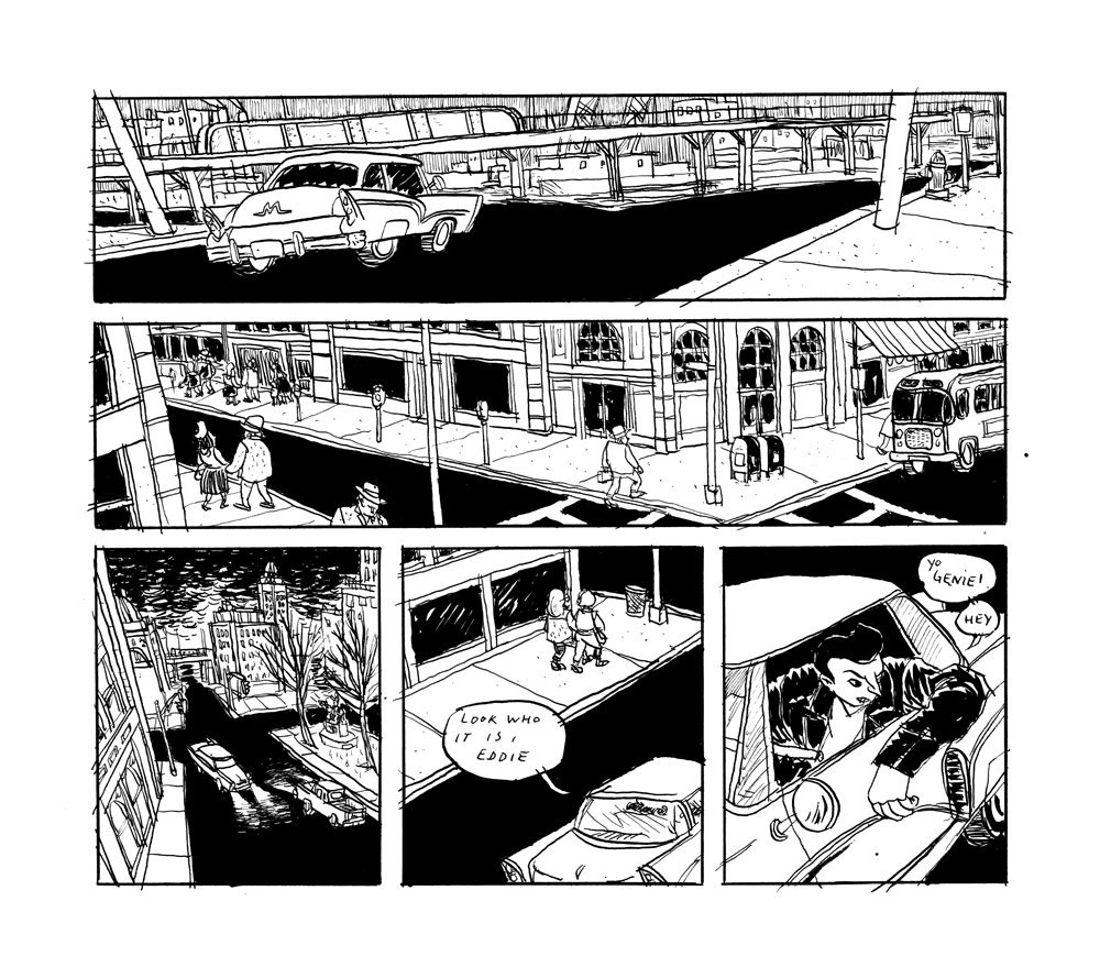
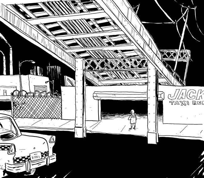
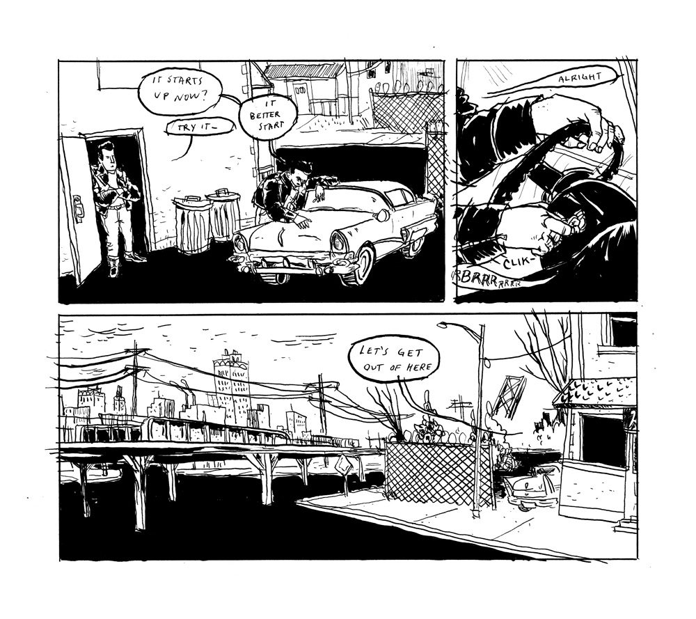
Iron Bound takes place in 1961 Newark. Geography and history form the backbone of the book: the neighborhood and the time period incubated the greaser protagonists; railroad tracks, street signs, and other parts of the landscape frame the action. Leach thought the name (which is the name of the neighborhood) came from the large steel structures there, but found signs during his research that perhaps it came from the industry there.
Iron Bound evolved from Leach drawing a sketchbook page full of greasers. “I wrote ‘Iron Bound’ on their jackets and thought that was tough,” he said. The sketches developed into a short story for Desert Island’s anthology Smoke Signals. He also created a second comic that wasn’t in Smoke Signals but further developed the character of Mr. Dores.
A lot of the look of the book came from all the black ink he was using, especially for drawing the characters’s leather jackets. Then he made another comic using these greasers and their world for his friend Sean Ford’s Sundays Comics Anthology, which used the square format Leach ended up adopting for the book itself. The shape lent itself to a cinematic feeling, reflecting another part of Iron Bound‘s genesis: watching Japanese gangster movies with Lucas Gutkowski.
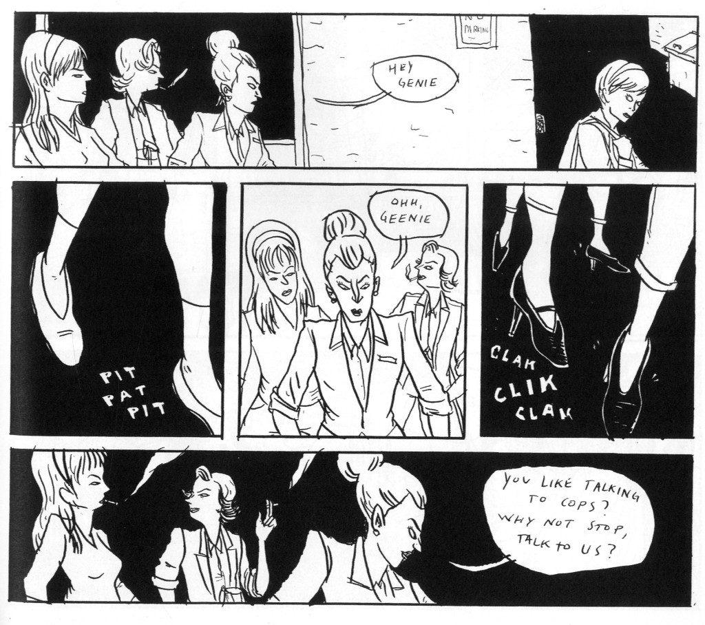
Leach was already well-steeped in American greaser and gangster movies and found some of the lingo and posturing distracting, although he included plenty of movie references in the book (Genie and Gloria go see The Misfits). The Japanese movies–Rusty Knife, Afraid to Die, among others–were more melodramatic and Leach found the experience of watching them while reading subtitles similar to reading a comic.
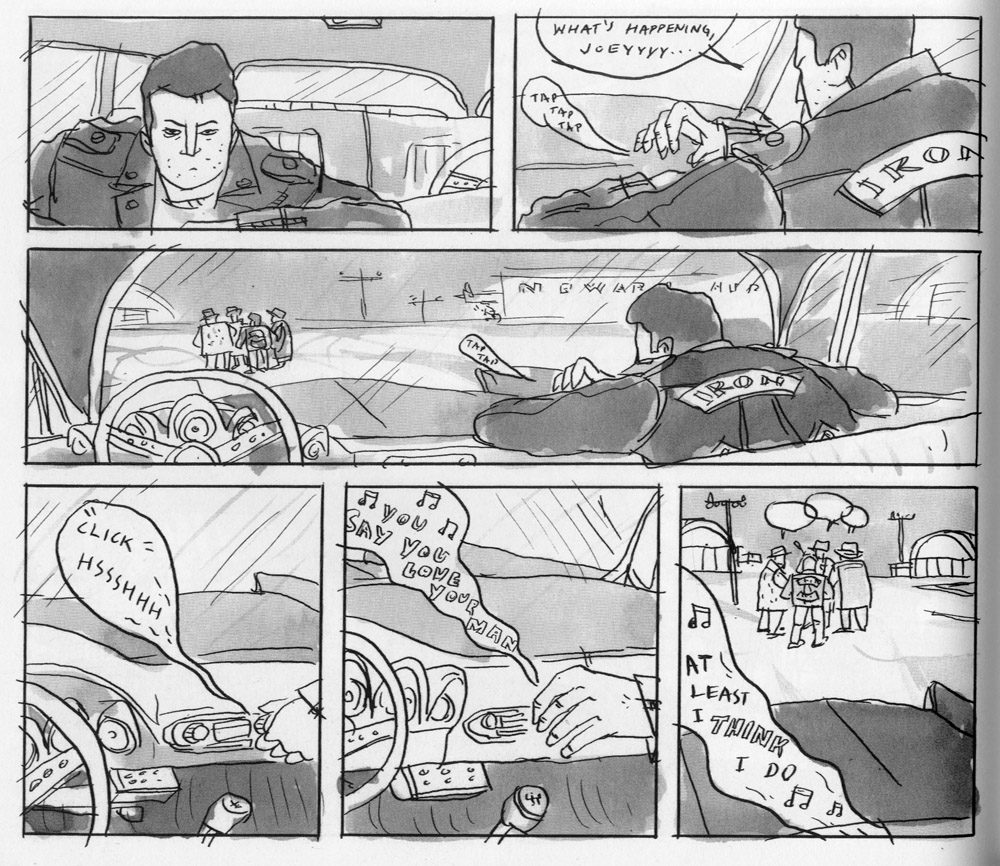
It was at this point that Gutkowski pointed out that Tokyo Drifters had a theme song and suggested that they write their own for Leach’s project. Leach said he would continuously send Gutkowski ideas and Gutkowski would meditate on that and come up with his own take, which ended what worked. Gutkowski would look at Leach’s pages for inspiration, send Leach a song, and Leach would listen to the song while drawing the rest of the comic.
Leach and Gutkowski pressed ahead with making all these songs but hadn’t tied it all together until Secret Acres called him and told him that in order to debut a book (with a flexi-disc) for the Small Press Expo in September, they needed to send in the music “like, yesterday.” Leach made an urgent phone call to Gutkowski planning their strategy and the following weekend they spent in Leach’s apartment with a newly-bought second guitar and recorded the music.
Q&A:
Since Leach created this book/music project, would he be interested in using other combinations of media in his future books?
The format of his work follows the story and not the other way around. The music worked for the book because of the time (1961) and location (Iron Bound and Asbury Park, NJ). For his last book, Pterodactyl Hunters, printing the story on newsprint worked well with a story set in the early 1900s.
Someone who lived in the same location and historical period of Iron Bound noted particular details that Leach got right, even the tap-step-swing dancing of the time and asked about what research he did.
Leach said he didn’t interview a lot of people, but he did spend lots of time in the Newark Public Library and helped himself to their extensive photo archive.
 Is the book specific to Newark’s landscape today?
No. Leach noted that most of the geography has changed. As a New Jersey native, Leach was long familiar with Newark’s skyline so he knew the general shape of the city, but for specifics, he went back to the photos.
Would he be interested in doing something further with the live-reading/music-playing combination, like touring?
Possibly. He and Gutkowski would be interested in exploring it further, but he was not a huge fan of traditional comics readings so they’d have to figure out the format.
What tools and techniques did Leach use to draw Iron Bound?
Leach used a crow-quill pen (either a Deleter or a Tachikawa) after switching from an unreliable Hunt #107. He used the same ink he used for the lines (Dr. Ph. Martins) to make the gray washes, like so: he had three jars of equal amounts of water and added varying amounts of ink to them to make a light gray, medium gray and dark gray. He ended up mostly using the first two, but it was good to have the last one there if he needed it. As he drew, the water in the jars would evaporate and change the color balance so every so often, he’d throw out all of them and refill them.
Did he invent a new way to draw for this project?
Leach said he feels like he only knows how to draw one way. Sometimes, he’s intrigued by his friends who chose very different styles for their projects, but this is just what he does.
A question for Gutkowski: we’ve heard how the music influenced the book, but how did the book influence his music?
Gutkowski said it was a “tough looking book and I’ve never tried to write tough looking songs before.”
How is the book meant to be read with the music? Since the flexi disc appears towards the end of the book, is that when the music should be played? Or listened to throughout?
Leach said there was no one way of doing it. The reason the disc appeared where it did was because the printer needed it to be at the end of a signature, and there were only six signatures in the book. Leach was praying that one of them would end in an appropriate place for the music (and hopefully not in the middle of a dialogue) and by chance there was one where a band, The Newark Wanderers, were playing.
Leach closed with an anecdote about talking to someone who lived in the area in the 1960s. The man said that the car clubs (one of which appears in the book) were huge at the time and that the guys in them wore cotton jackets with their insignia on the back. Leather jackets were more for motorcycle gangs (because the leather was needed as armor if they crashed). “The whole point [of the book] is leather jackets,” Leach said, but if you’ve ever tried to draw a motorcycle you know why there are no motorcycles in the book, so he kept the jackets and put his characters in cars.
Nick Sousanis spoke next about his dissertation, Unflattening. He began by remarking that, as an academic, he’s used to speaking about comics to people who aren’t regular comics readers or creators, which is why coming to the symposium has let him talk about comics with other cartoonists, an experience he very much appreciates.
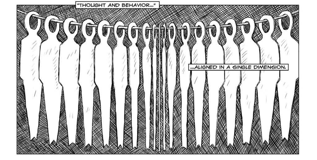
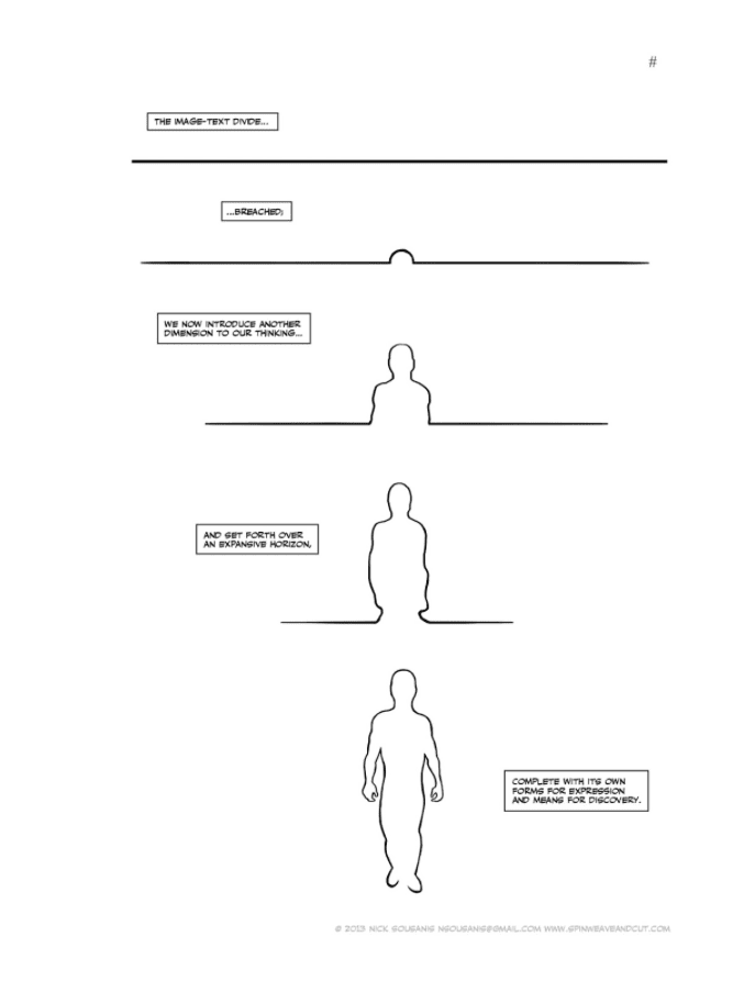
When people ask him why he’s making his dissertation in comic form, he answers why not? One of the things he highlights with Unflattening is how ways of presenting and disseminating ideas are ranked in a hierarchy, which he argues that they should not be. As a doctoral student, he is familiar with how his work is supposed to appear: lines of 12-point font across a page with selected images relegated to small inset boxes and labeled with definitions. This is only one way of presenting knowledge, but since it is the dominant method, many people think there aren’t other ways. Sousanis compared the way this limits our perspective to the book Flatland: A Romance in Many Dimensions by Edward Abbott Abbott. The characters in the book are many different shapes, but because their world is only two-dimensional, they understand the cardinal directions but have no concept of “up.” This is an apt metaphor for how people in education (or in society in general) are “unable to see what is beyond what we already know.”
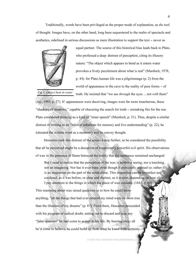
In education, especially during the last decade or so, ideas about what education is and should be have been bandied back and forth a lot. Testing and standardized curricula are all hotly debated topics about how we teach students, but the modes suggested as solutions do not consider their own structural limitations. “Education is something that’s taking place in boxes,” Sousanis noted, in modular units, in the box of a page or the physical classroom, and sooner or later, learners come to incorporate those boxes within their own way of thinking. They know boxes but don’t know “up.”
Sousanis noted the funny interactions he has had with people in academia when talking about different things he has done. When he mentions he was a mathematician as an undergrad, they respond by saying, “oh, you must’ve been really smart.” When he mentions comics, they say something about “being talented.” People do not realize how they profile different ways of thinking and transmitting information (be it numbers or comics narrative). Consequently, Sousanis’s goal with his dissertation is to start “breaking down boxes . . . [because they are] limiting what we are thinking and the way we can think.”
There is an ancient distrust of images, Sousanis pointed out, going back to Plato and Descartes. Descartes thought that because images of actual objects could change, they were unreliable, and only the actual object mattered the most. Text is the dominant form for transmitting academic data, but it is only one way that people use to intake information. Taking text by itself or just images by themselves is limiting as well; one of the reasons Sousanis loves comics so much is because they let him “be amphibious” and offer a combination of these two ways of thinking (reading text and seeing images) that becomes its own thing: “an ability to be both.” In the image of the Buddha below, a reader could go through and just pay attention to the text boxes, reading them as a progression. Or the person could just see the image of the buddha. However, what is happening on the page is more interesting: the text and the panels are progressing linearly while simultaneously acting as one larger picture: there are several forms of time taking place on the page, and a reader would miss the full effect by elevating one aspect above another.
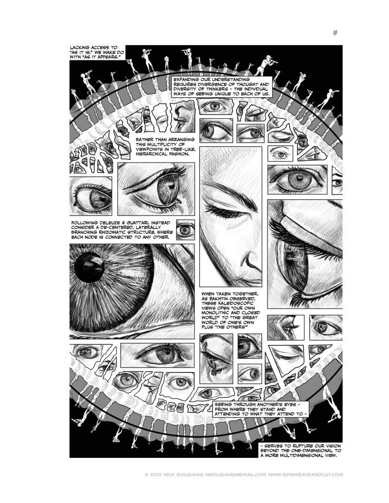
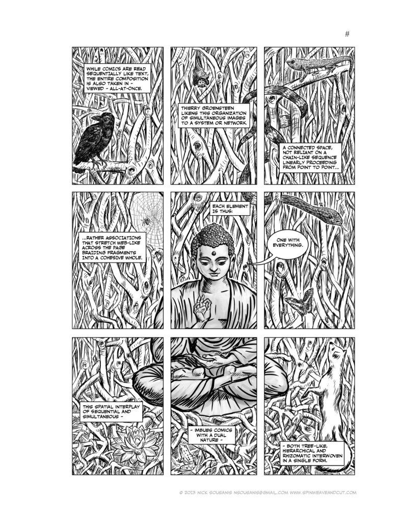 Sousanis explained that we all are affected by our own perspectives. On a purely visual level, this means that your left eye sees something that your right eye doesn’t see and vice-versa, but the aggregate image is from combining both. On another level, he said, “I think everybody’s theory of how comics work comes from how they think or read comics.” The left or right brain theory of thinking (that someone is more logical and analytical if they’re left-brained, etc.) is something that has been popular for years, but has recently been debunked. Each hemisphere of the brain does tackle different tasks, but they work in concert. Evolutionarily, this makes sense: someone might need to focus one particular task, but also be aware of what is going on around them at the same time. So while one part of the brain works on something, the other parts are working too, trading off in proportionality depending on the activity or input. This creates some very intriguing possibilities for how we make narratives and tell stories, as well as teach and learn. Chris Ware’s comics are great examples of presenting a linear narrative while also showing things happening off to the side.
Sousanis asked the audience if any of them think “in rows.” Personally, he said he tended to think more parenthetically. Sousanis’s pages use comics to expain his ideas, not to illustrate them. The images are not literal depictions of the words and the text is not just captioning the images, instead he makes each page so the combination of text and image conveys an idea. When he’s working on each page, he thinks, “what does the idea I’m trying to get across feel like? I’m trying to figure out how I move you through the space and how I explain [the idea.]”
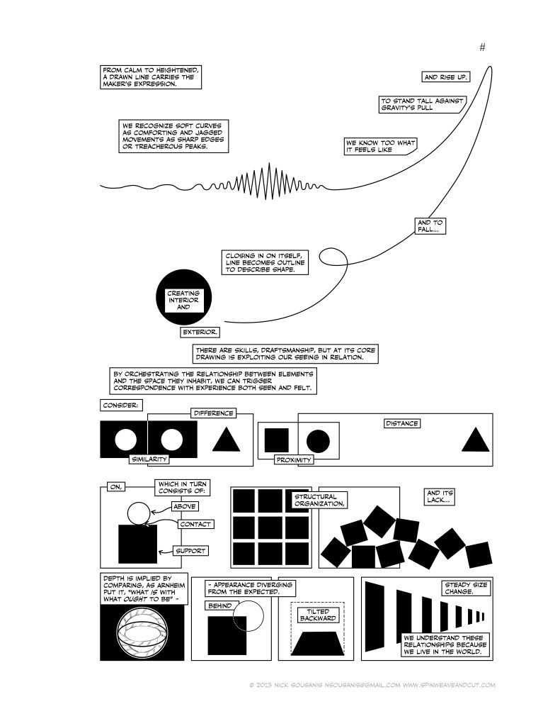
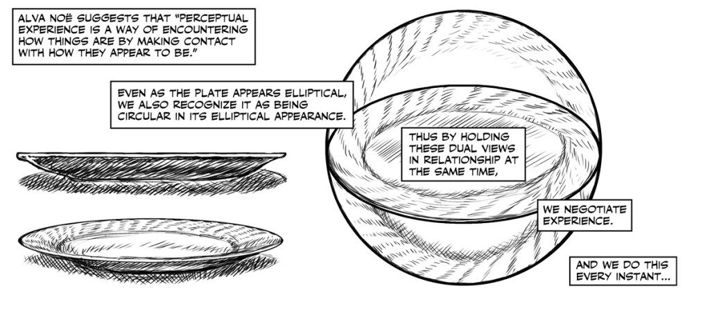
To discuss the idea of “perception as thinking,” Sousanis returned to the example of how your right eye and left eye see different things. Quoting Alva Nöe (see below), Sousanis suggested that what we see (a plate) is something perceived from many different angles. It’s not just one visual reality, it’s the sum of all of its appearances at once. Although the Classical ideal of thinking is something akin to Rodin’s The Thinker (sitting still and pondering), Sousanis explains that drawing is also a kind of thinking, one that involves movement and developing a relationship with the marks made on paper. He pointed out that we have an emotional connection to the things we draw and see on the page, which is why when people see a jagged line, they understand there is a certain feeling (anxiety, fright, etc.) associated with it that’s different from a smooth, curvy line. “We know these kinds of things from being in the world,” he said, noting how many core concepts of drawing come from our knowledge of gesture and other forms of communication.
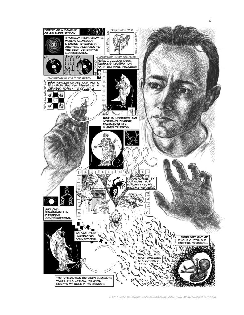
Drawing is a way of working out ideas on paper. Instead of simply putting down something already predesigned, people often make a mark, interpret it, then react to it by making another mark. Sketching is a kind of play or another way for someone to examine their ideas from all sides. This process opens up all kinds of things about thinking and communicating that can potentially change how we think and see. In the image below, Sousanis drew much of what was on the page, but then paused to work out the middle. There was a narrow passage of space running through the center that he had trouble composing. He’d just seen an ultrasound of his infant daughter and drew an image of her in the lower right hand corner and suddenly “she came into the picture and the page worked itself backward. It reframed things.” His drawing helped him think through the rest of his idea.
His whole goal with Unflattening is to “start to accept that we don’t just think in text . . . looking at things from multiple sides [helps] us step out of the flatness and move towards new discoveries.”
Q&A
Are you drawing from your notes?
Sousanis said he had typed up pages which were useful to work from, but most of his work starts with thumbnails and quite a lot of it changes between thumbnails and page.
Is this a style you see yourself using once this project is over?
He said that he’s someone whose tendency is to overdraw. In the early stages of his dissertation, when he wanted to demonstrate that he could draw to his fellow academics, he drew quite a lot of very realistically rendered images. He is especially intrigued by working with abstract shapes, though, as seen in one of the pages shown above.
What tools are you using?
He draws on the computer, especially because he has trouble lettering. Given the amount of material he needed to create for his dissertation and his deadlines for it, the computer was the best possible option for him.
In terms of his goal (trying to change education), how does he see this evolving? (The questioner mentioned his synesthesia, another way of seeing the world).
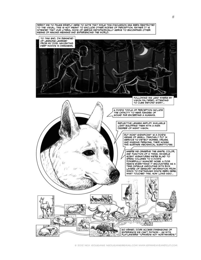
Sousanis answered that he wanted to move forward with other means of perception, but for his dissertation he was focusing on opening people up to the idea of leaving their flatness in general. This is something he acknowledged in the page with his dog (see above) where he points out how many different models of perception are possible. To a dog, smell is a completely different way of sensing the world and it’s a nuanced one. They can tell when someone was nearby, what they ate, what physical condition they were in, etc. There are plenty of other avenues to explore.
Did he have any timing problems? i.e. wanting to write certain words but not having enough images for them too?
“Once in a while, I know where I want to go with text and I fight the urge to illustrate it . . . the image carries its weight more than or as much as the text.”
Someone asked how he showed the rigor of his research and whether any of his math training went into the project.
One of his goals was to “teach the reader as we go,” so the dissertation moves from overly illustrated images to more abstract ones as it continues. Figuring out how to show things like reference and footnotes was an interesting visual challenge to consider. Endnotes seemed like a more elegant solution for the page.
What did doing this project teach you about how to use comics to analyze material (as opposed to using it for fictional narratives, something more common)?
Sousanis explained that Scott McCloud’s Understanding Comics series was a seminal work, but that after him, many analytical/informational comics other people created all tried to look like his and didn’t experiment with new formats. They would be a lot of little drawings of a professor moving through a page with speech balloons, talking about the ideas. He found this pretty limited. When he was making art in Detroit, he made a 4-page comic in a McCloud-like fashion for a political art show. Soon after, he made a second, but abandoned that format, pulled himself out of the drawing and experimented with visual metaphors. He would love to see the kind of art-making and storytelling skills comics makers (like the ones in the room) have brought to bear on this type of informational comics.
***
Image Credits:
Image 1: Brendan Leach, Iron Bound, Secret Acres, September 2013.
Image 2: Andrea Tsurumi, photo of Brendan Leach, Lucas Gutkowski & Alex Obercian, November 2013.
Image 3: Brendan Leach, Iron Bound, Secret Acres, September 2013.
Image 4: Brendan Leach, Iron Bound, Secret Acres, September 2013.
Image 5: Brendan Leach, Iron Bound, Secret Acres, September 2013.
Image 6: Brendan Leach, Iron Bound, Secret Acres, September 2013.
Image 7: Brendan Leach, Iron Bound, Secret Acres, September 2013.
Image 8: Brendan Leach, Iron Bound, Secret Acres, September 2013.
Image 9: Brendan Leach, Iron Bound, Secret Acres, September 2013.
Image 10: Connie Sun, photo of Nick Sousanis, November 2013.
Image 11: Nick Sousanis, spinweaveandcut.blogspot.com, 2012-2013
Image 12: Nick Sousanis, spinweaveandcut.blogspot.com, 2012-2013
Image 13: Nick Sousanis, spinweaveandcut.blogspot.com, 2012-2013
Image 14: Nick Sousanis, spinweaveandcut.blogspot.com, 2012-2013
Image 15: Nick Sousanis, spinweaveandcut.blogspot.com, 2012-2013
Image 16: Nick Sousanis, spinweaveandcut.blogspot.com, 2012-2013
Image 17: Nick Sousanis, spinweaveandcut.blogspot.com, 2012-2013
Image 18: Nick Sousanis, spinweaveandcut.blogspot.com, 2012-2013
Image 19: Nick Sousanis, spinweaveandcut.blogspot.com, 2012-2013
***
Andrea Tsurumi is a NY-based illustrator and cartoonist who likes her robots sad and her history funny. She is the recipient of a 2013 MOCCA Award and was included in the 2013 Best American Comics notables list. You can see her work here and her latest projects here.



One response
Great Post! Love Nick Sousanis’ work. Thanks!
Click here to subscribe today and leave your comment, or log in if you’re already a paid subscriber.