The New York Comics & Picture-Story Symposium is a weekly forum for discussing the tradition and future of text/image work. Open to the public, it meets Monday nights at 7-9 p.m. EST in New York City. Presentations vary weekly and include everything from historical topics and technical demonstrations to creators presenting their work. Check out upcoming meetings here.
On Monday, August 18th, at the 95th New York Comics Symposium, the cartoonist and instructor Tom Motley presented a talk and workshop entitled “Composition Lessons from Comics Masters.” The talk was held at the Butler Library at Columbia University. Karen Green introduced Motley, a veteran cartoonist and educator at both SVA and Pratt. He is a prolific illustrator, and his regular comic Tragic Strip appears in the Brooklyn Rail.
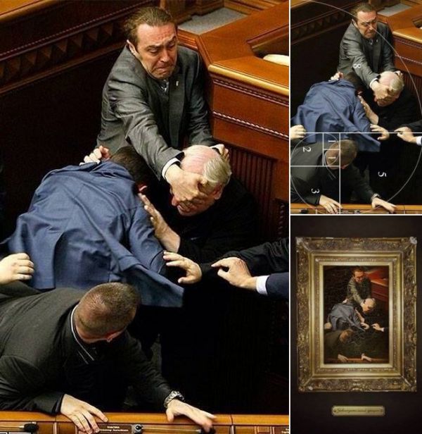
After a quick demonstration, Motley explained that composition is the “invisible component we don’t think of.” He covered the basics of renaissance composition, using the now famous photo of a fight that broke out in the Ukrainian parliament, and which, coincidentally, follows the rules of the golden ratio, an ideal of classical composition.
Next, he showed some classic comics pages, pointing to how they consistently line up with geometrically perfect composition grids and highlight “harmonic points.” The cartoonist Frank Santoro is a major champion of these guidelines and even composes his pages using a light table to impose these grids in his own composition—but as Motley pointed out a lot, of this can be achieved intuitively.
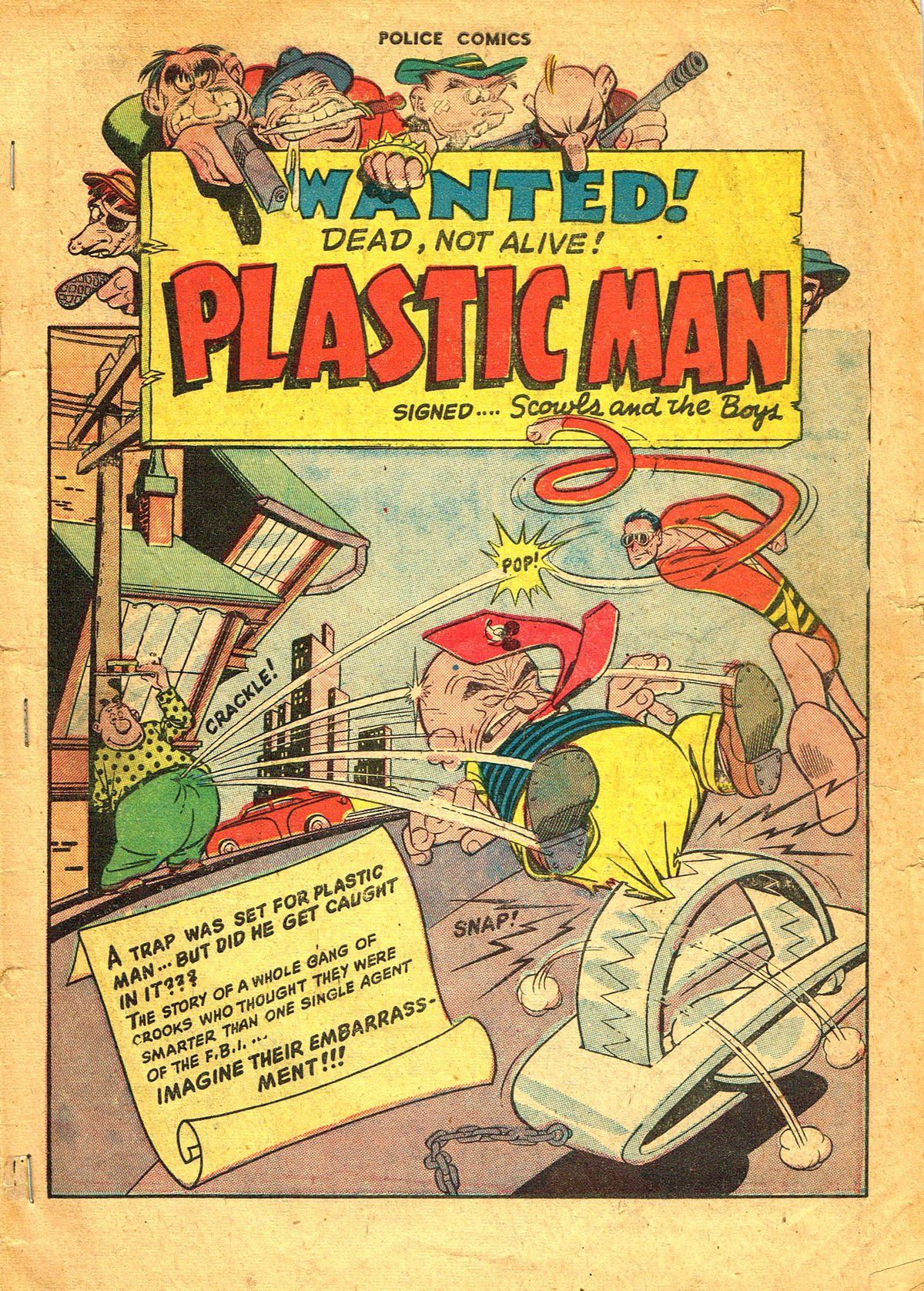
Motley’s presentation consisted of three major points, which he characterized as “not principles, but considerations,” the first being: Lines of Continuation. He showed the first page of a Jack Cole Plastic Man comic as an example of an image that embodies the idea that “a story presents a single complete action.” Elements within the frame draw our eyes around, helping to tell the entire story from start to finish.
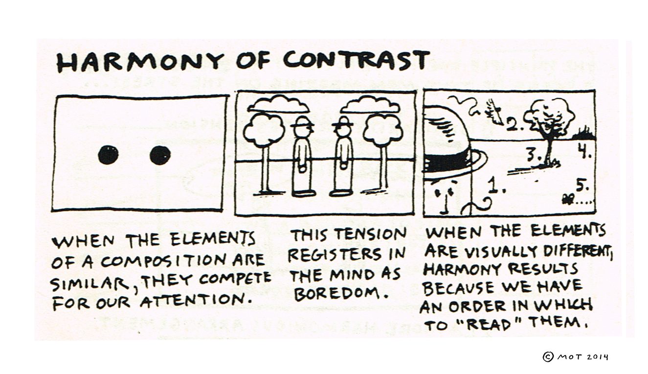
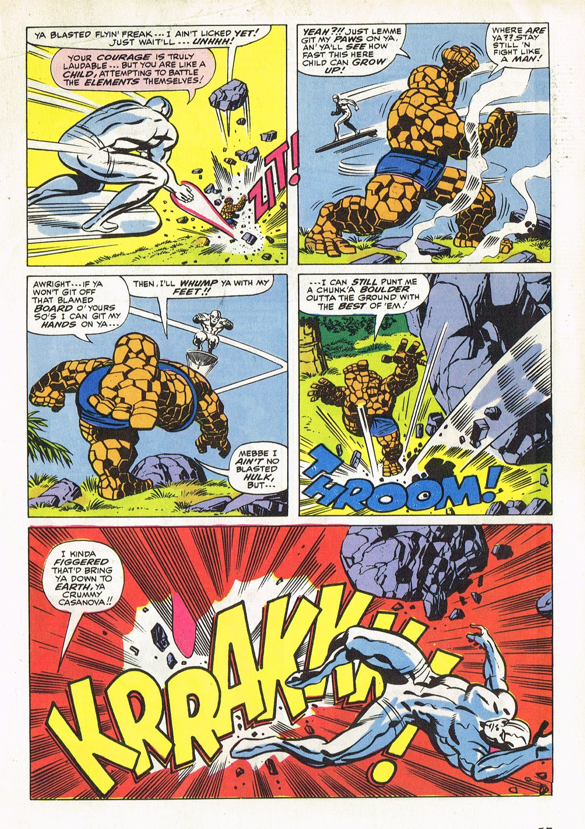
The next consideration was Harmony of Contrast, which espouses the idea that “when elements of a composition are too similar they compete for our attention” creating a sense of boredom, essentially canceling the other out. To create dynamic visual composition there needs to be variety, which creates a hierarchy that is interesting to look at. The Jack Kirby page below is an example of how the artist used distinct and new visual patterns and designs which worked together in unison:
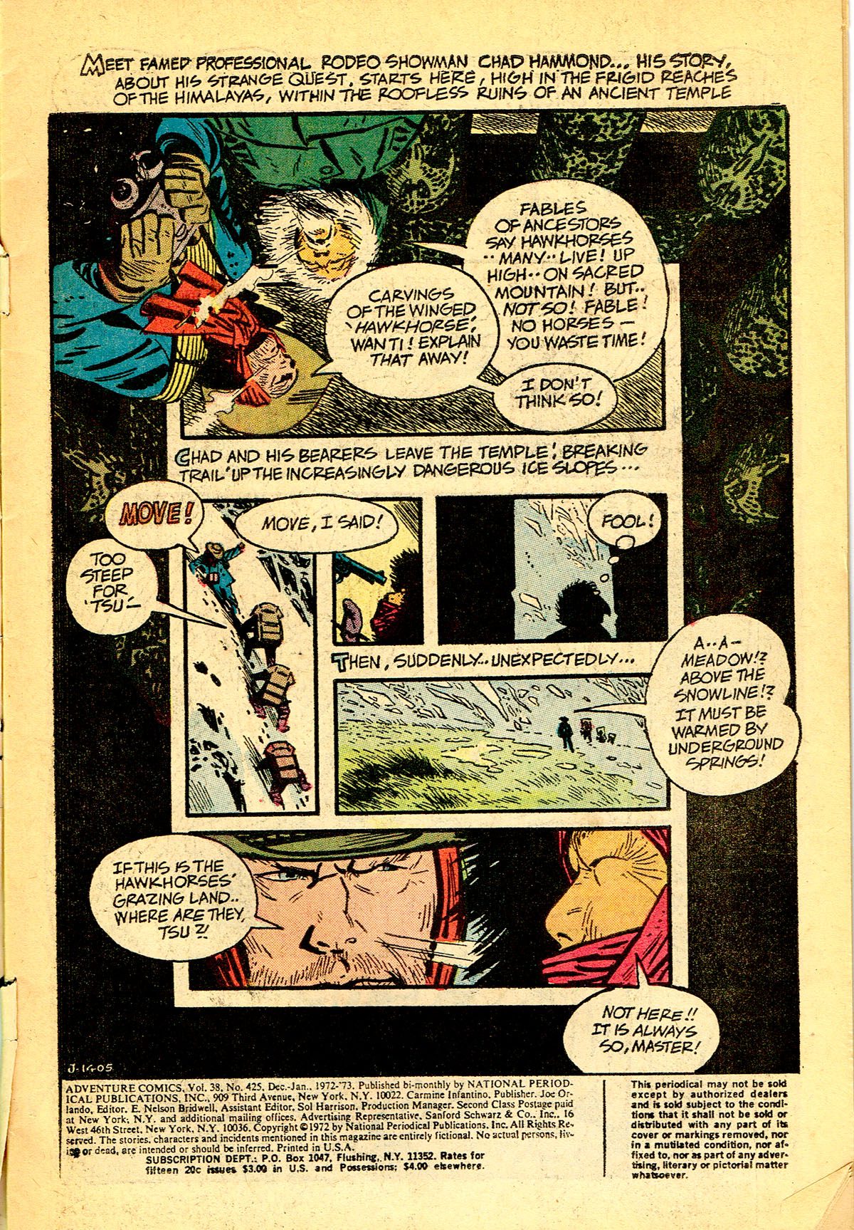
The next consideration was Economy of Design. Motley offered up the cartoonist Alex Toth as a master of this, describing him as a “maximal minimalist.” Toth was a master at creating spaces to showcase and frame important narrative elements. His pages are full of visual clues, letting the reader know what is important by heavy use of silhouette and editing, frames that highlight a hand or a pair of emotive eyes. You don’t have to show everything to communicate the essentials of the story, and subtracting elements adds depth to what is left behind.
Another concept Motley was Composition Driven Distortion. This is the idea that a composition can be enhanced by “incorrect” drawing. A beautiful and classic example is the warped arm of Edgar Degas’s bather in Le Tub (below). Her right arm is shortened, flattened out, and anatomically dubious, but were it more “correct” it would change the whole picture. As it is, it makes the composition all the more beautiful and satisfying to look at.
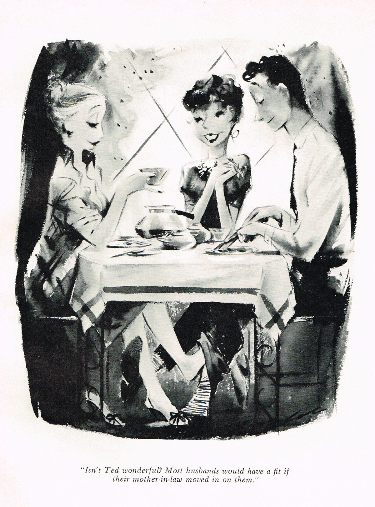
After establishing these aspects of comic composition, Motley invited the room to analyze several examples of sophisticated compositions. Jack Cole’s gags for Playboy garnered enthusiastic input from the audience. The cartoon below contains the repeating graphic element of the crisscross, which creates visual harmony and a way to move about the frame, as well as the differentiation (blonde against a dark background, dark hair against light) which helps organize the picture. The framing and repeated patterns draw our eyes around the page, making sure we take in all the elements of the story. Finally, the gaze of the figures within the panel creates a line of continuity that helps bring the reader’s attention down under the table (another framing device) to drive home the gag’s punch line.
After analyzing several beautiful examples of Cole’s, Toth’s, and Kirby’s art, Motley showed several weaker examples of compositional failures and near-misses. He then asked the audience why these panels and splash pages failed where the others excelled. Photocopied reproductions of “bad” compositions were passed around, along with drawing materials and work sheets so that those present could correct and play with their own and others work.
***
Image Credits:
Image 1: Manzil Lajura, Ukrainian Parliament Fight Illustrates the Golden Ratio, 2014
Image 2: Jack Cole, Plastic Man, 1943
Image 3: Tom Motley, “Harmony of Contrast”, 2014
Image 4: Jack Kirby, Fantastic Four, 1961
Image 5: Alex Toth, splash page, 1974
Image 6: Jack Cole, Mother in Law, Playboy, 1954
***
About the author: Sophia Wiedeman is a comic artist and author of The Lettuce Girl series of comics as well as the Xeric-winning graphic novel The Deformitory. She lives and draws in New York City. You can see her work at sophiadraws.com on her tumblr at sophiadraws.tumblr.com and follow her @sophiawiedeman on Twitter.
