The New York Comics & Picture-Story Symposium is a weekly forum for discussing the tradition and future of text/image work. Open to the public, it meets Monday nights 7-9pm EST in New York City. Presentations vary weekly and include everything from historical topics and technical demonstrations to creators presenting their work. Check out upcoming meetings here.
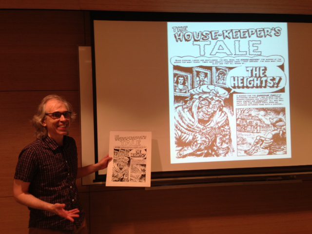
This week’s Symposium (held at Parsons, moderated by Connie Sun) featured cartoonist and educator R. Sikoryak explaining how he uses digital tools. Sikoryak, author of Masterpiece Comics and numerous other comics parodies, is exceptionally knowledgeable about pre-digital and digital drawing/printing techniques because he researches them so extensively for his material. “All of my work involves forgery—taking old styles and combining them with other elements,” he said. Because his comics must evoke the look and feel of his source material, he knows how the original effects were made and how to make them using a combination of hand-drawn and digital techniques. A list of the resources he mentioned will be included at the end of this article.
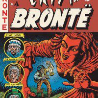
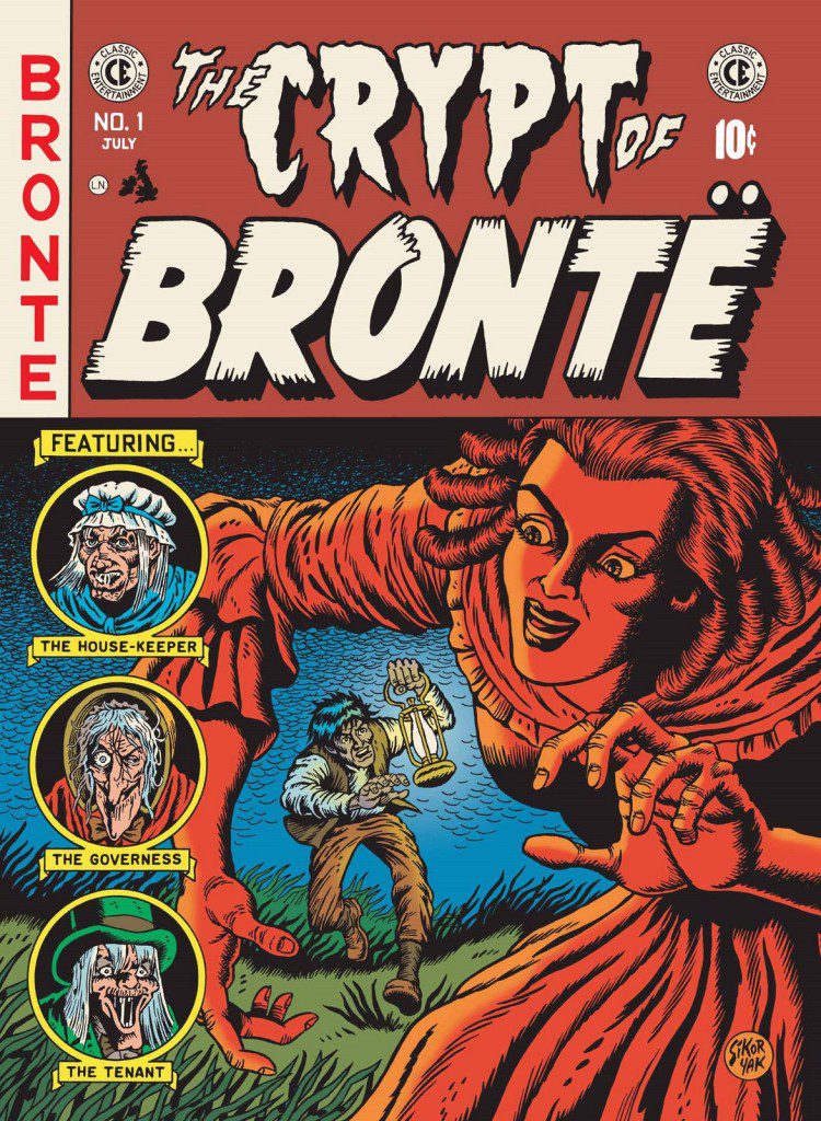
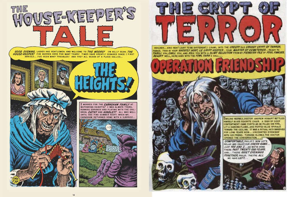
Sikoryak then took us through several of his projects, moving from earlier to most recent (and consequently, from light incorporation of digital tools to heavier use of them). For “The Crypt of Brontë”, his parody combining Wuthering Heights with EC’s Tales from the Crypt, Sikoryak exhaustively researched both Horror comics of the 1950s and illustrations of the 1847 novel, noting the compositional elements, the character depicitons, and the colors and typography used (each Wuthering Heights character was “played” by characters from other EC comics). Sikoryak even got comicbookfonts.com to clean up their digital version of an EC handlettered font to get rid of the distressed embellishments they’d added to the letterforms. Sikoryak discussed his decision to go with fonts instead of handlettering (although he did draw the display text). “It’s more important for me to get the style right than to get the elements of my hand moving correctly,” he said. Creatively incorporating the tools at hand to get a desired effect is a core part of how and why he uses digital techniques. The digital and hand-drawn methods work together to create the final product. He pointed out that the steps he described are just the way he works and not a prescribed method for everyone. However, they do demonstrate the capabilities of working in the digital medium.
Sikoryak used “The Crypt of Brontë” to show how he uses digital tools, namely Photoshop and InDesign, along with hand-sketching, to plan his comics. After isolating the text he wanted to adapt from a PDF of the novel (available via Project Gutenberg), Sikoryak laid out his pages in rough thumbnails, deciding what he wanted to happen on each page and where the text would lie. This process involved some combination of laying out text and other elements in Photoshop, printing it out, sketching in Sharpie over the composition, scanning it in, altering it in Photoshop, printing it out again, etc.
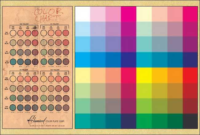
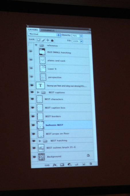
This way, Photoshop is a vector for bringing all the elements together more elegantly and quickly than how it used to be done by hand (with sheets of tracing paper and photocopies). Sikoryak even points out how the layers in Photoshop function similarly to the layers of tracing paper he used years ago, except with more capabilities. Between each of these steps, he refined his images further and further (moving a figure, redrawing an element, etc.) He laid out his text in InDesign instead of Photoshop (“because you don’t have to have a million layers each time you make a new word balloon”). Once he got his elements into satisfactory order, he printed it out again and light boxed the composition onto paper before he could pencil and ink it. Going back to the idea of synthesizing hand-drawn and digital tools, he colored the final art in Photoshop using the limited 64 color palette that 1950s artists used for print. The old method of coloring used to involve cutting out color separations with Zip-A-Tone, something Sikoryak has traded for the Paint tool.
At this point, a member asked how he dealt with Wite-Out on his originals, since it looks fine on a photocopier but terrible when scanned. Sikoryak answered that he also photocopied his originals and then scanned the result. “My originals are like a war zone . . . I want them to look like old comics . . . so one extra step isn’t a problem for me.”
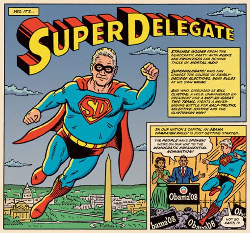
Moving on to discuss the process of making Super Delegate for MAD Magazine, he showed how the Wacom (pronounced Wah-kum) tablet entered his process. “As soon as I was working on the computer, the tablet was part of the process.” Since this assignment had an especially short schedule (compared to “The Crypt of Brontë”), digital tools were crucial in speeding up the process. Once again, Sikoryak used Photoshop to combine elements and build his pages. He used the program to collage digital photo reference from 1950s Superman comics, pictures of the Clintons and Obama, and pictures of himself and his wife, Kriota Willberg, posing as the characters into his compositions (to be drawn over). Printing out his pages, Sikoryak then traced them onto the story board using a lightbox and inked pencils. In later comics, he’d print the art in blue ink onto paper and use that as his pencils instead of tracing them. Once again, he colored the art in Photoshop using the 64 color palette. Additionally, he added a Photoshop layer of scanned blank newsprint and set it to multiply, so the newsprint texture overlay all the art underneath and contributed to the 1950s comic effect.
In subsequent projects, like SpongeBob SquarePants comics for Nickelodeon Magazine and an election 2010 comics spread for GQ, Sikoryak started using the Cintiq, a Wacom product that lets you draw directly onto a screen instead of a tablet. Adopting it after using it for his animation work, Sikoryak found it intuitive to use. The zoom function also greatly enhances this tool, as he can zoom in as far as he wants on one element, changing scale to suit his needs.
Sikoryak used the Nickelodeon Magazine comics to demonstrate how he uses Photoshop grids to help with perspective. One way of making these grids is by drawing a few lines, copying them, repeatedly pasting them, then transforming and tilting them to get the grid you want. (A member raised the possibility that Photoshop CS6 now does this on its own). Citing one of his favorite resources, The DC Comics Guide to Digitally Drawing Comics by Freddie E. Williams II, Sikoryak mentioned Williams’s website as having perspective path tools you can download for free.
Miscellaneous Points:
Sikoryak works at 1200dpi in grayscale, except when coloring. He colors in CMYK and not RGB because he designs his work for print, and is worried about losing information moving from RGB to CMYK mode. He works on PSD files, but delivers art as LZW-compressed TIFFS (because that’s a way to make files smaller without losing quality).
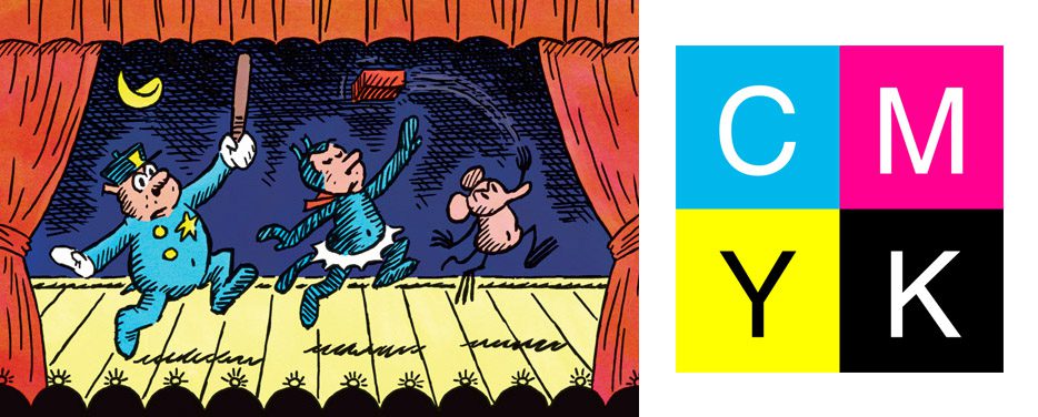
It’s possible to make your own dot screens in Photoshop by making a pattern, or by using one downloaded from the internet. It’s “a mechanical texture that recalls an analog means of printing,” similar to his use of the 64 color palette and newsprint textures. One striking example of this approach is his Krazy Kat illustration for The New Yorker, which he completed while away from home (and thus drew digitally). He wanted the color to evoke newspaper comics, so he prepared a CMYK palette for himself by painting cyan, magenta, yellow, and black swatches onto paper, scanning them, then using it as his digital palette.
He recommends making a font of your own handlettering. It’s quick and relatively cheap through various websites, and very useful in the long rum.
In the Q&A there was some discussion of whether the program, Manga Studio, was better than Photoshop at inking because it was vector and rastor based.
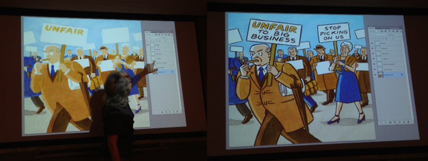
The illustration of protesting rich people was done to evoke New Yorker covers, so after making a color sketch in Photoshop, Sikoryak hand-painted the colors in watercolor, then combined them with the linework in Photoshop. Photoshop allowed him to retouch all the elements.
Sikoryak also brought several pages of his originals so members could see the process up close.
Deciding how to use digital tools depends on your own feelings about “style choice, efficiency, and convenience.” How you make it work is highly individualized.
Resources:
The DC Comics Guide to Digitally Drawing Comics by Freddie E. Williams II
FreddieArt (Freddie E. Williams II)
Yourfonts.com (for making your own fonts)
Scribd.com (where you can find the Famous Artists Cartoon Course and books on perspective, among other things. You can read the pages for free, but download PDFs of them as a member).
Digitalcomicsmuseum.com (great resource for cool old comics)
***
Image 1: R. Sikoryak, Photo by Andrea Tsurumi, June 2013
Image 2: R. Sikoryak, Cover, “The Crypt of Brontë,” Masterpiece Comics, Drawn and Quarterly, 2009
Image 3: 64 color palette scanned from comic, HowtoGeek.com
Image 4: Left: R. Sikoryak, first page of “The Crypt of Brontë,” Masterpiece Comics, Drawn and Quarterly, 2009; Right: Jack Davis, First page of “Operation Friendship,” Tales from the Crypt #41, EC Comics, 1954
Image 5: R. Sikoryak (art), “Super Delegate,” MAD Magazine #490, 2008
Image 6: Screenshot of Sikoryak’s layers, Photo by Andrea Tsurumi, 2013
Image 7: R. Sikoryak (art), Photo by Andrea Tsurumi, 2013
Image 8: Left: R. Sikoryak, Illustration for Dance column, The New Yorker, 2011
Right: CMYK palette (not the one painted by Sikoryak), wikicommons
***
About the author: Andrea Tsurumi is an illustrator and cartoonist who takes tremendous liberties with history. You can see her work here and check out her latest projects here. She lives in Astoria, NY with fellow cartoonist Alexander Rothman.
