The New York Comics & Picture-Story Symposium is a weekly forum for discussing the tradition and future of text/image work. Open to the public, it meets Monday nights 7-9 pm EST in New York City. Presentations vary weekly and include everything from historical topics and technical demonstrations to creators presenting their work. Check out upcoming meetings here.
This week Bluestockings Bookstore saw the 52nd New York Comics and Picture-Story Symposium, featuring the second appearance of Michael Joseph, rare book librarian at Rutgers University, who presented a paper entitled “Lynd Ward’s Vertigo: Strategies for Creating a Voice in a Silent Novel.” While Joseph’s previous presentation treated the more general question of the interpretability of the graphic novel, here he focused more directly on a single work by a single author, the early twentieth century American artist, Lynd Ward, who produced of a series of six “wordless novels” recently reprinted by the Library of America. Joseph used this refined attention as a means to address the question of whether Ward’s work should be fit into the canon of the graphic novel, or whether his refusal to use text ought to exclude him from it, before proceeding to an extensive analysis of the novel itself.
While many celebrated Ward’s publication by the Library of America, seeing it as a final recognition of the literary value of the graphic novel, others found Ward’s reliance solely on pictures to present the plot insufficiently challenging to the doxa that illustrations have no place in serious literature, as it could be said that he was simply a visual artist who made sequences of narrative prints. Joseph sees the controversy as a broad question about the discourse of the graphic novel itself, rather than a singular question of the status of this particular artist – could Ward’s admission to the canon of American literature, rather than another artist who may have combined image and text, be a confirmation of the lowly status of the picture story?
Joseph, who believes Ward’s work is ingenious and worthy of admiration, saw the controversy as an opportunity to interrogate the nature and idiomatic energy of all types of pictorial narrative. His reliance solely on pictures is not so far outside the mainstream of comic literature, and his sociopolitical beliefs and subject matters are well within the tradition of comic art. Each of Ward’s novels features innocent, good-natured, affectionate, hard-working, and idealistic innocents betrayed by cynical, greedy, and heartless adults. Much of Ward’s leftism finds its way into today’s graphic novels and comic books. Ward transmitted the technical innovations of European woodcut novels by Otto Nuckel and Frans Masereel to later pictorial works that imparted narrative instead of simply embellishing text.
Joseph clarified his point about the audience of Ward’s work by comparing it to work by Lyonel Feninger and Winsor McCay, both of whom advanced comic art significantly, but aimed their light-hearted stories at children rather than adolescents. In the United States in the 1930s, Ward alone presented works for adolescents. From this comparison, Joseph segued to a long discussion of the technical features of Ward’s work.
The first technical feature Joseph explained was Ward’s simulation of phonological elements by using the rhythmic patterning of regular image shapes and sizes to construct a visual prosody. Although Ward’s entire output was technically ambitious, Vertigo was his most systematic attempt to organize these rhythms by such devices. Vertigo, a picture novel of 230 woodblock images, used four sizes to structure the story: 2” x 2” (40 images total, hereafter called “small” according to the sophisticated nomenclature of the academic), 3 ½” x 2” (91 images, “medium”), 3 ½” x 3 ½” (51 images, “large”), and 5” x 3 ½” (48 images, “jumbo”). The relatively scarce small images, to which Joseph mainly confined his attention, bring the reader close in on single characters, stressing their inner experiences and bringing readers own emotions close to them. Multiples of four medium images begin each section of the text, delivering information mainly about the course of the plot, and seem somewhat affectless compared to the other types, thus serving also to establish an emotional baseline. The large images break the pattern of medium images to suggest an amplification of the significance of the moments they depict, and to suggest that the motif of the image also has significance for the larger community of which its characters are a part. Last, the jumbo images typically comment on theme, with strong dramatic overtones or with contradictory symbols presented simultaneously in a single panel, and perhaps even attribute universal significance to their subjects.
The systematic combination of these sizes in a narrative sequence allows Ward to support that narrative with a wealth of concise, subordinate details. He does this in four ways, the first by the aforementioned changes in size to interpolate mood or disposition, the second by shaping the block edges in a variety of ways to present harmonies or dissonances, the third signaling a particular mood in the transition from the previous block sizes (which can either be abrupt, as when Ward goes from small to jumbo, or more serene, as when he goes only from small to medium), and the fourth diverging from the narrative flow of the plot in the contrast between image sizes.
The plot of Vertigo involves the relationships between an anonymous girl, her father, a boy, and other assorted characters as they grow together and apart during the Depression. Ward uses a variety of visual techniques within the panels to depict alternately the young love of the girl and the boy, the moral difficulties faced by an “Elderly Gentleman” who has been ordered by the Board of Directors of his company to break a strike, the choice of The Father to allow his daughter space to fall in love with The Boy, etc. The complexities of character are maintained by Ward’s visual devices. For example, the Elderly Gentleman is, in panel 195, is depicted as both vulnerable to the powerful forces that might destroy The Boy and The Girl’s relationship, as well as someone positioned also to be the agent of their suffering, possibly able to stop the mindless proliferation of technology and impersonal development that has wrecked the social world during the period. Other examples include blocks 187 and 90, which depict the gruesome Board of Directors, but suggest by the exaggeration of their features that this may be the vision the Elderly Gentleman has of them.
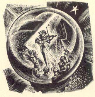
The bulk of Joseph’s presentation focused on the mechanics of the small images, which, again, are the rarest of the image sizes. Reminding Joseph of close-up shots in film and short solos in symphonies, these small images serve to mark moments of intense stress or passion, to heighten drama, and, when contrasted to larger images surrounding them, to pinpoint crucial plot twists or character traits. The first small image in Vertigo, 122, appears when The Boy approaches The Girl at her school commencement activities, whispering an invitation into her ear. The image contracts the narrative refocuses attention on their special relationship and asks us to feel the constrained excitement of the moment. This image is followed immediately by another small image, 123, of The Girl speaking to The Father, with The Boy in the background, on the lower left of the image. Joseph noted that the succession of two small images, not common in Vertigo, has a modifying effect on the action and annuls the flow of ordinary time. To emphasize his point about the succession of more than one small image, Joseph then turned to the next set, images 129-131, three that depict The Boy and The Girl in an amusement park where they have a glimpse into their idyllic future, but also experience the first stirrings of love and the first shock waves of the Depression.
Along with the technical features of Ward’s novels goes his symbolic imagery. Joseph focused his attention closely on the repetition of the single star motif, a multivalent symbol that seems to imply the transcendent promise of a glorious destiny not experienced by the characters within the novel and Ward’s subversion of a common Christian image (the star seen by the Magi) and his translation of it into the secular image of a cultural promise. The meaning of Ward’s symbols is often structured by their placement in repeating compositions, as with the ring motif in images 135 and 143, the first of which shows The Boy offering The Girl a brass ring as a mock wedding ring, and the second showing his presentation of an engagement ring. The repetition of the basic compositional pattern serves to remind readers of the relationships among parts of the story separated by the linear narrative. The enlistment of the reader actively in creating the story suggests to Joseph that the recounting of the plot in Ward’s novels is an exercise in subjectivity. The brass ring, being a cliché to signify worldly success, helps sound the story’s romantic theme and to conjoin it with worldly success and mutual attraction. The Boy’s pragmatism is, in turn, linked to his decision to leave the city in search of work and his refusal to impose himself on The Girl when he returns five years later empty-handed. This determination to earn money, again in turn, is contrasted to the unbridled greed of the Board Members of the Eagle Corporation of America, four of whom are depicted grotesquely in the four small images from 187-190.
After describing the function of these images, Joseph expanded his discussion to a more general reflection on the potential of language to express. Joseph stated his disbelief in the ineffability of anything, but suggested also that it would be extremely difficult for verbal language to express what is seen in Vertigo with as satisfyingly succinct a phrase.
From this digression, Joseph returned to the succession of small images in 143-144, the first of which features the presentation of the engagement ring in compositional analogy to image 135 (featuring the brass ring), and the second of which depicts The Girl’s positive response to the proposal. 143 reverses the perspective of 135, showing The Boy presenting the ring (on the lower left) to The Girl in a perspective seen over her shoulder. That composition is again reversed in 144, which now depicts the couple kissing from over The Boy’s shoulder. The coupling of these two small images serves to break from the social and political orientation of the larger blocks, instead sustaining the inexhaustible magnitude of the present in which the two fall in love. Joseph also used these images as an occasion to focus on Ward’s woodcut technique, which displays a sophisticated understanding of the use of differing line weights – the shoulder of The Boy in 144, depicted with an extreme thickness of line, serves metaphorically to present his physical and emotional sturdiness.
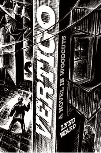
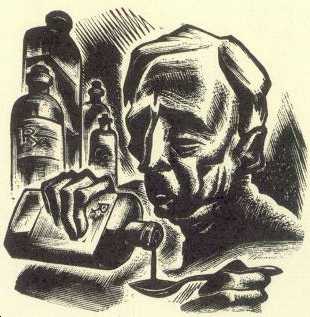
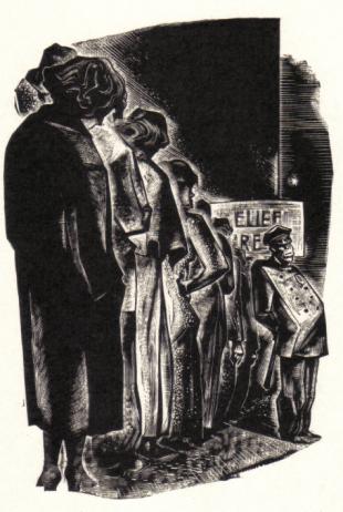
The last of the small blocks Joseph focused on was 160, depicting the tragic attempted suicide of The Father and his daughter’s intervention to save him. This depicts the explosion of the gunshot from The Girl’s vantage point, showing only her hands as she tries to grab the gun. This image is part of a section that concludes six blocks later with a jumbo block depicting The Girl joining a line for public relief. Joseph then returned to his examination of a series of larger blocks, including a set that depicts the alcoholism and emotional desperation of The Elderly Gentleman (176) and another, the eight images from 216 to 223, that shows the now-impoverished Boy refusing to take up work as a strike-breaker and his consequent emotional trials. This sequence, which begins with a jumbo image instead of a medium, narrative block, suggests the dramatic intensity of the confrontation between the desperate Boy and the self-servingly wealthy “Bugg,” owner of the department store, as well as the thematic significance of the confrontation. This sequence makes use of medium and small images as well, including 219, the last small image in Vertigo, which shows a thuggish policeman who has arrived on the scene after a holdup depicted in 218 with a medium block, and the large 220, which has leaped over a medium image from the small 219, and shows The Boy’s loss of control over his situation. With 221, also used as the cover of the novel, Joseph suggested that Ward was, within the narrative, trying to suggest that public resources (in this case, the police force) have increasingly served to protect elites, as the police arrive on the scene after Bugg is held up by a suspected outlaw, whom the police then kill.
Joseph concluded his presentation with the final images of the book, including 223, which returns to the large, impersonal city placed in a composition that is distinctly reminiscent of one of the first images, 25. The couple, the trees, and the beckoning star of 25 have been replaced by the lone Boy and an accusing streetlamp and spiritually deadening towers, which Joseph read as the antithesis of the sexuality and sexual reproduction denied The Boy and The Girl by the forces of circumstance. Thus, Ward’s novel ends by asking its readers to see this doleful state of affairs as an allegory of America under capitalism in 1937. Joseph concluded by asking whether this was not also the vision many comic artists and graphic novelists have of the world under capitalism as such.
***
Image 1: Lynd Ward, Vertigo, Cover (also block 221)
Image 2: Lynd Ward, Vertigo, small image 176
Image 3: Lynd Ward, Vertigo, small image 130
Image 4: Lynd Ward, Vertigo, jumbo image 166
