The New York Comics & Picture-Story Symposium is a weekly forum for discussing the tradition and future of text/image work. Open to the public, it meets Monday nights 7-9 p.m. EST in New York City. Presentations vary weekly and include everything from historical topics and technical demonstrations to creators presenting their work. Check out upcoming meetings here.
This week, presenters Amy Kurzweil and Charlie Boatner both explored how to close-read comics and identify the formal elements that craft the reader’s experience. Kurzweil, an educator, cartoonist, and fiction writer, who is working on her own graphic memoir, is fascinated by the connections between comics and memory. Boatner, who wrote for comics titles Marvel Fanfare, Action, and Tales of Terror (as well as an article for The Comics Journal), close-read two Green Lantern/Green Arrow comics in order to demonstrate how images reinforce elements of the story.
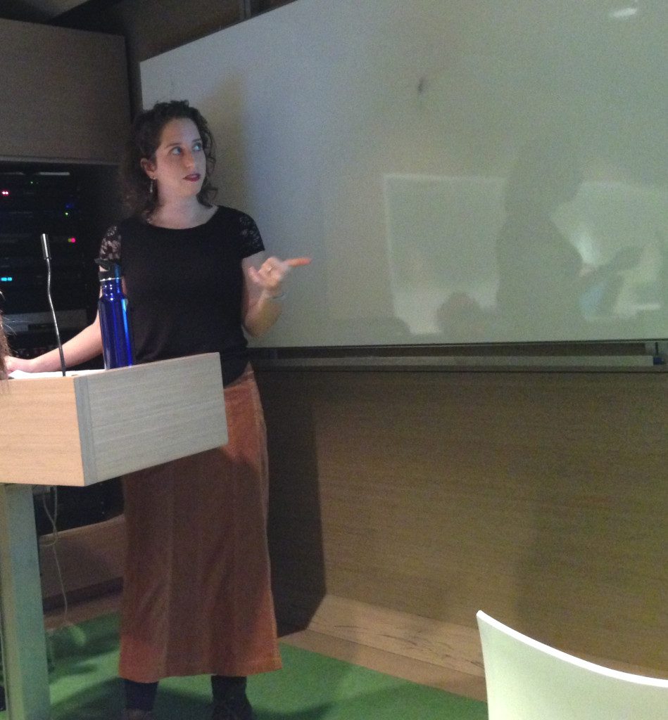
Kurzweil began her talk, “Decaying Sense: How Comics Compose Memory,” by noting how many graphic novels are memoirs. There is something about the form that “lends itself to writing about memory” and leads to the “recreation of memories on the page.” She engaged the audience in the act of remembering by asking everyone to briefly close their eyes and recall something from the past. She then noted how memory is “not a faithful faculty” but “an act of retrieval.” Remembering is “an act of recreation” that often uses the imagination. She explained how the act of remembering, or conjuring something using different pieces of information, resembles the act of reading comics, or creating a narrative from the images and words seen on the page.
Comics, as a medium, are special for how they let the artist or reader “control how time is working” in a story or image. Quoting Art Spiegelman, Kurzweil explained this happens because the past, present, and future can all be on the same page. Bringing up a picture of Garfield dreaming about himself dreaming, Kurzweil said this image could be combining the present and the future (Garfield looking forward to the next time he sleeps), the present and the past (Garfield dreaming about last night), or it could show an all-consuming present (Garfield dreaming about what he’s doing). Readers extract meaning from comics by looking at the images on the page and making connections between them. Scott McCloud calls this action “closure,” or how the eye and brain piece together the images separated by gutters. In comics, Kurzweil said, “the level of closure one is constantly asked to do” is different than in film because with comics, readers must “stitch together [the story] ourselves.” Notably, the act of remembering operates in the same way. Memory is “not continuous . . . it is not linear. It’s fragmented . . . memory doesn’t exist in our minds like a film; it exists like a comic,” she explained.
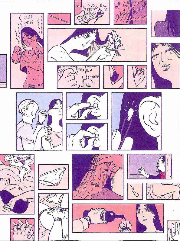
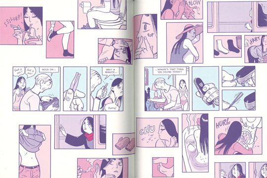
Kurzweil pointed to Chris Ware and David Mazzucchelli as modern examples of how cartoonists use form. A spread in David Mazzucchelli’s Asterios Polyp focuses on Hana, the wife of Asterios. These panels of isolated Hana moments suddenly flood the book in the way that memories flood the mind. Little disjointed moments of Hana’s “grooming and dressing habits” are collaged on the top and bottom of the pages, but in the middle there’s a linear sequence of Asterios pulling a Q-tip out of Hana’s ear. The pages contain both a straightforward and focused story–pulled out of a jumble of other memories–and fragments from the cumulative experience of living with her. Not only does the reader see what Asterios remembers of Hana, but they also simulate what it feels like for him to remember her.
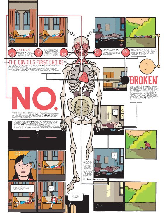
Memory plays a central part in Chris Ware’s Building Stories. All the stories come from the life of Ware’s nameless heroine and often show her or other characters calling up their own memories. The “labyrinthine panel structure” shows the experience of remembering by drawing connections between different elements. He is “mapping how things happen according to the memories of his characters.” In the example Kurzweil used, the protagonist lies down and thinks about a devastating breakup she endured. She also plays an old game where she tries to locate her consciousness in her body.
All of the associations from this breakup are mapped onto the anatomical map of her body, which includes her truncated leg. Tellingly, a big “NO,” shows up right next to her womb, calling back to the abortion she had with an ex-boyfriend. Images of her lying down in the past, when she was with the boyfriend, echo images of both her younger self and present self. Near the missing leg are empty panels. According to Ware, cartooning for him parallels the act of remembering: “cartooning is a mysterious process . . . [and involves] seeing what the recollections dredge up . . . I just start at the upper left hand corner or center and see what happens.”
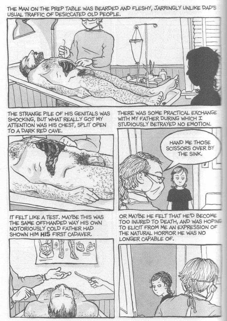
Kurzweil used a page from Alison Bechdel’s comics memoir, Fun Home, to demonstrate what comics do with perspective in memory. Bechdel narrates her childhood experience seeing a corpse being prepared for burial. There are multiple levels of perspective folded into the page: the third person perspective of Bechdel’s narrating, the view of young Bechdel reacting within the scene, and the first person perspective of the room as seen from young Bechdel’s point of view. Tying this to coping mechanisms for traumatic experiences, Kurzweil wonders if this jumping in and out of first person allows Bechdel to play with psychological distancing techniques.
In the first panel, Bechdel appears from behind as a darkened shape silhouetted against the scene in the mortuary room, a common comics trope for establishing what a character is looking at. The second panel is a close-up of the body from young Bechdel’s point of view; the camera is being controlled by her experience. Then the camera flips and Bechdel the author is suddenly watching herself as a child reacting to the body. She is “meta-watching” or “looking at herself watching the past.”
Here, Kurzweil brought up Bechdel’s approach as a “method cartoonist” (or someone who studiously recreates and embodies remembered scenes as photo reference) to talk about how much “repetitive labor” comics require. Drawing the same characters or settings over and over again has interesting implications for acts of reenacting memories.
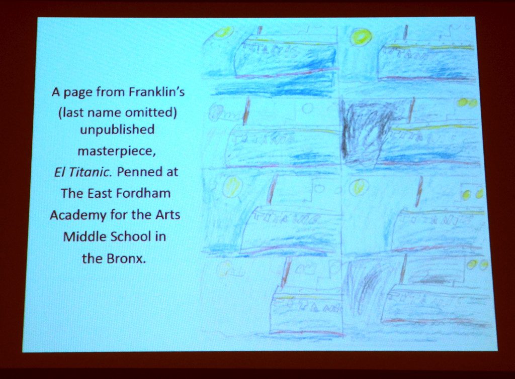
Kurzweil’s final example came from a drawing by a sixth grader in her comics class at East Fordham Academy for the Arts Middle School in the Bronx. The student Frank sat down and drew repeated images of the Titanic. She speculated what the effects of physically drawing images over and over again by hand has on an artist’s mind. Kurzweil asked the audience to think about the memory we focused on at the beginning of the symposium and to draw what our faces looked like in the memory. She then asked if we were subconsciously mimicking the face in our drawings while we drew them. Returning to the idea of repeated images, she pointed out there’s something about drawing images over and over that makes the images part of one’s muscle memory. It is “art that embodies memory as it reconstructs it.”
During the Q & A, someone mentioned how drawing angry, jagged lines while you’re smiling or calm and smooth lines while you’re frowning is difficult. Kurzweil compared it to challenging yourself to making gestures that contradict what you’re saying. Someone then asked Kurzweil about her experience drawing a graphic novel about her family and how she prioritizes accuracy in representing memories. She answered that while she’s being as accurate as possible and working from research, she wants the emotional truth to be right.
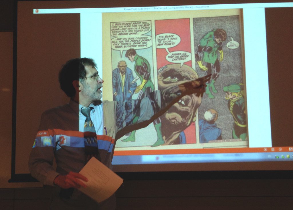
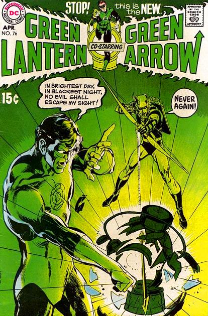
Charlie Boatner began his talk with an image of two children reading a comic. Comics are well known for being easily accessible to readers, especially those with low-level literacy, such as children and new speakers of a language. Because comics gained a reputation for being easy to read, people assumed that comics are simply constructed. That is not so, as Boatner set out to demonstrate with two 1970s Green Lantern/Green Arrow comics written by Dennis O’Neil and drawn by Neal Adams. Boatner explained some comics, especially in the mainstream style, prioritize ease of reading while others “force us to make meanings . . . [something] closer to how we read poems.” Many comic books can be better appreciated by analyzing their visuals for individual symbols and relationships between them.
By the early 1970s, DC decided to experiment with making some of its characters more relevant for the times and so Green Lantern and Green Arrow teamed up for a short series that included “No Evil Shall Escape My Sight!”(1970) and “And Through Him, Save a World”(1972). O’Neil and Adams used this run to explore how much social and political content a superhero book could bear. Boatner was interested in whether visual analysis of the stories would reinforce the radical viewpoint that they seemed to promise or undermine it.
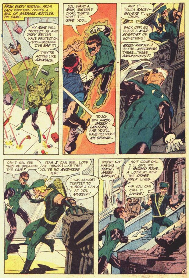
In the first comic, Green Lantern and Green Arrow represent opposite means of enacting justice; Green Lantern is an “interstellar policeman with an all-powerful ring” and Green Arrow is a man dressed like a medieval folk hero. The beginning of “No Evil Shall Escape My Sight” underscores Green Lantern’s top-down approach to power. He flies above the streets, distanced from the people below. He lands in the middle of a brawl, disperses what looks like a group of street thugs, and glad-hands the landlord they were attacking. Boatner pointed out how the middle panel of Green Lantern and the slumlord shaking hands plays up their similarities: they’re both white men with power. Green Lantern got the situation wrong, however, as Green Arrow points out: the “thugs” were tenants being mistreated by the slumlord.
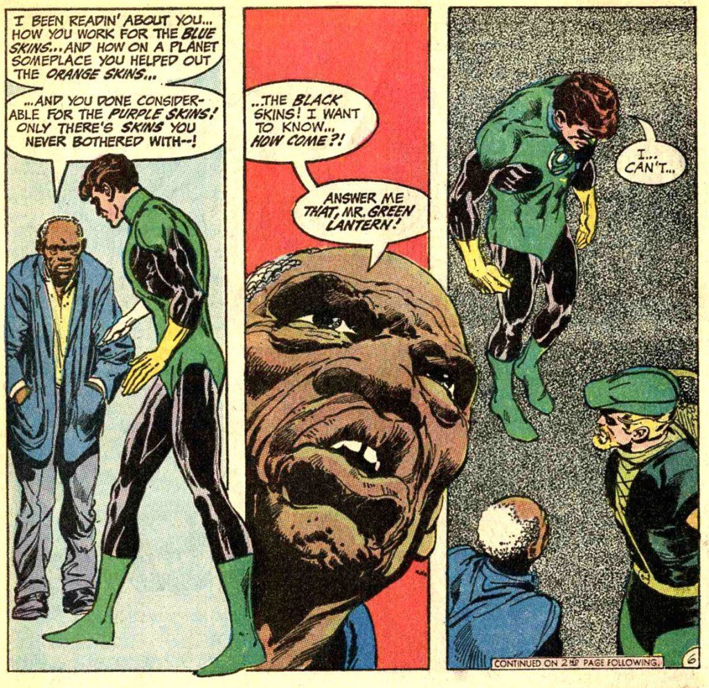
Posture, position, and proximity are formal elements that Neal uses to show the power dynamic between the two protagonists: Green Arrow enters standing above Green Lantern (Green Arrow will turn out to be right, Green Lantern will be wrong). Green Arrow enters from the street and reaches out a hand to pull Green Lantern down to the same level and into the slum. A three-panel sequence uses dramatic changes in posture and size to show a slum resident confronting Green Lantern. While the resident appears with slumped shoulders, denoting submission, and Green Lantern towers over him, the hero bends toward the man’s head. A dramatic low-angle and enlarged picture of the resident’s face bursts through the middle of the sequence, thrusting the man’s story into focus and implying its truth. The camera zooms out in the third panel, reducing the heroes in size and letting the viewer see Green Lantern’s entire body fold in shame.
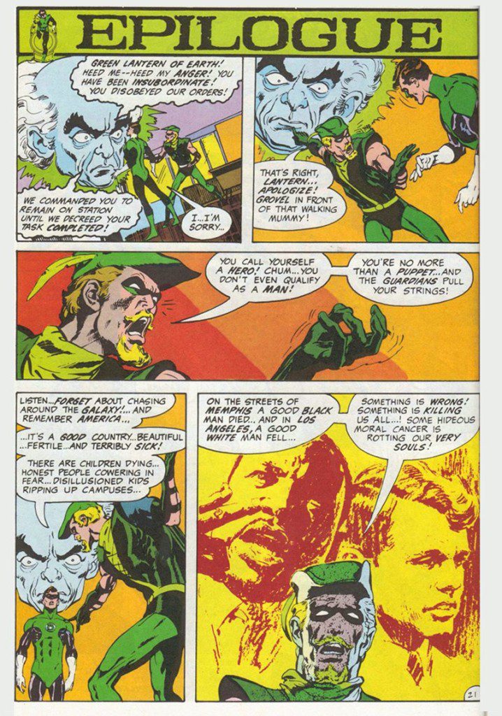
Later, when Green Lantern tries to fight the slumlord (by literally fighting the slumlord), a Guardian appears and orders him to explain himself. The similarity between the size and positioning of the Guardian’s head and the slumlord’s head aligns the Guardians of the Universe with the story’s villain. Green Lantern then flies off into a “token” broadly drawn outer space environment (noticeably lacking in specificity); it’s as if Adams can’t wait for Lantern to return to the streets.
Although the story presents social injustice, it ends with the triumph of the legal system: Green Arrow and Green Lantern help a district attorney charge the slumlord. “The structure is not revolutionary,” Boatner noted, in these comics as in dime novels, even though sensational material appears, “the remedy is never a social attack on the problem . . . Political situations are resolved with an emotional climax that . . . [effectively lets the reader and society off the hook].”
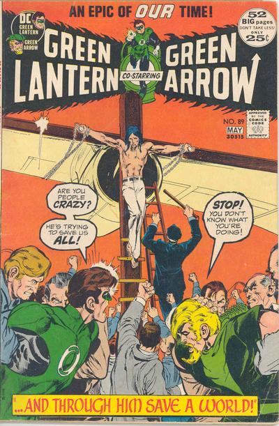
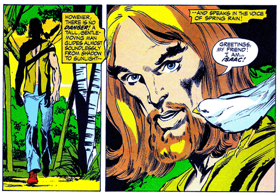
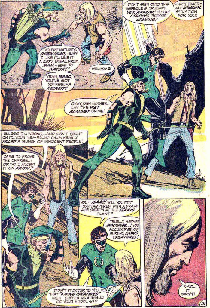
Although Green Arrow was in the right in the first comic, in the final issue of the series he is compromised by the same violent and ineffective approach that frustrated Green Lantern. Isaac, a Jesus-figure and eco-terrorist, fights against an airline to protect nature. Green Arrow and Green Lantern are both stymied by the situation: the law protects the business, but Isaac is right about the airline hurting the environment. While the “interstellar policeman” Green Lantern can’t do much, Green Arrow enthusiastically embraces Isaac’s cause and agrees to help him. Green Arrow is still an archer and a superhero, though; he’s more aggressive and violent than the Christ like Isaac.
Boatner highlights several panels showing Green Arrow’s dark side: he shoots an arrow into a tree, he fights a dog and security guard, and dramatic lighting on his face makes him look threatening. When he shoots a sleeping-gas arrow to stop Green Lantern from apprehending Isaac, Isaac attacks Green Arrow’s methods. In contrast, Isaac wears soft clothes and loose hair and his open posture show him as non-confrontational. Boatner emphasized that the villain in this comic is “more diffuse . . . it’s no longer a single thug, but an industry,” something more difficult for a superhero to fight. Boatner used other pages from the comic to show how composition reinforces the back-and-forth conflict between the heroes.
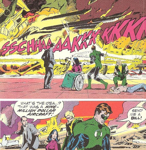
In the end, no one triumphs. Isaac (rather unsubtly) crucifies himself on an airplane and when the two heroes try to save him, the angry airline employees beat them and “crucify” them alongside Isaac. The two heroes are guilty and impotent – the “two thieves”: Green Lantern lost his ring and when Green Arrow tries to free himself he stays stuck, pathetically swinging by one arm. Isaac dies and the two heroes are freed, but Green Lantern uses his ring to destroy the aircraft in a fit of frustration. There’s “a big showy climax at the end, but nothing is accomplished,” something that seems to question whether heroic action can actually do anything. But the heroes must struggle, nevertheless, as we all must. The series ended on this issue.
In the following Q & A, participants tied Boatner’s talk to Kurzweil’s by discussing how formal elements of a comic are used to influence the reader’s experience. Someone said it was interesting that while both groups of creators used these techniques to great effect, people like Ware and Mazzucchelli “call out” these methods while people like Adams do not; perhaps showing the “classic . . . low brow vs. high brow” difference.
Asked about the ending of the Green Arrow/Green Lantern series, Boatner explained it partly “petered out because it got stuck in a pattern of a-social-issue-per-episode – it “ran out” of issues. Further, O’Neil had discovered the paradox that superheroes confronting social problems couldn’t win, as traditional heroes must do.
On a different note, someone wanted to know about Boatner’s experience answering children’s letters for Scooby Doo and Superfriends. There was a range, Boatner said, but the one strong theme he found was that kids wanted to set up romantic triangles between characters.
Symposium members Nick Sousanis and Tom Motley moderated.
***
Image Credits:
-
David Mazzucchelli, Asterios Polyp, Pantheon 2009.
-
Andrea Tsurumi, photo of Amy Kurzweil, 2013.
-
Jim Davis, Garfield wallpaper, desktopnexus.com
-
David Mazzucchelli, Asterios Polyp, Pantheon 2009.
-
Chris Ware, Building Stories, Pantheon 2012.
-
Alison Bechdel, Fun Home: A Family Tragicomic, Houghton Mifflin Harcourt, 2006.
-
Franklin ___, El Titanic, drawing from Kurzweil’s class at East Fordham Academy for the Arts Middle School, the Bronx.
-
Andrea Tsurumi, photo of Charlie Boatner, 2013.
-
Dennis O’Neil & Neal Adams, “No Evil Shall Escape My Sight!” Green Lantern Vol. 2 #76, DC Comics 1970.
-
Dennis O’Neil & Neal Adams, “No Evil Shall Escape My Sight!” Green Lantern Vol. 2 #76, DC Comics 1970.
-
Dennis O’Neil & Neal Adams, “No Evil Shall Escape My Sight!” Green Lantern Vol. 2 #76, DC Comics 1970.
-
Dennis O’Neil & Neal Adams, “No Evil Shall Escape My Sight!” Green Lantern Vol. 2 #76, DC Comics 1970.
-
Dennis O’Neil & Neal Adams, “And Through Him, Save a World” Green Lantern Vol. 2 #89, DC Comics 1972.
-
Dennis O’Neil & Neal Adams, “And Through Him, Save a World” Green Lantern Vol. 2 #89, DC Comics 1972.
-
Dennis O’Neil & Neal Adams, “And Through Him, Save a World” Green Lantern Vol. 2 #89, DC Comics 1972.
-
Dennis O’Neil & Neal Adams, “And Through Him, Save a World” Green Lantern Vol. 2 #89, DC Comics 1972.
***
Andrea Tsurumi is a NY-based illustrator and cartoonist who likes her robots sad and her history funny. She is the recipient of a 2013 MOCCA Award and was included in the 2013 Best American Comics notables list. You can see her work here and her latest projects here.


![National Poetry Month: “WHEN PRAYER DIDN’T AWAY THE GAY, MY DAD TAUGHT ME HOW TO PLAY DOOM ON THE FAMILY COMPUTER [Golden Shovel]”](https://therumpus.net/wp-content/uploads/2026/04/pic-Ty-Raso.jpeg)

