The New York Comics & Picture-Story Symposium is a weekly forum for discussing the tradition and future of text/image work. Open to the public, it meets Monday nights at 7-9pm EST in New York City. Presentations vary weekly and include everything from historical topics and technical demonstrations to creators presenting their work. Check out upcoming meetings here.
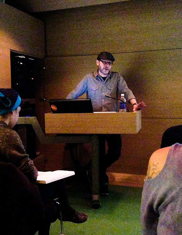
Hang Dai Studios was well represented in the audience at last Monday’s symposium. They came in support of two of their own: cartoonist Gregory Benton and photographer and Photocomix-maker Seth Kushner.
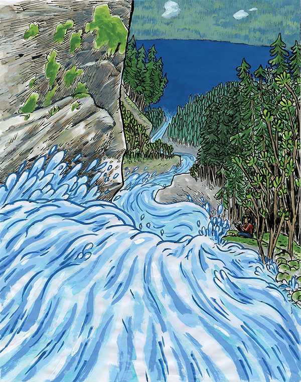
Stacked in a pile in the back of the room were a dozen or so copies of Force of Nature, Benton’s contribution to the brand new Hang Dai Edition imprint recently founded in Brooklyn by Dean Haspiel, Gregory Benton, and Seth Kushner to “make it a better world for comics,” as Benton phrased it. Force of Nature is a 24-page soft cover comic. It tells the story of a watercolor artist who paints happily in a beautiful forest until a bear attacks him, snatches his sketchbook, and disappears. The artist embarks on a journey to reclaim what he once held most precious in life and in the process, learns to redefine it.
This story is the humorous result of the most traumatic event in Benton’s career. In the storm season of 2011, his studio was flooded and five years worth of his art was destroyed. Benton was left with no choice but to begin afresh and learn how to let those stories go.
Shortly after the flood, Benton met Haspiel at a gallery opening in Brooklyn and Dean invited him to join the Hang Dai Studios. Benton, who had always considered himself a lone wolf, was surprised to find he was enjoying the camaraderie of his peers.
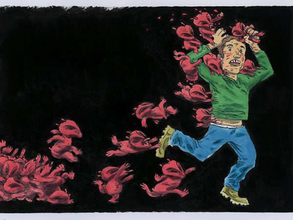
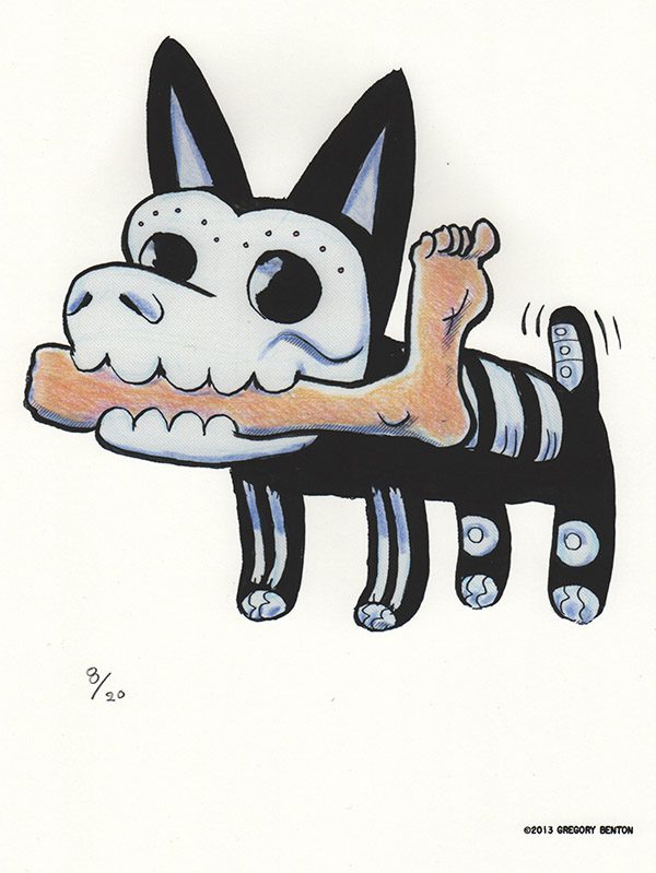
The first piece he created after the flood was for a Halloween show. It conveyed his state of mind and his fear of losing control, but it was also the piece that placed him back on the track of doing what he loves most: drawing.
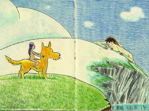
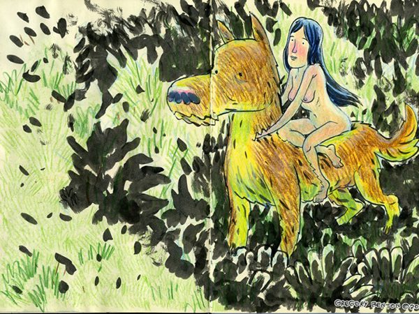
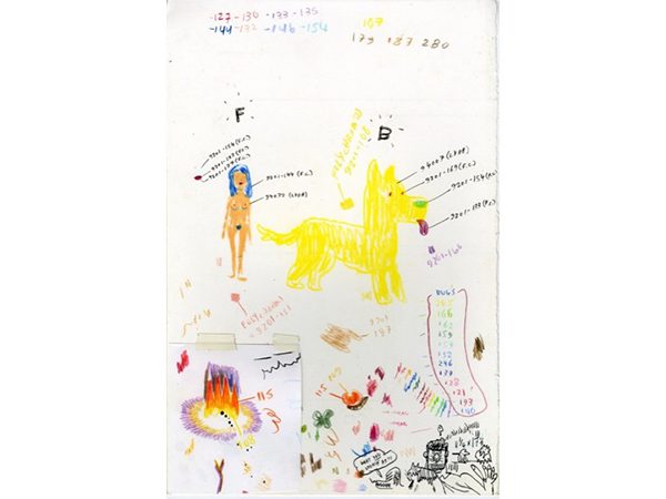
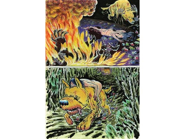
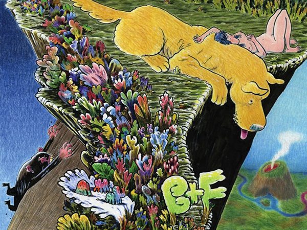
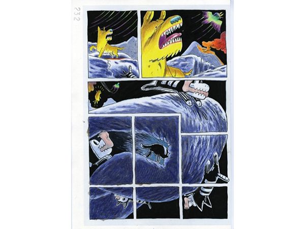
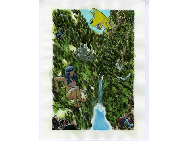
One day, he encountered his characters–B, the dog, and F, the woman–in a casual ink drawing that he colored with pencils. The two characters were mysteriously proportioned. Even Benton himself couldn’t tell whether B is a giant dog hanging out with a pixie sized woman and traveling through a forest, or if B and F are two insect-like adventurers trekking through a two-inch patch of grass.
These two mysterious characters appeared in his sketchbook without any backstory, which is how they would be revealed to readers of the future book.
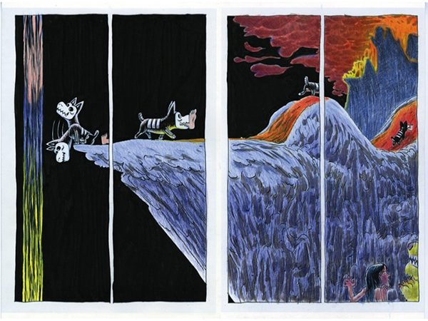
As he continued drawing them, Benton revealed more and more about the world they inhabited; he fleshed out exotic creatures and foliage in color from each mark he made on the paper.
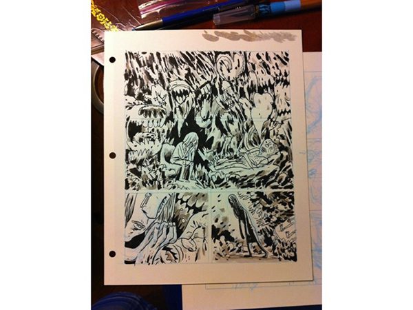
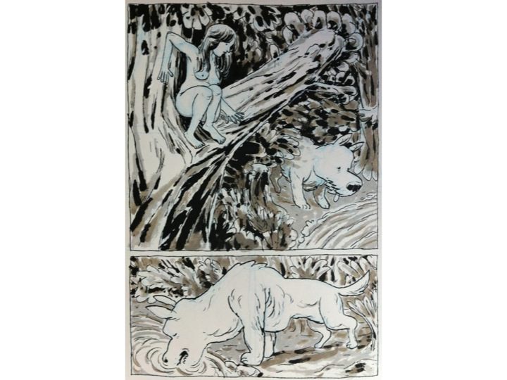
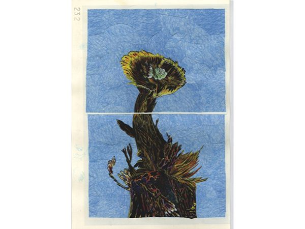
When he was asked to contribute a story about nudity for a Spanish comics anthology, he used these characters because he felt they had something to “say,” so to speak, beyond the singular pages. To this end, he decided to experiment with an old technique he had heard was used by cartoonists in the 1950’s. He managed to salvage the last reams of Duoshade paper from a store that was going out of business. This allowed him to hold on to the freshness of his sketchbook drawings and the newly found joy of improvisation. The variety of tone and texture that can be achieved by painting over the Duoshade paper was also key in establishing the lush look and feel of B and F’s world. As an added bonus, the work had the mysterious allure of this forgotten technique.
When the 3-page black and white story was completed, Benton was left with the urgency of his materials. The developer chemicals he had bought were dangerously nearing their expiration date. Benton was compelled to continue the story. Ultimately, the core of the B and F story is embedded in their relationship and their design. “So you could read 3 pages or 64 pages and understand the same thing” Benton joked.
Benton intentionally avoided any form of exposition. He only wanted to discover where B and F were going and not where they came from. He hoped that in doing so he would convey the same sense of excitement he was feeling to his readers. In the past, his process would involve a meticulous planning of the script and the breakdown of the panels before any drawing would take place.
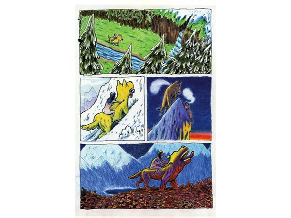
This time around, he felt delighted in the analogue process and the sensuality of the materials, and looked no further than one page ahead, advancing at the pace of his characters as they frolicked through the woods. Even when his characters encountered hardship and danger, he made it a point to emphasize the sense of security and comfort they found in each other’s company.
Benton also left some room for the readers interpret the dangers themselves. For the most part it is hard to determine whether the inhabitants of this world are friendly, cute or sinister.
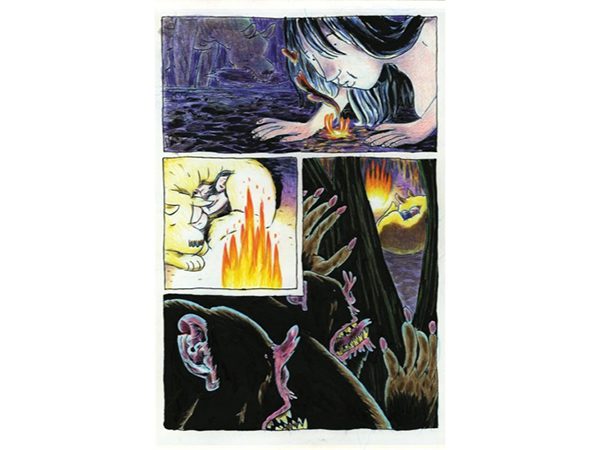
Benton put a lot of thought into the color schemes in order to transform B and F from simply being two characters hanging out on a single page to protagonists of a comic. When he first drew them, he used the color as a means to flesh out the details of his initial marks. Also, to lead the reader through a wordless narrative, he needed to compensate for the lack of text with color so that they would express the full scope of emotions and atmosphere and evoke a certain time and place.
Those color charts were the most conscious tools he used to plan the pages ahead. The rest of the “writing” was drawn through a stream of consciousness.
No creature was left unscathed in his story. Benton allowed for his own state of mind (which at times even became violent) to lead the narrative. He killed off B and F but also resurrected them in the name of hope. Those last pages were rounded off as the approaching MoCCA comics festival provided the necessary impetus/motivation for the open-ended story to become a book.
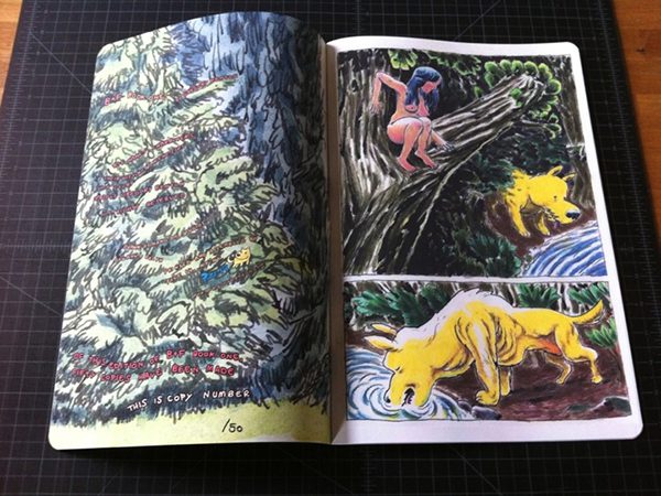
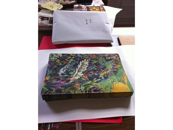
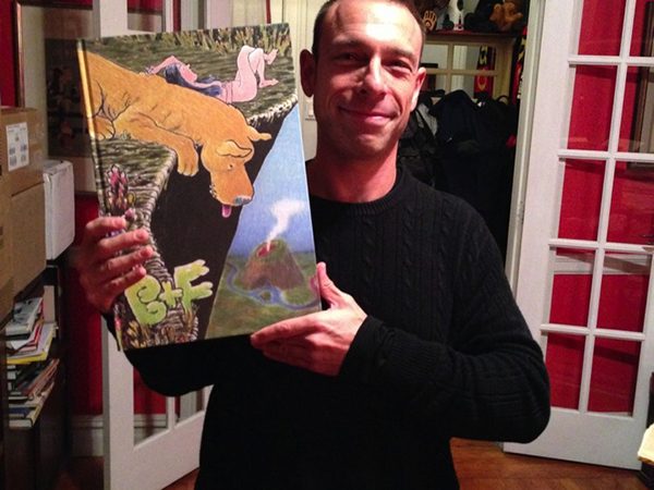
Benton powered though a mere three days to finalize the cover, print and assemble 25 handmade copies of the book. Each copy took 40 minutes to make as he used a slow-but-reliable printer, a corner rounding tool, and the assembly line skills he acquired from a youth spent collating New York Times issues. The loss that took him over a year to accept took him on a path where he did what he loved with a completely new approach to storytelling and he also ended a decade-long break from creating books.
The 25 copies sold out by 4 p.m. on the first day of the festival. Benton rushed home to produce a second edition that took him all night. The next morning he learn that his book had been picked up a member of the inaugural MoCCA Award of Excellence jury and that he had won a medal along with six other cartoonists. (There were 5 winners total and 2 honorable mentions). Following the award, the book received much attention and resulted in book contracts with the American publisher Adhouse and the French publisher Çà Et Là.
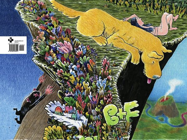
The original drawings from the book were exhibited in the MoCCA wing at The Society of Illustrators along side those of the six other cartoonists. The extra time allowed him to rework the original cover and plan it as a wraparound illustration with deeper contrasts. He would use this cover for the expanded version of the book scheduled to be published in the fall but not before censoring the nakedness of F to meet the demands of the American market.
Benton went on to explain how he expanded a 16-page story into a 64 page hard-cover book. The beginning was straight forward: he simply continued from the point he left off. B and F follow the skeletal patterned dog who had taken possession of F’s right leg during when she had died.
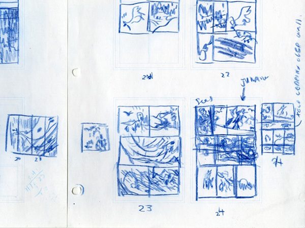
But this time around, Benton had to keep closer tabs on the rhythm of the story as it was unfolding and he had to keep in mind the limitations of the deadline and page count. When he approached page 40 and the end seemed far away, he created a storyboard to make sure he could get to the point where he wanted to end the story.
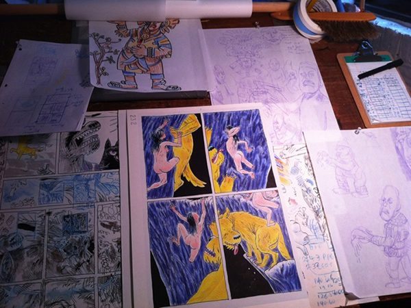
He also kept a detailed check list of how many pages were left to sketch, ink and color.
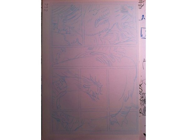
It was important for Benton to continue surprising himself from page to page even though his process became a lot more systematic. He did so by being open to chance accidents, or transforming the obstacles he encountered into revelations of shape and composition. He gave an example of a page he was sketching, which didn’t seem to work until he flipped it on its head: the panels looped back onto each other in an interesting way. Benton retraced the sketch onto a new piece of paper and reinforced the dominant shapes, which created an innovative dynamic grid.
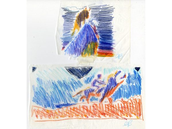
When the art for the book was completed, Benton didn’t stop exploring the world he had created. He played around with watercolor and collage using the scraps and cut-up proofs of the book. In a sense, he is making the structure of B+F’s travels through a structureless world the basis for making future stories.
Of the 64 pages, only half a dozen or so had been redrawn. He redrew them because the look of some of the supporting cast needed to visually fit the kind of action they were taking. For example, he redrew the tree people from cartoonish to a more realistic style because they became more sinister from frame to frame.
In answer to a question about why the comic is wordless, Benton replied that he wanted to give the reader as much freedom of interpretation as he could, and for the characters to take the reader on the same surprising journey on which they had taken him. As for the meanings of their names, he did not to elaborate and it remains a mystery.
At the end of his presentation Benton thanked his studio mates for their continuous support and their valuable input and inspiration.
Seth Kushner, who spoke next, also made sure to express his gratitude for being part of the community of artists at Hang Dai Studios. The ability to collaborate on a daily basis with cartoonists has played a great role in his artistic ventures.
Kushner is a photographer by trade but comics became his passion early in life. In fact, he learned to read through comics. They provided him with a fantasy world into which he could escape from oversized bullies and other adolescent hardships.
In fact, he found fumetti, a genre of comics, particularly fascinating because it involved both his loves: comics and photography. The 1970’s were the golden age of fumetti in Europe and South America. The term literally means puffs of smoke (for word balloons) but refers to all comics created this particular genre. The stories were taken mainly from soap operas, romantic novellas, or recycled stills from popular TV shows and films such as Star Trek or Grease (Kushner’s favorite collectible).
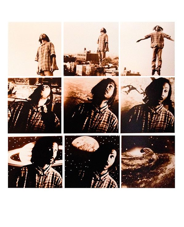
In art school, Kushner discovered the work of Duane Michals and experimented with his own sequences of storytelling with photography.
He had forgotten about this until later in his career when he was able to articulate to himself what aspects of the medium he was most interested in pursuing. He extended the role of the portrait artist to a kind of dramaturg of his subjects’s internal monologues, manifesting their personal and public histories as components of composition, color, setting, and light.
Kushner first encountered cartoonist Haspiel, who would later become his most frequent collaborator, from a photo shoot for The Brooklynites, his first personal longterm project that he authored with Anthony Lasala.
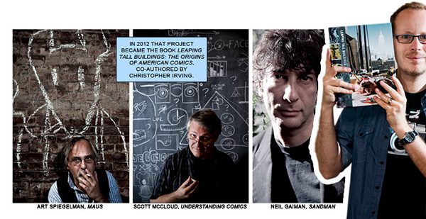
Befriending Haspiel led to Kushner’s Leaping Tall Buildings: The Origins of American Comics, his next big project in which he photographed his cultural heroes and took yet another step closer towards incorporating cartooning techniques for narrative storytelling.
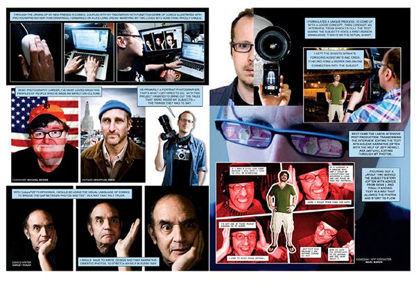
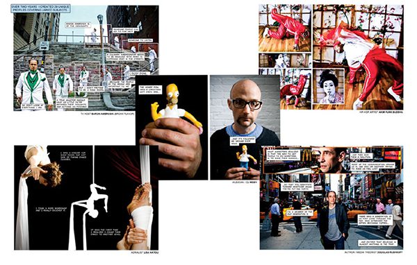
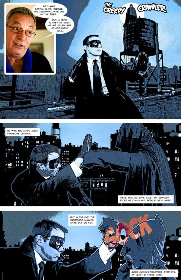
Last Summer, Kushner was commissioned by American Photo Magazine to write an 8 page meta-comic about his path to marry photography and cartooning into his own version of fumetti. It began with yet another personal series: Culturepop Photocomix.
In two years, Kushner created over 30 installments that consisted of profiles of his favorite pop culture heroes, such as musicians, writers, performers and cartoonists. In the strip, he describes the method he developed to extract and highlight their stories, combining both intimate one-on-one sessions with his subjects and collaborative efforts. In particular, he collaborated with Haspiel and Jeff Newelt, during the editing process; they planning layouts and post production.
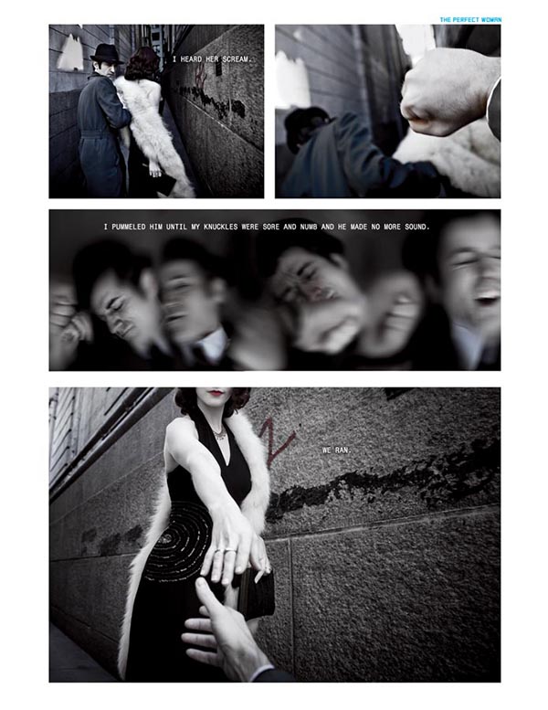
Kushner describes always being drawn to the narrative aspect of photography. Making photocomix over the past few years has rendered his freelance projects somewhat unsatisfactory because he has to deliver but a single image. He enjoys threading photographs together, pacing them and placing them side by side on a carefully mapped grid in order to “bridge the gap between photos and text in a way that feels truer,” especially because it allows him to examine emotion and gesture not only in what he sees but what he hears and feels. The intimate knowledge of his subjects brings out more complex tales from his subject, and photocomicx allows him to retell them with distinct approaches that vary from subject to subject. The process also allows for a larger crew of professionals to contribute to the product without penetrating the intimacy of their on-set relationship.
.
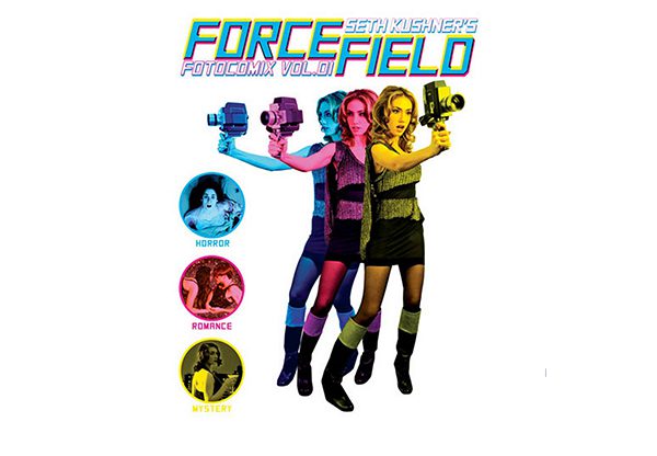
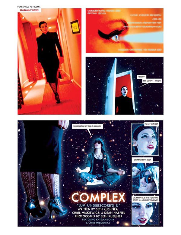
The fact that the labor on his elaborate photocomix took place during his spare time between jobs gave him the justification and freedom to experiment and delight in new discoveries, effects, and sequences. He recently published a collection of genre comics: horror, romance, and mystery titled Forcefield Fotocomix Volume #1. The cover was inspired by two of his favorite films Blade Runner and Barbarella. Kushner also has ambitions of creating a full-length science fiction graphic novel, which he would dramatize and direct. He also began working on a collaborative project with his friend Chris Miskiewicz titled Complex that revolves around four lost souls at the impending destruction of the world. However, he soon discovered during the tests that he enjoyed the shorter experimentations in genre and paying tribute to his favorite eras, movies, and comic books.
Kushner said that part of the magic of photocomix as a medium is that it forces him to focus harder on the principals and components of storytelling: layer, composition, color, and typography. Unlike illustrated characters, the protagonists leading the stories are essentially portraits of real people. That would be the case when he would finally realize his fantasy of using real recognizable actors, such as those mythological Fumetti he once heard that featured Sophia Loren and were directed by Fellini.
The reality undermines the structure of the story. Be it fiction or non-fiction, every story demands full immersion from the reader into a parallel universe of language. A well-structured story should lead its reader past the surface of the photograph into the narrated world. Nowadays, Kushner claims to be extremely nitpicky about the comics he reads. What used to be purely entertainment for him is now a source of valuable lessons and an analytical tool for the development of his own narrative techniques.
While working with professional theater actors on a photocomix commission to promote the Broadway show Forever Dusty, he was able to define his personal aesthetic of the medium by elimination. Although pleased with the final commercial product, in his own work and stories he enjoys directing the more subtle gestures and quiet movements. He prefers to emphasize drama through contrast between figure, background, and lighting.
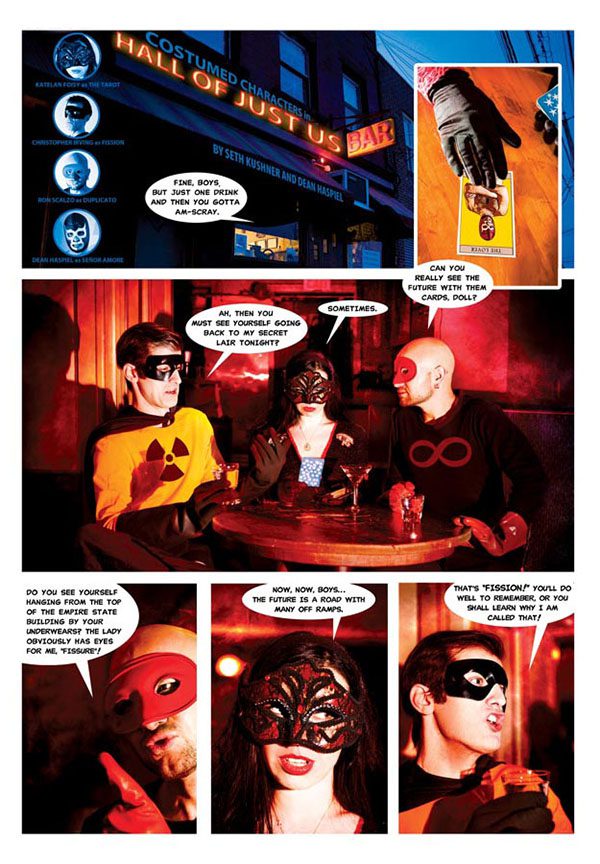
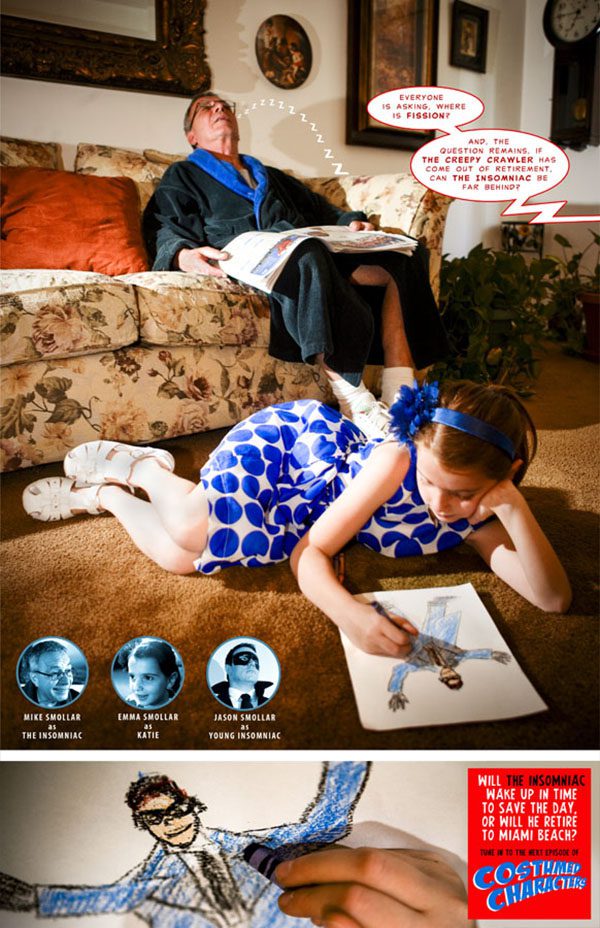
Many trivial elements of cartooning present challenges in the production of photocomix: fight scenes, flash backs, explosions, elaborate backdrops, and sound effects. The low-budget solutions are part of the charm of fumetti; blurring the photographs to depict speed in fights, casting close friends and family to make frequent appearances, and incorporating on-location photography with collages in Photoshop. Kushner explained the strength of the medium is seamlessly merging reality and imagination and making the set indistinguishable from the elements that were added later. It is part of the process of immersion beyond the surface of the photographs.
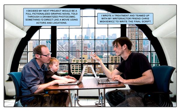
He also used this merging technique to depict the studio of his dreams in his autobiographical homage to Scott McCloud Understanding Photocomix.
List of Images:
Image 1: Gregory Benton, Force of Nature, Book One:Plein Air, Hang Dai Editions, 2013
Image 2: Gregory Benton, 2011
Image 3: Gregroy Benton, 2012
Image 4: Gregory Benton, B+F, Self Published, 2013
Image 5: Gregory Benton, 2012
Image 6-7: Gregory Benton, B+F, ¡Que Suerte!, Olaf Ladousse, 2012
Image 8: Gregory Benton, B+F, Adhouse Books & Editions Ca et La, 2013
Image 9-12: Gregory Benton, 2013
Image 13: Gregory Benton, Unpublished cover, 2013
Image 14: Gregory Benton, B+F, Adhouse Books & Editions Ca et La, 2013
Image 15: Gregory Benton, B+F, Adhouse Books & Editions Ca et La, 2013
Image 16-18: Gregory Benton, 2013
Image 19: Gregory Benton, B+F, Adhouse Books & Editions Ca et La, 2013
Image 20-21: Gregory Benton, 2013
Image 22: photographer unknown, 2013
Image 23: photographer unknown, 2013
Image 24: Seth Kushner circa 1995
Image 25-26: Seth Kushner, Understanding Photocomix, American Photo Magazine, 2012
Image 27: Seth Kushner, and Christopher Irving, Leaping Tall Buildings: The Origins of American Comics, powerHouse Books, 2012
Image 28: Seth Kushner, Popculture #28
Image 29: Seth Kushner, Understanding Photocomix, American Photo Magazine, 2012
Image 30: Seth Kushner, Forcefield Fotocomix Volume 01, Self Published, 2013
Image 31-32: Seth Kushner, Costume Characters
Image 33: Seth Kushner, Forever Dusty: A Fotocomix Experience, 2013
Image 34: Seth Kushner, Understanding Photocomix, American Photo Magazine, 2012
About the author: Keren Katz is the illustrating half of the Katz Sisters duo. She is also the half that is not fictitious. Her latest book Uncontested Spaces is scheduled to be published by NO Press in 2013.
You can check out more of her projects here.
