The New York Comics & Picture-Story Symposium is a weekly forum for discussing the tradition and future of text/image work. Open to the public, it meets Monday nights at 7-9 p.m. EST in New York City. Presentations vary weekly and include everything from historical topics and technical demonstrations to creators presenting their work. Check out upcoming meetings here.
This Monday’s talk began with a series of announcements. First, this was the last meeting before the new year and the start of the new sessions will begin on January 28. The new meeting dates will be on Tuesdays instead of Mondays. Then Ben Katchor explained the background of our patiently waiting lecturer, Misha Beletsky. Misha worked at Pantheon, which is how Ben knows him. From there, Misha was involved with the history of typography and has written books on certain artists including Ismar David, who was famous for his calligraphic images. In addition Misha is the art direct at Abbeville Press for over a decade. The opening of the talk began with Misha stating, “Russia has never been the land of comics” to which the audience laughed at. Then he amended his statement a bit by saying that though the Russians may have not caught on to comics, there has been an eventful past of multi-panel visual storytelling. During the turn of 20th century, there was a Russian group that tried to alter how visual language was viewed. It was also during this time that another artist group decided to transform up the visual language as well named the Futurist. According to this Misha, the Futurist had been focused on changing up the visual language and messing with it. They saw art and visual culture as being largely irrelevant in the larger scheme of things and their compositions reflected that. One of the main Futurists, Vladmir Mayakovsky, thought that images and words do not need to represent anything and often do not represent anything of meaning. He was part of the group OBERIU, which created illustrations that seem more like precursors to animated gifs of today with short sayings and musings. They were dedicated to the political end of the spectrum, putting the Communist point of view ahead of their personal beliefs.
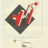
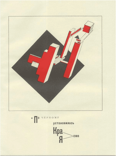
Another artist, who Misha described as being a cubo-futurist contributed to children’s book and had a very linear progressive style. Other artists that contributed to the art of children’s literature was Nathan Alterman who used woodblock prints and had a very expressionist type of style. In addition, an artist, David who was actually in charge of the Soviet Republic’s art scene for three to four years, created exciting children’s books as he bent the rules of the medium a bit. The artist, El Lissitsky also created children’s books with symbolic geometric figures. For instance, Lissitsky’s red square stood for the Communist party while the black square was old capitalist ideals. The red square dominated the black square in the children’s books. There also are other art forms that helped move the illustrations of children’s book, like photography. Although it was a new art form, it was really bringing the illustrations around. With photography, it was not the best of materials that were being used but it was still used. As photography was being played with in the children’s book, the images were more like still movies. In conjunction with photography, collage was also very important to the children’s books. A book that used this method of collage and mixing different media together was Hubert Goes to Wonderland, which was about a little German boy who visits Wonderland, or Russia. It shows the progressive and hard-working people of Russia. It also includes a board game of how to get the boy to Russia, even though the board game looks like a comic, it is most definitely not, but it does play with the idea of linear storytelling. OBERIU, which was a group in Russia that dealt with the propaganda of the media, used their propaganda posters in their children’s books. Misha explained that they used typeface to express their content. There was also the new graphic language with repetitive shapes, which was meant to convey mass movements that the Communist party was fond of. In addition, the figures were playful and changed between flat to 3-D imagery. These images were part of the still life of the story. In turn the story would revolve around the still lifes that even people were part of. Then in the 1950s, Social Realism was the new style and so overtook the illustrations. Though during this time many people combined realistic views of people with Futurism in mind.
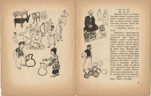
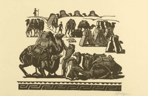
Tat’inia Mavrina was big into children’s books and did well with this Social Realism style. Others had a more conventional sense of Realism and proved that storytelling could be primitive for basic comprehension. In these conventional images, figures would just go through repetitive tasks and they often had a Constructivist style since it took over in the 1920s. Misha went on to say that before there had been an experimental approach to children’s illustration that had started with the Futurists but it came to a head later on. Olga and her sister, both took to the experimental qualities of the time, used typography in a much more visual way for their illustrations in books. There were geometric shapes and simplified forms within children’s books to convey easy to understand messages. Children were often within the storylines and people were continuing to do tasks, such as farming and other jobs related to the good of the nation, within the books. This experimentation was encourages from 1920s to 1935 until Stalin came to power. From there, Misha took a break in the lecture, and then went on to a small Q & A. Reconvening, Misha launched back into the second half of the presentation. Here the focus was mainly on the wood engravings of children’s books. Notably Misha looked at Vladmir Favorsky. First, he began by saying that wood engraving really meant for adults. There was a tradition in Russia of illustrated novels. The illustrated novel was a big art form in Russia but not so much in the United States.
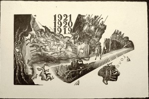
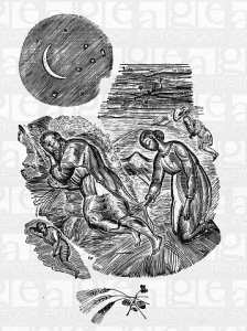
Favorsky facilitated his own style within the Constructivist style at the Moscow School. Usually noted for being pragmatic and seeing objects and functional entities, Constructivists dealt with mostly design and architecture. However, Favorsky was much more of the intellectual. He saw life and objects as something to think on and though he used objects, Favorsky thought there was more to an object than just the superficial value that the Constructivist put on it. As an artist, Favorsky sought to express the understanding of objects through his own work. Veering away from the subject of children’s books, Misha showed that Favorsky created an illustrated book about the Russian Civil War. Creating a sequence of events through images, he showed a passage of time on one page. Through the one page, the objects were allowed to be shown in different ways and how the object evolved over a period of time. His images were not put in square frames and stood out and across the picture frame. People could walk out of the frame and causing the figures to become more dynamic. Favorsky was also interested in symbolism and gestures to create a fluid picture of life. His landscapes could also be distant as another symbol of the movement of time just on one page. Or his characters were in the same picture multiple times, which was another indication that one page showed a passage of time.
Misha showed Favorsky’s illustrations in the Book of Ruth that used symbolism and flat silhouettes of people in the illustrations. In another book, Favorsky used cut-out figures, like a collage or cut-out painting that was going on around the same time period. Later, Favorsky used a more realistic style of art, making the figures seem like they actually existed. He did a range of books from children’s literature to illustrated books from the likes of Tolstoy. His students also did children’s literature books, creating more playful and expressive wood engraved books. They would create wonderful moments in time and used a variety of textures, compositions but still within the style of Favorsky. A rival of Favorsky, who Misha explained as having a much more conventional style in his work and looked towards typography works for inspiration. He was chosen over Favorsky to create the American illustrated version of Anna Karinna. The rival did not use a frame for his illustrations in the book and the objects were flat. However, even the rival’s style was under fire in the 1930s as was many other artists when the Communist came to power. Luckily after 1953, after the death of Stalin, artist began to work again including Favorsky. The times had changed and there could have been more changes and innovations with Russian illustrated literature but the rise of the Communist party and the suppression of artists caused it not to be.
After the grand tour of the Russian literature artists and illustrated books of Russia, Misha reminded everyone that this is almost a forgotten art in Russia. It is coming back but it was and is a very important art form that should be celebrated in Russian art history. A round of questions came up including the names of the artists, which Misha rattled off some names but then pointed to his Pintrest for images and hopefully that would lead to the artists. There was also a question of materials used and Misha admitted that the quality of the materials were not good but that was why the artists turned to the woodblock prints because it was better than the other materials they could get their hands on. Misha’s main hope was for this type of art form to be better known and that this talk helped people become more interested in it. Image 1 – El Lissitsky’s Children’s Book, 1922. Image 2 – Tat’inia Mavrina, Khazis Illustration, 1930 Image 3- Vladmir Favorsky, depicting the Russian Civil War through time, 1928 Image 4 – Vladmir Favorsky, Book of Ruth page, 1924 Image 4 – Vladmir Favorsky,Scene with Camels Unloading, 1940s
About the author: Emily Decker is a graduate student at Pratt Institute working towards a dual masters in art history and library and information sciences.
