The New York Comics & Picture-Story Symposium is a weekly forum for discussing the tradition and future of text/image work. Open to the public, it meets Monday nights at 7-9 p.m. EST in New York City. Presentations vary weekly and include everything from historical topics and technical demonstrations to creators presenting their work. Check out upcoming meetings here.
On Monday, June 23rd, at the 89th New York Comics Symposium, the designer Ralph Moreau and the cartoonist A.T. Pratt discussed their work, and the possibilities of working with the comic medium.
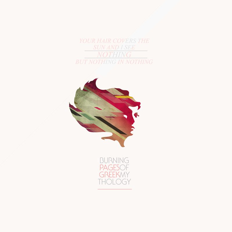
Ralph Moreau spoke first, describing the title of his talk “Graphic Design Aesthetics in Comics” as “a little presumptuous” because, in his opinion, comics are already the “strongest form of graphic design you could create.” He began by showing his own design work (Moreau is entering the MFA program for Design and Technology this fall at Parsons New School). He described his design work as appropriating existing motifs and infusing them with his own aesthetics—in a sense, designing other people’s art. He lets his pieces be influenced heavily by artists he admires in an effort to learn the mechanisms of effective design and aesthetics.
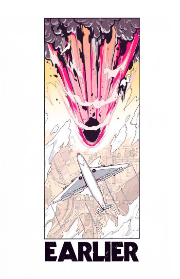
Moreau then shifted the talk to expound on the design potential of comics and circulated several titles including Jojo A-Go! Go!, Mesmo Delivery by Raphael Grampa, and 365 Samurai and a Few Bowls of Rice by J.P. Kaljoni. Moreau admires these artists’ use of space—specifically, the use of sound effects as an active design element, not simply something that need to be made room for. Moreau also offered up Benjamin Huen, Kenneth Rocafort, Nick Edwards (especially his use of color), and Sheldon Vella as prime example of artists who exploit the design potential of the comic’s page to its maximum potential.
Moreau opened up the discussion to the group, and the comics of Moebius and Heavy Metal Magazine were suggested as a good examples of the influence of design in comics. Moreau also shared “inspiration folders” which illustrated his diverse tastes and commitment to drawing from varied sources to achieve aesthetic harmony.
*
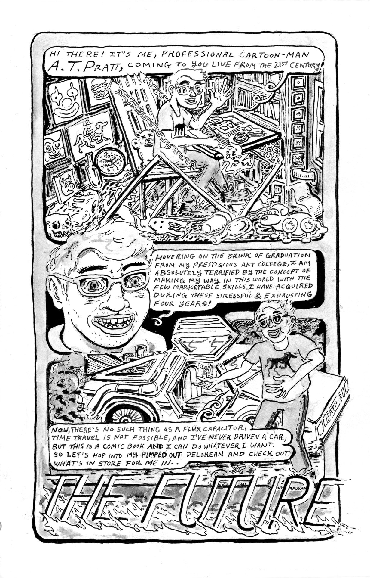
A.T. Pratt spoke next giving a thorough history of his artistic development in his presentation entitled “Playing with the Page.” Pratt gave several entertaining readings of his comics, which are often humorous and almost always infused with a sense of the perverse. He began by reading “The Future” a comic which he imagines himself traveling in time to see how successful his future self would be as a “professional cartoon-man.” But, of course, the future is a nightmarish place, where books and paper are obsolete, and, disturbingly, his future self is a half-blind decrepit old man who passes out comics for free and still lives with his parents.
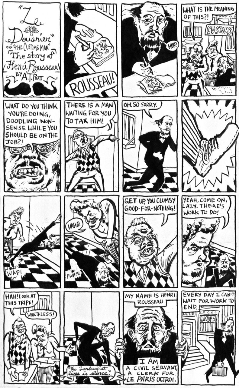
This set the tone for most of the comics Pratt shared with the audience: funny, cynical, and dark. Pratt’s comics are often self-referential; he uses a lot of diagonals and non-traditional, but aesthetically interesting grids. Pratt’s panels self-consciously refer to the form itself. In his comic “Le Douanier,” a story of Henri Rousseau (below) he experimented with the increase of panel size to belie the physiological state of the protagonist, a method he modeled after Amazing Spider Man #33.
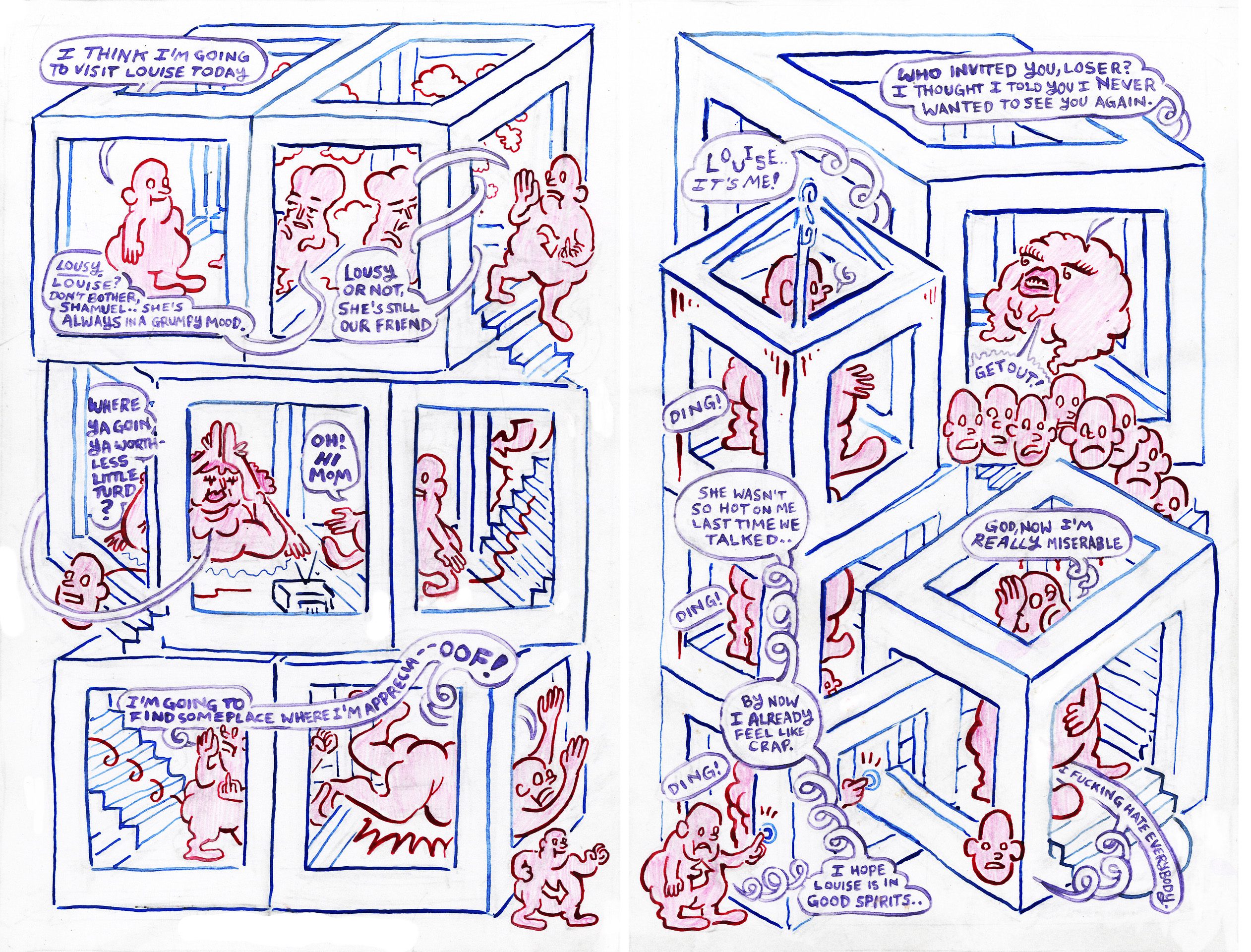
Pratt’s comics have a crowded, dense aesthetic, much like early underground comics, and are shot through with playful and outrageous motifs. His comics can be as lighthearted as they are dark. Though the content is sometimes disturbing, the work also manages to maintain an inherent sweetness. Pratt’s frequent experimentation and self-referentiality makes his work self-conscious without being self-serious.
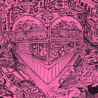
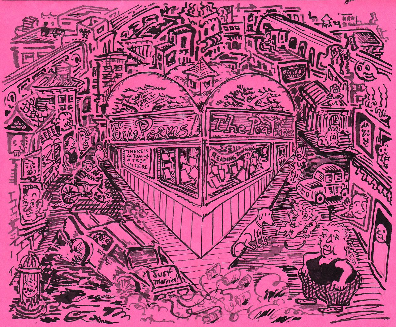
Pratt passed around several of his hand-bound self-published mini-comics. His bookmaking methods are as diverse as his aesthetic inflections. He uses both signature and Japanese binding, as well as single pages folded down to create staple-less booklets. Many books use colored papers, creative cutouts, and pop-ups to play with the structure of the page in a truly three-dimensional sense. A strong example is “Stupid Cupid” (below) which was recently accepted into the Society of Illustrator’s first Comic and Cartoon Art Annual, in the short format category.
After sharing an impressive amount of work, Pratt took questions from the audience. When asked how he developed his dark sense of humor Pratt said that attending college (he is a recent graduate of the Rhode Island School of Design) allowed him to develop his dark side, as he no longer shared everything he drew with his parents. The audience also asked questions regarding process, binding methods, print runs, and script writing. Pratt also discussed his daily dog-drawing blog, Pratt’s Pocket Pups, which mines both his love of dogs (an interest that is evident in many of his comics) and his experiences as a dog walker in Brooklyn. According to the artist, the audience of his comics and the fans of his dog blog are distinct and rarely overlap, but it is easy to suspect that the appeal of both efforts is the same: Pratt’s thoughtful, frenetic and unique world view.
***
Image Credits:
Image 1: Ralph Moreau, Burning Pages of Greek Mythology, 2013
image 2: Ralph Moreau, 2013
Image 3: Sheldon Vell, “End”, page 8, originally published in Meathaus S.O.S. 2008
Image 4: A.T. Pratt, “The Future”, page 1, 2013
Image 5: A.T. Pratt, “Le Douanier”, page 1, 2012
Image 6: A.T. Pratt, “Red & Blues Dead End Blues”, Page 1, Underwater Museum #1, 2013
Image 7: A.T. Pratt, Pop Pup Dog Day, Center spread, 2014
Image 8: A.T. Pratt, Stupid Cupid, center spread with pop-up heart, 2014
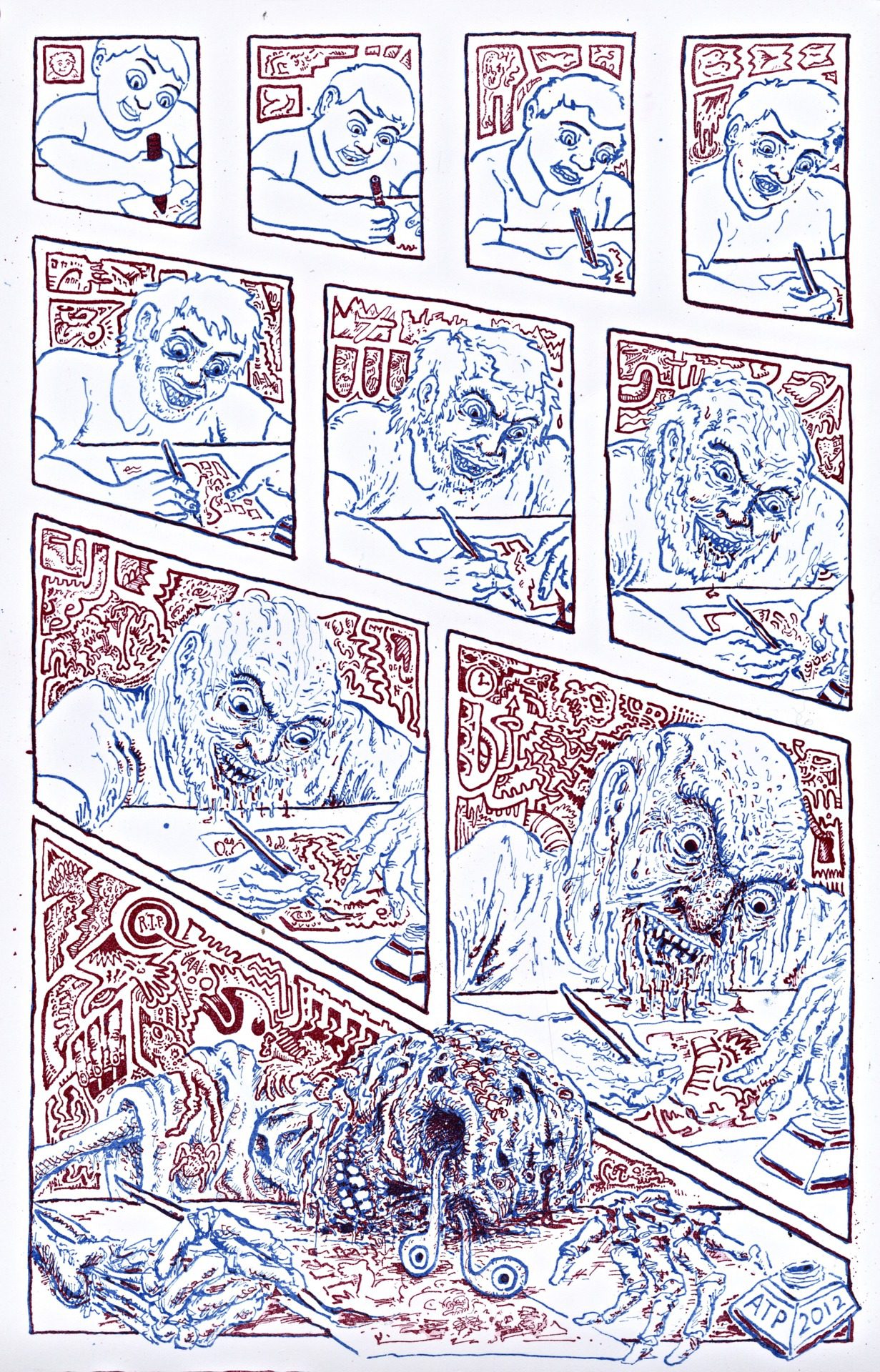
Image 9: A.T. Pratt, “Masochisticomic” or “Tragedy in 10 panels”, 2 color photo litho print, 2012
***
About the author: Sophia Wiedeman is a comic artist and author of The Lettuce Girl series of comics as well as the Xeric-winning graphic novel The Deformitory. She lives and draws in New York City. You can see her work at sophiadraws.com on her tumblr at sophiadraws.tumblr.com and follow her @sophiawiedeman on twitter.
