The New York Comics & Picture-Story Symposium is a weekly forum for discussing the tradition and future of text/image work. Open to the public, it meets Tuesday nights 7-9 p.m. EST in New York City. Presentations vary weekly and include everything from historical topics and technical demonstrations to creators presenting their work. Check out upcoming meetings here.
The 116th meeting of the NY Comics & Picture-Story Symposium was held on Tuesday, February 24th, 2015. Frank Santoro presented his work on the formal structure of graphic novels and comics. Artist and cartoonist Archie Rand presented his poetry-image works at the last meeting, as the second half of our series on comics poetry.
***
Artist Archie Rand was born in Brooklyn and studied in New York City. At age 17, he had his first solo show at the Tibor de Nagy Gallery in New York,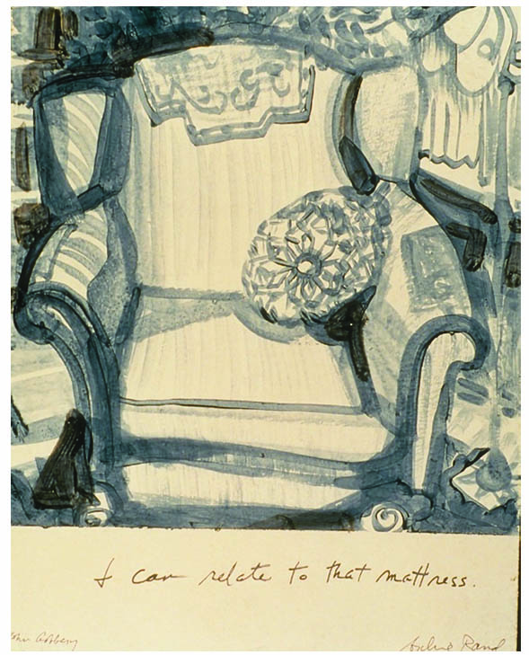 launching a career of over 80 solo exhibitions and 200 group exhibitions thus far in the US and abroad. He is Presidential Professor of Art at Brooklyn College.
Rand is beyond prolific. Currently a faculty member at Brooklyn College, he’s produced scores of graphic novels, illustrations, paintings, and has had over a hundred solo exhibitions here and abroad. He’s taught in numerous graduate art programs and his work has appeared in major art journals and newspapers for over three decades. His presentation at the NY Symposium didn’t linger on any single image for any amount of time, but rather ran through many images really fast. How does he describe his working method? “I bang out tons of stuff every day.”
Rand first started his career of melding words and pictures at the age of seven or eight. He would write whole novels and illustrate them. “Text and image were never apart in my head,” he recalls. At 17 years old, he had his first solo show at the Tibor de Nagy Gallery in New York. At twenty-five, he became close friends with Philip Guston. He recounts a story about the mammoth cartoonish paintings Guston is best remembered for: A bystander asked if Guston were influenced by Robert Crumb. 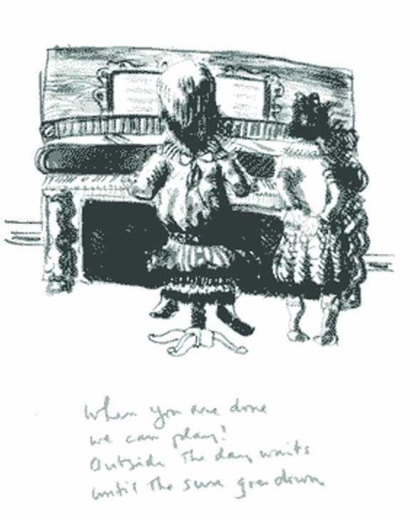 Guston replied “Who?” Rand later concluded that Guston and Crumb were both operating under the influence of Max Fleischer.
Rand’s mode of choice is collaboration, through which he has explored subjects like jazz, the Bible, and Jewish history with a stream of famous poets including Robert Creeley, John Yau, and John Ashbury. “Pictures do one thing, text does another, the third thing is something entirely different,” he insists. (A certain collaborator once asked Rand, “When I sent you a poem about a safari, why didn’t you give me a man in a pith helmet?”—much to Rand’s horror.) “I like to work with no clientele. [I’d hate if] this becomes product.” He’s also illustrated Samuel Beckett’s poem Solitude and a poem by Virginia Mantale. Working methods vary—Robert Creeley wrote quatrains to images, one after another, that Rand produced and gave him in all in one afternoon. Rand did Yau’s 100 More Jokes from the Book of the Dead in etchings. (“It’s such a fine art. Let’s screw it up!”). He remembers, “We turned out tons of crap! We had a ball.”
Rand says, “I’ve made a career of doing Jewish themes in Hebrew, just because there’s nowhere else to see them.” Among other works, Rand has done The Thirty-Nine Forbidden Labors of the Sabbath and Hebrew translations of the Bible, which he loves, calling it “fun stuff” and “crazy shit!” One painting, for the Jewish Museum, depicting Jonah (of whale fame) was condemned as heresy by an Orthodox rabbi, who excommunicated Rand. Rand, 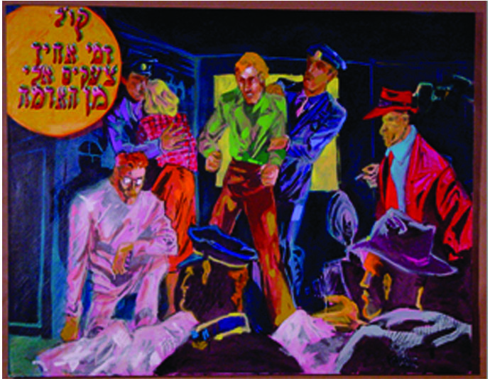 ever the iconoclast, took delight in this. “I like it whenever the Orthodox find the stuff blasphemous,” he says, and enjoys what he calls his own “Jewish shtetl vulgarity.” (Note: Rand was accepted back into the fold after the rabbi died.)
Rand is currently working on John Ashbery’s “Flowchart Illuminated,” involving some 120 canvases. His agent doesn’t want him to show these before their premiere—this talk at New York Comics and Picture Story Symposium was the first time that anyone has ever seen them. (They’re magnificent.) He also has a new book in production that he describes as “funny crazy stupid pictures,” based on one of his murals. It contains only pictures, without any text. What’s it going to be like? “If I were a kid,” Rand says proudly, “I would like this book.” The book will be released in September 2015.
***
Cartoonist Frank Santoro is the author of Storeyville, Pompeii, and other comic books published by PictureBox. A columnist for The Comics Journal, he co-founded the comics criticism magazine ComicsComics with Dan Nadel and Timothy Hodler. He has also taught drawing at Parsons School of Design and maintains and edits the Comics Workbook tumblr blog. He has exhibited at the Carnegie Museum of Art in Pittsburgh, and The Academy of Arts and Letters in New York. He lives and works in Pittsburgh, Pennsylvania.
Nothing is more basic than how to lay out a comic book page. Comics, as studied by Frank Santoro, come in three major categories according to their physical dimensions: 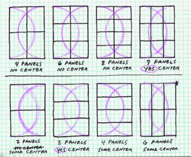 North American comics (approximately 6 5/8″ x 10 1/8″), manga (5 3/4″ by 8 1/4″), and French bandes dessinées like Tintin (roughly 9″ x 12″). Santoro boils it down further, to two basic formats: a 2×3 rectangle and a 3×4 rectangle. (Le Corbusier has broken these relationships down to 892 unique variations, but Santoro prefers to keep it simple). The American comics we’re familiar with generally have three tiers of panels, which make up a six panel grid—although the artist often opens up the center tier from two to one panel to make a five panel grid with a strong center panel. French bandes dessinées are best suited for four tiers, and manga have their own unique appeal with their diminutive size and copious bleeds.
Santoro has discovered that from these basic skeletons come the best ways of laying out figures, backgrounds, and all the elements that make up a successful comic or graphic novel. He cites how major cartoonists have adhered to certain geometric relationships between the center and the rest of a given page to make it all “read.”
Is this accidental or planned? Santoro believes that artists don’t generally start by laying out the 2×3 or 3×4 grid, but rather intuitively draw the page in such a way as to maximize the page’s readability, and nearly always “hit” the major intersecting lines where things work the best.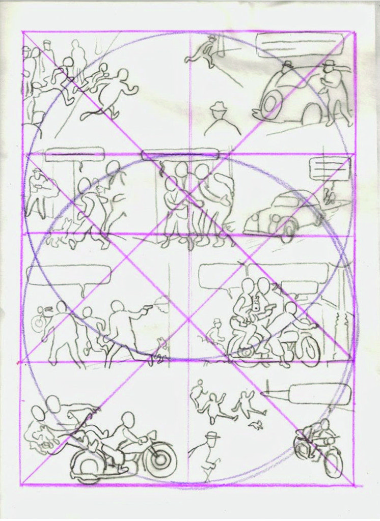 Then they sketch to adjust. The layout lines that Santoro demonstrates in his blog have been employed by artists as diverse as Poussin, Hal Foster, and Ben Katchor—not unlike the ways music is structured with its tempo and key signatures.
Foster’s Prince Valiant maintains the architecture of the grid so faithfully that he must have been aware that he was following a template of sorts. Ben Katchor composes his comics by eye, as a musician does it by ear, or, more accurately, “by feel.” Santoro demonstrated his point by ruling out a template on a sheet of vellum, placing it over a Prince Valiant page and over one of Katchor’s Hand Drying in America strips, and lo and behold, everything lines up. Similarly, manga uses a three panel grid, and The Watchmen uses nine.
Santoro imposes a geometry on his own work. Storeyville, about a hobo living during the Depression, has the dimensions of a newspaper, but Santoro wanted a center panel, so he came up with a 15 panel grid, and wanted it to be modernist, so he didn’t draw or color it in any one period stye. The experimental Cold Heat, disguised as a female ninja story, has its own unusual geometry. Finally, in Pompeii, the whole story is told in a three panel, three tier format. (There are some one panel pages, but generally no vertical panel borders.) Here Santoro worked intuitively, drew the same size as the work would be printed, and even followed the practice of working in signatures to that his story would end in the most convenient way.
For further study, readers are encouraged to refer to Santoro’s blog at coldheatcomics.blogspot.com.
***
Image credits:
Image 1: From “I can relate to that mattress,” Heavenly Days Illuminated, in collaboration with John Ashbery, © Soft Skull Press, 2001.
Image 2: From “Drawn and Quartered,” in collaboration with Robert Creeley, © Granary Books, 2001.
Image 3: Cain and Able, from the Diaspora Series, oil, 2002, © Archie Rand.
Image 4: The basic grid, from Frank Santorno’s blog coldheatcomics.blogspot.com.
Image 5: Example of the grid used in a four-tier comic page, from Frank Santorno’s blog coldheatcomics.blogspot.com.
***
About the author: Mark Lerer holds a bachelor’s degree from Princeton University and an MFA from the New York Academy of Art. His cartoon drawings have been published in the New York Post, appeared at New Century Artists and Nexus galleries, and are regularly featured on Facebook.
