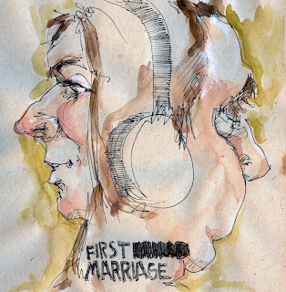
 Wendy MacNaughton’s visual blog provides “drawings of people on public transportation on their way to and from work. Five days a week, twice a day, twenty minutes each way. And other commutes to boot.” The effect is somewhere between the chillingly under-acted and over-costumed TV series Mad Men, a song by The Zincs, and drunken half-memories of watching Slacker. So it’s a lot like riding the underground, just without those stupid screeching sounds.
2008 was in many ways the year of the map. It wasn’t just the endless electoral cartography. From graphic proclamations of change to the laughing of veeps to the “site-specific” brick walls in Word Magazine‘s splendid album cover map of the world, we couldn’t seem to get enough maps, infographics, or just plain ol’ pictures, pretty pictures. MacNaughton, according to LinkedIn, has a background in both advertising and international social work, and is currently employed by the curious, socially conscious ad agency Underground. Her art is less a collection of snapshots and more a mapping of dislocation. With the right marketing, her actual map of privately maintained public space in downtown SF could easily be on display at the Jack Hanley Gallery.
