 Sound logical reasoning would lead a person to conclude that my sustained interest in a document like Nicholas Felton’s Feltron Annual Report is sort of nuts. Overflowing with a nearly endless amount of data detailing the most boring minutia of Nicholas’ day-to-day life, no one besides Felton’s mother or medical health handlers should intentionally request let alone exchange any sum of money for such a thing.
But I do.
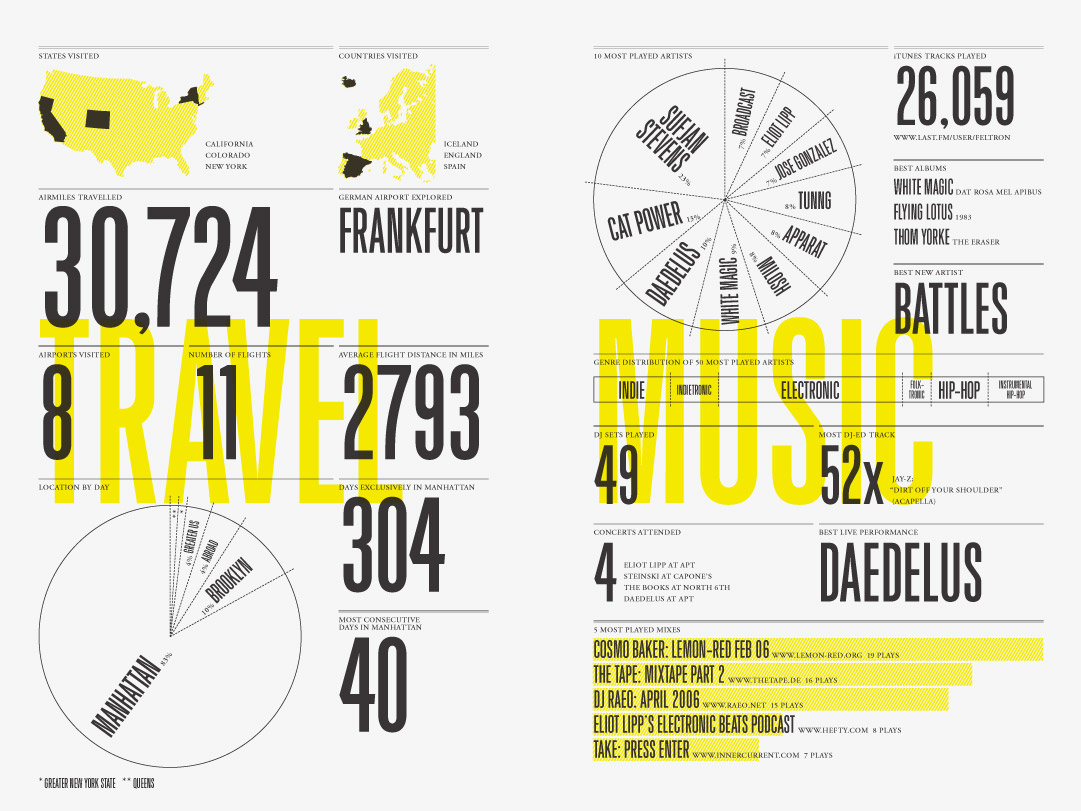
The Reports are mailed to suckers like myself at the beginning of each year. Essentially small booklets, they are dimensionally similar to an LL Bean clothing catalogue. From cover to cover, the reports are filled with what appear to be a bunch of well organized but weirdly shaped and oddly labeled charts and graphs. Here, for instance, are the contents of Page 3 | Report 2006:
A map of the USA highlighting the 3 states Feltron visited that year—California, Colorado, New York. Next to that, a sliced map of Europe showing his visits to Iceland, England, and Spain. Below the maps is a small headline “Airmiles Traveled,” which itself hovers above the number in a very large font, “30,724.” Next to that in also large type is the word “Frankfurt,” which makes sense once you see that it itself is under the small headline of “German Airport Explored.” Then, closer to the center of the page and also in big type: “Airports Visited: 8,” “Number of Flights: 11,” “Average Flight Distance (miles): 2793.” And then there’s the bottom third of the page, a break down of Feltron’s location by day. 304 days were spent exclusively on the island of Manhattan with the longest stretch of consecutive time spent on the island identified as 40 days. A pac man pie chart shows that for the 17% of his time away from the city proper he was mostly in Brooklyn, which was where he was for 10% of the entire calendar year.
If given a quick glance, the consistent color palette and clever typography give off an advertorial vibe. But if Page 3 were an attempt to market anything, it almost seems like it’d be a graphic-heavy advertisement for Feltron’s meticulously notated travel diary—a product that actually doesn’t presently exist.
For the 2009 Report, my fourth, I paid $23.00.
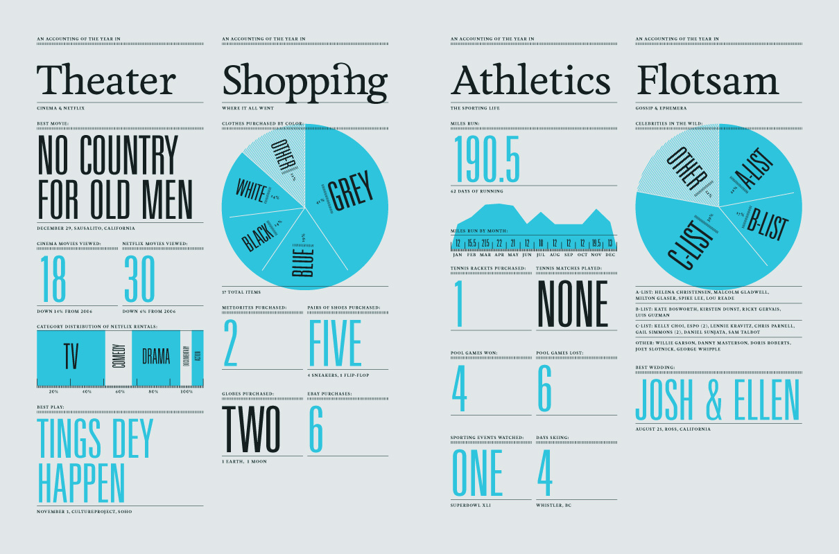
Other pages from other Reports are equally invasive and alluringly revealing of Feltron’s personal activities, whereabouts, and habits. In 2007, for instance, I know that he read 1,758 magazine pages, including but not limited to five sections of New Yorker fiction. In 2009, Mexico City was the most common vacation destination to pop up in his conversations. On every page, the reports are overflowing with this type of third-drink conversational info—the sort of stuff you think other people care to hear about only after both you and those other people are well imbibed. The variety of the data is clever and just off-beat enough to be mostly charming, not unlike a guy who can pull off wearing suspenders with a t-shirt and slacks. For example, if you are like me, then you have no clue as to how many kinds of animal you consumed over the course of a month, let alone one year. Felton, however, does, and he knows which ones, too. From Jan 1, 2006 to Dec 31, he ate at least once: cow, deer, horse, kangaroo, lamb, pig, rabbit, chicken, duck, turkey, cod, eel, fluke, herring, mackerel, manta ray, pompano, red snapper, salmon, tilapia, tuna, yellowtail, crab, lobster, mussel, oyster, scallop, sea urchin, shrimp, snail, jellyfish, octopus, and squid.
As a list buried at the bottom of a paragraph, Felton’s carnivore diet is a boring read at best and a showoffy demonstration of record keeping and compulsive behavior at worst. Fleshed out on gorgeous paper, though, in Feltron’s own particular brand of suave graphic design, the list becomes something else. But what is that something else? Why would anyone really care about this stuff enough to pay for it? And why would Feltron go through the obviously immense amount of trouble to create the reports, year and year?
I buy the reports because inside each one is a beautiful struggle. They are proof positive of how hard it is to be an artist who tells stories that connect. I see in each one gestures that give vague shape to a particular brand of contemporary adult often called these days an urban creative professional (not to be confused with its more high-profile, more thrifty cousin, the hipster). The trappings are all there—the critically durable music choices, the well reviewed restaurants, the globe-trotting for work and play, the late nights implied by all that booze—but the internal experience of living such a life is missing. I buy the Reports because I feel a sense of camaraderie when I see an other struggling publicly to make more out of the very little he has—observations about the way he eats, the way he travels, the places he goes—to explain what happens inside and to turn that into something that strikes deep within a reader. Moreover, I relate to Felton’s efforts to contribute to or initiate a community where audience and artist find something similar to feel—even if it’s just about a stupid little thing like a visit to a dentist. How, really, can anyone make a bus trip or a dinner compelling theatre? It’s difficult work. It’s an art, you could say. These Reports on my shelf and on my wall are early Felton; I will wait for his middle period because I know it will be good. I have the data to prove it.
As a Report Owner, I will say that there’s a physical satisfaction that comes from holding a Report. In a way it’s the hand-to-feeling equivalent of the eye-to-awe experience of standing way out in front of an incredibly large and slickly surfaced towering sky scraper. You stand back, arch your neck, and looking up you can imagine that, behind the tower windows, there are perhaps thousands of industrious workers industriously working along, their aims, needs, and ambitions colliding, running parallel, and co-existing and encased together inside a clean, emotionless building of gleaming organization. A building that is all sharp angles of steel and glass and perceived by those on the outside—like the imagined you, gawking up—as one very well-designed box of modern engineering innovation. In other words, from the outside, an onlooker can only see the gleaming box and be in awe of the fact that there’s a whole beehive of messy, emotionally-driven human work being done behind one very clinically clean facade. Like the tower, the Report is an impressive presentation of sterilized sharp angles—the charts and graphs align to invisible grid lines that give the report a perceivable structure only in the sense that everything looks like it’s exactly where it should be—and the whole thing just whispers hints about all the human activity buzzing within the Report’s deeper levels. It is this loud whisper that might be one of the more inspiring things about holding the Report, knowing that nothing less than a ton of concentrated human effort went into corralling and organizing hundreds if not thousands of chaotic emotionally-charged human activities into a hand-held and incredibly tidy presentation and beautiful design.
The Reports are printed on the sort of paper you’d get for your wedding invitations if you had a four-figure budget set aside for “wedding stationary.” The pages are not stapled or glued but held together by vibrantly bright thread weaved through the spine, and this makes it look expensively handmade, even when viewed from a slight distance across a room. The 2009 report is particularly stellar as it’s the first edition to be letterpressed, meaning that every single element of text and graphic is impressed into the paper, which really means that every line and character has a physical texture you can feel and a depth you can see, especially when looking at the big and bold numbers. The larger blocks of text look strong and permanent, if text can have such attributes.
It’s clear that an enormous amount of time went into the physical creation of the Report, starting from day one. For starters, Felton had to spend all year simply collecting the data. If you spend too much of your own time thinking about this, you’ll start to worry about how many moments Felton missed out on, how many instances when he must not have been fully engaged with himself or his companions while he recorded the moment’s particulars into a notebook or smart phone. Like over-thinking the original source for each component of your lunch, it is sometimes best to not think too hard about such things. Plus, however many man-hours it took Felton to simply digest all that information so that he could see what could even be coherently designable. Add to that the actual designing of the Report, probably with a combination of Adobe Photoshop, Illustrator, and a publishing layout program, no quick feat since these reports tend to run in the 12-16-page range. Plus, there’s the whole printing process itself, the back and forth with the printers, reviewing mock ups and making edits, finalizing colors, picking the right paper stock, settling on the size, the spine thread, the margins, etc. etc. It’s a phenomenal effort, especially for one guy. Feeling a reasonable amount of awe is inevitable when flipping through the Reports.

A Report Owner’s awe will be accompanied by a reasonable amount of curiosity when the Report Owner starts to think about what propels a man to convert the most boring details of his existence into page-turning elegant design. Because within the reports themselves, despite being about nearly everything that is Felton’s life, there are key omissions, including any indication as to why Felton ever felt moved to make the Feltron Report in the first place. There is no bar graph or line display for the various motivations that energized Felton to record the date of every visit to a bar over the course of a year. There is no sleek list of all the things Felton hoped the Report would accomplish. Determining Felton’s motivation is tricky business. Trying to really understand why any artist does what they do is usually impossible because, if even within the art itself the artist lays plain his own ambition, we as the audience never know if this is a purely accurate message to be interpreted as an honest truth. An embedded statement of purpose could be as spun through the artistic wash and as dripping with artistic intent and meaning as any other element of the art made heavy by all the weighty significance just waiting to be wrung out.
That said, there’s something worth taking at face value from the statement Felton released just prior to the publication of his ‘09 Report and from something he said in a conference talk not too long after the publication. The former, “I have strived to sort and collate the data in a clinical and repeatable manner that could be reproduced by someone looking for the same stories I have selected.” The latter, “As a graphic designer, I’d been searching for a while for means of telling stories.” Implicit in both statements is that Felton fashioned his Reports to contain what are essentially stories. If we look at the Reports this way, the data is not simply numbers and stats about Felton life; the data becomes a mode of stories about Felton’s life. The distinction is small but significant. It’s a matter of elevation and orchestration. If Felton transforms the raw data (1.5:1::social dinners:solo dinners | Report: 2006 Page 6) into the frame for a story: In 2006, Felton spent more time eating in the company of others than eating in solitude—then Felton has orchestrated an elevation of the data to a level of story telling. Despite what Felton has stated as his intent, the orchestrated elevation does not occur. The data never communicates anything beyond what it is. The frames are never built. It never tells more than it shows.
If Felton wished for the graphs, charts, and lists of his Reports to become stories, he would have to provide some context to give them meaning. Otherwise, the data acts much as a photograph does—and, as Susan Sontag said, “strictly speaking, one never understands anything from a photograph.” The Report data is in many ways a context-free snapshot of a very particular part of Felton’s behavior. In 2007, Felton traveled 7.4 miles over the course of 5 bus trips via the M15 route. Sontag again, “In contrast to the amorous relation, which is based on how something looks, understanding is based on how it functions. And functioning takes place in time, and must be explained in time. Only that which narrates can make us understand.” The data on Felton’s bus activity over the course of the year amounts to nothing more than data about Felton’s bus activity over the course of a year. A Report Owner cannot understand anything more about Felton’s life if the Report Owner does not know how these bus trips functioned within Felton’s life. Were these bus trips taken to visit an aunt recovering from surgery in a hospital uptown? Were these bus trips taken to see a favorite painter showing for a limited time in a gallery downtown? The data never reveals the context that embeds that data with significance and the Report Owner is left with only a photograph of a very particular part of Felton’s activity.
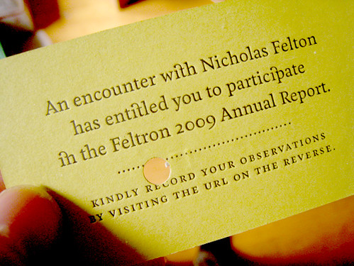
 Even though the data does not lift itself into the realm of narration, the Feltron Reports do tell a particular story—one that I eagerly tune into each year. The story is about one character’s battle to achieve, a man with an ambition I can relate to. Felton’s Reports are an attempt to communicate with an audience about what it’s like to be Felton. That is, he’s attempting to narrate through his medium of choice, his unique brand of perspective. His gaze is turned inwards and his voice speaks about the interaction between a man and the world around him, just as many storytellers do. Each year, I watch Felton evolve as he continues to push the possibilities of what sorts of stories can be told via the medium of information graphics and design. So far, he hasn’t successfully told a data-driven story, at least within the Reports. But I have a good deal of faith that he will soon break through to the level of narration, especially after I read the 2009 Report. For ‘09, Felton distributed business cards containing unique URLs to anyone with whom he had a meaningful encounter. A card recipient had the option of volunteering his or her perspective on his or her moment of interaction with Felton. On November 20, Hana reported Felton to be “Cheerful to tipsy(?).” On March 20, Jessica B reported Felton to be “Unhurried and relaxed.” Here, in 2009 and for the first time, we have characters with opinions. With slight modifications to this info, stories are nearly formed. If ‘Hana’ were in fact identified as ‘Hana—Felton’s high school girlfriend,’ the information would take the form of a particular style of flash fiction. In other words, the data would serve to show how these characters and how these moments functioned in Felton’s life. There on the page, with words organized in a gorgeous chart would be gems of narration. Glimmers of what it actually means to be Nicholas Felton.
***
Selections from Nicholas Felton’s Feltron Annual Report will be part of the MoMA exhibition “Talk to Me,” scheduled to open on July 24, 2011.


5 responses
This is amazing.
Spectacular.
I used to do a very small subset of this kind of data collection about myself, years ago. It’s a weird feeling, keeping little data points every day and looking back on them and waiting for some kind of meaning or pattern to pop out at you.
As I read this, I must have shared this with at least a dozen other people as I stumbled on this paragraph that moved me or this one! And then THIS one! I enjoyed this so much.
This especially stuck: “I’d been searching for a while for means of telling stories.â€
I’ve been attempting something similar, using last.fm as a history of my moods.
So interesting! I am intrigued by the report, and am planning on tracking them down. Thanks for the article.
Fascinating. Can’t wait to see the exhibition next year.
One thing nags at me: musn’t this urge (obligation?) to document affect Felton’s choices? It adds a layer to everything he does, and must cloud what he thinks he wants or needs at any given moment. Acting + taking-note of acting does not equal acting for acting’s sake. It’s not more or less than, just a different beast.
Click here to subscribe today and leave your comment, or log in if you’re already a paid subscriber.