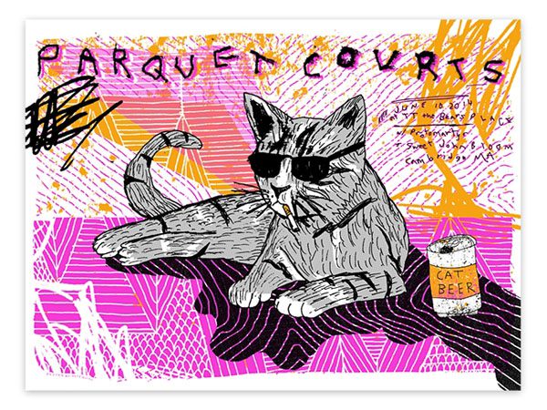
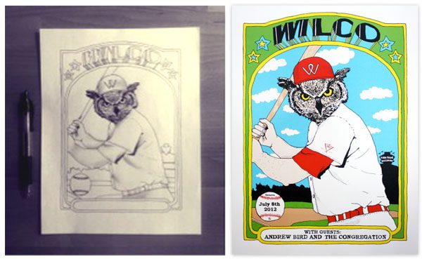
Welcome back to Sound & Vision, the Rumpus profile series that spotlights the creative talents of those working behind the scenes in the music industry. This time up I’m talking with Nate Duval, who has designed and illustrated posters and album covers for musicians including Wilco, Spoon, Broken Social Scene, Andrew Bird, and M. Ward. Duval’s work is bold and vibrant, his graphics often depicting novel combinations of humans, plants, and animals. When we met, Duval explained how he got into design, what it was like to break into the field, and where he sees it trending next. He also has a lot to say about the number eight.
***
The Rumpus: I understand that your background is in advertising and design.
Nate Duval: Yes, in high school I was good at most subjects, but I knew when it was time for college that I wanted to pursue my interest in visual arts. I didn’t want to miss out on other experiences, so instead of art school I went to Syracuse University in the Visual and Performing Arts school. The program was “real world” based. They gave you a product and you had to conceptualize a print ad campaign, get feedback on your designs, and at the end of the semester you would actually produce the ad.
Rumpus: Did you know right away that you would apply your design skills to the music world?
 Duval: I played trumpet and guitar in school, and I was always into music, but I didn’t know at the time that my design training would lead me to a music-related career. When it was time for me to graduate I started looking at jobs at ad agencies, but something wasn’t connecting for me. It just seemed less creative in real life than the picture I painted when I was in college. So I ended up working at a place called Blue Q in Pittsfield, Massachusetts as the lone in-house designer. They make products and gift merchandise, and I got a real crash course in the commercial arts—everything from photographing products to putting art into templates, working with manufacturers, talking with artists, and making the catalogue. I spent a year there really learning how to make and sell things. That experience inspired me and opened my eyes to new ways to be creative in my down time.
Rumpus: How did you get into gig poster design?
Duval: In the beginning my interest in concert posters was very fanboyish. I was like, “Wow! The Rapture are coming to town. It would be so cool to work with them!” It was the MySpace era, and a lot of bands ran their own pages. Sometimes you could get them on the other side of a MySpace message! So I started making concert posters for local shows, like at the Iron Horse in Northampton. I met more people and more bands there. I started networking and building a portfolio.
Rumpus: Do you remember your first successful pitch?
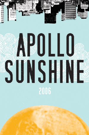
Duval: I think it was for a band called Apollo Sunshine. They were three guys who were, at the time, living near me in Amherst, Massachusetts, and I really liked one of their songs called “Today Is the Day.” They played around town a lot, and I thought they were so cool, so one day I reached out, and from that point on I really got the itch. There’s a website called Gigposters.com where they host a lot of discussions about making posters. It was really important to me to find other people out there who were doing what I wanted to do. There’s also an event called Flatstock held at South by Southwest and other festivals where I learned a lot about other artists’ processes. Even though we’re in direct competition with each other, we openly share ideas and information.
Rumpus: What’s one of the most common misconceptions people have about how to break into concert poster design?
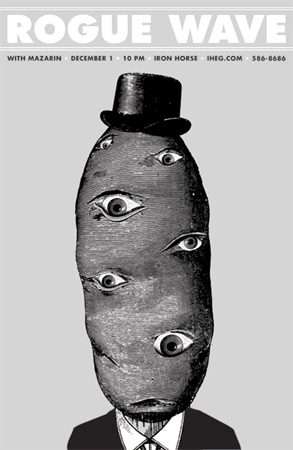 Duval: People often ask me if the bands know I’m making posters for them. You can’t just make things for bands and sell them because then you’re stealing that band’s identity.
Rumpus: So you’re saying that selling hand-made posters is different than carving “Kiss” or “The Doors” into your desk at school?
Duval: [Laughs.] Yes! Making unauthorized merchandise for a band is no different that taking the Nike logo and putting it on a T-shirt and selling it. Plus “bootlegger” isn’t a good look for your portfolio. If you’re just starting out you’re much better off making posters for smaller bands who are your friends. Start small, and show people what you can do.
Rumpus: When you first started out, did you have a signature style or was it more you trying to capture the vibe of a band?
Duval: It was a mix. My goal was and still is not to sell me, but to make something for whomever I’m working with. Some bands are very hands-on, and some aren’t. It used to be I’d work with the promoters or managers of smaller bands and turn posters around pretty quickly, but these days I make all kinds of merchandise, not just posters, but also album covers and T-shirts and stuff, and mostly for larger touring bands.
Rumpus: How do the bands find you?
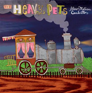 Duval: Some illustrators have one style, but I’ve done a lot of work for different bands, from indie and jam artists to country musicians. Sometimes the band reaches out to me, and I also work with a lot of artist management groups. We talk about generally what they’re looking for and sometimes I’ll pitch three or four ideas in written form to help get things going.
Rumpus: When you’re thinking up ideas for a concert poster, are you focused on the event specifically, or something more lasting? I feel like it used to be that gig posters announced an event, and when the event was over, the poster disappeared. But now they seem a lot less ephemeral.
Duval: Yes, I think they are becoming less ephemeral and for the same reasons that vinyl is coming back. You can fill your computer with MP3s, but it’s not as appealing as collecting physical objects. Gig posters are silkscreened, and feel a certain way when you touch them, and they smell like ink. They’re also tangible and limited. In fact, they’re signed and numbered, which makes them desirable as collectibles. As music has become streamlined and digital, bands and fans have picked up the specialness of having something real and lasting. A poster is the new T-shirt at the merch booth: You can get a mass produced object, or you can take home a special hand-made thing that speaks to you about an artist you like, which was made by another artist you may like, commemorating an event you liked.
Rumpus: And of course there is the visual draw of a poster that you don’t often get with concert T-shirts. I remember walking into record stores and choosing to buy albums just because I loved the artwork.
Duval: Yes—I’ve been there too. You think, “If this sounds like it looks, it’s going to be something I’m into.” I think about that lot when I design.
Rumpus: Can you describe your design process? Do you prefer to work “in analog” or on a computer?
Duval: It varies from project to project, but when I begin a design, I don’t use a tablet. Usually it’s a ballpoint pen on computer paper. People often tell me they like my imperfect line, and I think that has a lot to do with the fact that my work isn’t a vector-based, computer-generated line. It’s a human line.
Rumpus: And how do those initial drawing become refined?
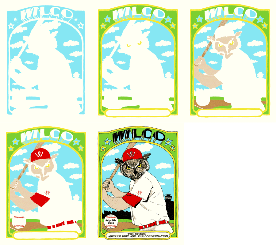
Duval: You know, I first learned to design for silkscreen, and I think it has made me a better artist because it limits certain aspects, such as the colors you use, and that style works well across media. So now, even though I complete my work in Photoshop, I still act as if I’m making a silkscreen. Each color is a layer, and I’m sort of building each design with a set of screens. Say it’s a three-color project with black, yellow, and red. I’ll do all of my black images as one layer; then I’ll do the same with the other colors.
Rumpus: As your career has evolved you’ve moved from designing concert posters and music packaging to doing other kinds of merchandise and product design, and it’s perhaps ironic that you’re now also back in the ad world.
Duval: The posters I was making for young, hip, indie bands, were in essence turning into giant, silkscreened business cards for me and my business as they spread their way around the Internet with my name and credit attached to them. When people saw them, businesses especially, they wanted that youthful, playful vibe I was making for bands translated to their brand or products.
Rumpus: Can you describe one of those campaigns?
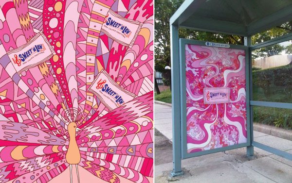
Duval: A few years ago a book publisher called Gestalten approached my wife [illustrator Jen Skelley] and me about being in a book they were putting together on design. The book came out, and a year later a New York ad agency called Mother contacted us. The creative director had the book and invited some of the illustrators to pitch them campaign ideas for Sweet ‘N Low. We thought, Hey, this probably won’t pan out but let’s try it. We didn’t hear anything at first, but then maybe six months later they came back to us and offered us the job. It was exciting to do this big national campaign—I mean it was surreal. There were ads on top of taxis and a Jumbotron animation in Times Square, ads in every print magazine, and huge six-foot bus stop posters of these crazy, psychedelic, over-the-top illustrations.
Rumpus: Are there major differences for you between, let’s say, working for a commercial client on something like Sweet ‘N Low,and working on projects for an indie band?
Duval: Sweet ‘N’ Low was a rare breed. [The process] was very open, and I had as much control over that as a concert poster. Surprisingly, sometimes an album cover or a T-shirt can be more restrictive because you’re not just collaborating with the musician but also the label.
Rumpus: Are there often big-time disagreements, like in This is Spinal Tap?
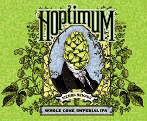
Duval: Sometimes it’s a daunting path. Labels are signing fewer bands. They have to be careful about the budgets, and they end up trying to control everything including the creative. But sometimes my work on music stuff has led to other kinds of work, which doesn’t have those constraints. Someone at Sierra Nevada liked my designs for Phish, for example, and hired me. In fact, I’ve been doing a lot of beer labels recently. The craft beer industry has really exploded, and every month you hear of a new brewery opening. Sometimes this stuff is limited release or seasonal, and it often has artwork attached to it. The craft beer scene reminds me of the early concert poster scene, and there’s also a crossover demographic. Just as sometimes people are drawn to an album based on the cover art, people can become curious about a beer because of the label.
Rumpus: Do see yourself ever leaving the music world behind for a full-time ad career?
 Duval: My business is a now a mix of contract and retail work for people in and beyond music. I’ll always design concert posters, but it’s very hard to make a living just doing that.
Rumpus: Is there any music right now that’s rocking your world? Something you listen to when you design?
Duval: Musically I find my interests shifting almost seasonally. This summer the sound I’ve been gravitating toward is the psychedelic America thing that’s happening, bands like Generationals and Houndmouth—cool, young stuff with folkie vibe—but I never listen when I design.
Rumpus: That’s interesting: I’ve always imagined that listening to music would help as an interpretative tool.
Duval: I always used to listen to the bands I was designing for to spark an idea, but I’ve found that if you try to get too focused on one part of, let’s say, a line or a song you might lose a bigger idea. Plus, everyone takes something different from what they hear or see.
Rumpus: Speaking of interpretation, I don’t want to overstep, but on the bio section of your website, you list among the “twenty-three things you enjoy” semi-hollow guitars, the color blue, and the number eight. Would you like to elaborate on any of these?
Duval: Let’s go with the last one. I have always liked the number eight. It rhymes with my name and was often my number in sports growing up. When someone else took it, I usually chose a number that somehow, to me, was still an eight. I went with twenty-three in high school because I saw it as two cubed. [Laughs.]
Rumpus: Is there anything else we should know about Nate Duval?
Duval: Another fun fact: I always keep as many two-dollar bills in my wallet as I come across. Right now there are five. I never spend them, just must be some sort of superstition thing I’ve had for like ten years.
***
This interview has been edited and condensed. If you’d like to recommend someone for “Sound & Vision,” drop Allyson a line here.
***
Feature photograph by Hillary Dawson. Other photographs courtesy of Nate Duval.

