Welcome back to Sound & Vision, the Rumpus profile series that spotlights the creative talents of those working behind the scenes in the music industry. Spencer Drate and Judith Salavetz are a prolific award-winning creative team who have made their mark as designers, authors, radio personalities, curators, and artist representatives. Their long collaboration began decades ago, designing albums for musicians from Richard Hell to Bon Jovi, including twenty-two inductees into the Rock and Roll Hall of Fame. Drate was a 1979 GRAMMY nominee in album packaging for co-designing Talking Heads’s Fear of Music and has been a four-time GRAMMY judge on the album packaging committee. His album work with Salavetz is also included in the MoMA and Rock and Roll Hall of Fame permanent collections.
Beyond album design, Drate and Salavetz have also co-curated gallery shows, served as film judges and board members for the Southeastern International Film Festival, and authored twenty-one visually oriented pop-culture books. Drate also interviews musicians for Punk Globe Magazine, and along with Salavetz he hosts the pop-culture podcast The Indie Café. I was honored to interview them both for my WPKN radio show, FM Mutations, last month. What follows is an extension of our conversation.
***
The Rumpus: I want to start out by asking both of you, individually and as a partnership, about your design backgrounds.
Spencer Drate: My design background started in college at the University of Bridgeport, where I was lucky to have an all-Yale faculty, which was a big influence on my design life. To tell you the truth, when I was in college I wasn’t thinking about what I wanted to do professionally, but with the [Josef] Albers type of training I got in design school I learned about color and concepts of putting things together. It was a very “out of the box” kind of training that related to some of the work I was going to do later in design.
Rumpus: So what was your first design job related to music, and how did you get it?
Drate: Well, that’s interesting. I was looking for work in New York City. One day I was walking around in ripped dungarees and a person wearing a three-piece suit confronted me on Fifth Avenue. It was funny—this guy went to college with me and he knew I was a designer, and he said, “I need a type guy.” So I said, “Okay, cool, what are you working on?” He said, “Well, I’m working for Apple Records on John Lennon’s Imagine album trade ads.” And that’s really how I started, with no portfolio, just out of the box this guy trusted me. Later, the other experience was that I was at a movie theater and I was talking with a guy who was an usher there, 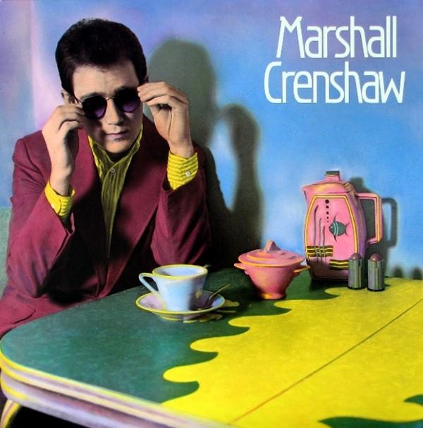 and he said he needed a type guy. He ended up bringing in a project for Richard Hell and the Voidoids’s Blank Generation! That started my career because after that album I ended up doing albums for Sire Records.
Rumpus: And Judith, let’s also talk about your background.
Judith Salavetz: My background isn’t quite as colorful and dramatic as Spencer’s! (Laughs) Basically I went to CCNY in New York City and graduated with a fine arts degree with a minor in graphics. When Spencer and I met he was working on a Marshall Crenshaw album, and I said, “I minored in graphics, you know I’d love to do some work with you.” And he said, “Great, why don’t you come to the studio? Let’s see what we can do.” That turned out to be our first collaboration. He already had the image for the cover and we worked on the title and the type together.
Drate: That cover ended up in a very famous AIGA [the professional association for design] cover show, which Annie Leibovitz voted in—
Salavetz: From there Spencer and I went on to do many, many, more covers together.
Rumpus: Yes, quite a few! What’s driven your collaboration?
Drate: I think what’s kept us together is our high point in typography and I have to emphasize that because many designers are not good typographers. You have to have great typography and of course you also have to have the visualization, whether it’s illustration, or photography. The things that first got me together with Judith—she didn’t mention this—was she did a silkscreen print. It was incredible! I saw that print and said, “Oh my God! This is an incredible piece of art!” It was a no brainer. I said to myself, “I’m going to work with this woman!”
Salavetz: (Laughs) I didn’t know that!
Drate: It’s interesting too, about a man and a woman working together. I want to bring this up.
Salavetz: Many of the preliminary meetings we went to, it was as if I were invisible and I know it was because I was a woman. When the meeting would get started and people would start talking, the clients would look straight at Spencer and talk directly to him.
Rumpus: Do you think that’s changed over time?
Salavetz: Oh, absolutely! I also think because I was kind of insecure at that time, not about my talents, but because I didn’t want to make waves. I didn’t want us to lose the job and I used to think that if I spoke up or had any input that it was going to be looked on in a negative manner because it was a woman talking. So I always waited until Spencer and I would get back to our studio, and then we would discuss the direction we would go in, what we were going to do, etc. Together we’ve designed for twenty-two Rock and Roll Hall of Fame inductees.
Rumpus: To go to the creative, how do you approach a project? Does the discussion usually include the musical artist? Does it include listening to the music pre-release?
Salavetz: Each project is unique unto itself. We’ve had jobs where musicians want to get involved and sort of want to sit by us as we proceed to work. For example, we collaborated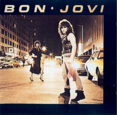 and designed Bon Jovi’s first album cover that was titled Bon Jovi. At the time no one, and I mean no one, knew who Jon Bon Jovi was—so he would come to our studio on a regular basis because he wanted to be involved and see the direction we were going in. At the time my son was three years old and I would bring him to the studio. We had a couch and I had lots of toys for him and several times Jon Bon Jovi would come, and in order to allow us to work, he would play with my son on the floor!
Drate: But the funny thing was when he first came up he brought a cassette of Runaway, and he played it—it was a very short meeting and then he left—and Judith ran over to me and said, “Spencer! He’s gonna sell a million!”
Salavetz: Oh, God! When I heard that tape I knew there was no way he wasn’t going to be super-famous. And the guy was so handsome. We were so lucky to have had the opportunity to do this cover for him, and he also allowed me, someone with a background as an artist/designer to dress the band. I styled Bon Jovi for their first cover! I still cannot believe I did that.
Rumpus: Tell me more about that cover.
Salavetz: We filmed it in Columbus Circle in the middle of winter. It was freezing cold!
Drate: If you see the front cover, you’ll see a truck behind the band, which happened by accident. This truck had lights coming from the back; so rock and roll! That’s when I said this album’s gonna happen, and it did.
Rumpus: Can we also talk a bit about Joan Jett’s record Album? Because earlier you mentioned the importance of typography but there’s no typography there, no title, just a photograph of Joan set against a bright yellow background.
Drate: Meryl Laguna had the photograph of Joan. This is a great shot. And so I called Kenny and said, “No type on the front cover. Instead we’re going to do a clear sticker on the shrink-wrap with the title and name, and you’re going to rip it off and then you’re left with the photograph. That’s how it started. The rest was photographs of the group, pictures from the tour—
Salavetz: I don’t know if Spencer remembers but they provided us with hundreds of photographs, and it was our job to pick out what we wanted on the inside and where everything went.
Drate: It was an iconic album, right after I Love Rock ‘N’ Roll.
Rumpus: Yes! I remember buying this album. It didn’t have anything on the cover except that image, which was so compelling to me, and the album was in fact kind of subversive.
Drate: Yes. Actually when they put out the cassette version it also included a “secret song,” which was a cover of the Rolling Stones’s “Star Star.” They told me someone who was working at a record store out in New Jersey got fired because they didn’t know that song was on there and they played it in front of a bunch of families with kids.
The song has some NSFW lyrics. You can hear them in the video below.
Rumpus: Of course.
Drate: Most people don’t know how that one was put together. Jerry Harrison went to visit Tina Weymouth’s brother, who is an architect, and saw a vinyl pattern on his floor and thought it would look great as an album cover. After that I got together with David Byrne and we conceived of the idea of doing typewriter font, so I went to a typewriter place where a lot of women were typing at that time, and I asked them to type out the title for me in different fonts. I picked one out and put a box around it, which David really liked because it encased the title and name of the group. They wanted to do the cover in actual vinyl, like the flooring, but Warner Brothers said it was outrageous and would cost a fortune, so we did it on embossed matte cover board instead with day-glow green letters. The famous designer Peter Saville said this is one of the greatest industrial-looking album covers ever designed and it’s in a book called 100 Best Album Covers and many other books. We were also nominated for a GRAMMY award in album packaging in 1979 for that cover.
Rumpus: As CDs started to come around, did it change the way you approached design because the jewel box is much smaller and you have a lot less space to work with?
Drate: Well, Judith and I worked on what we think of as the salvation of that, with what was called “special packaging,” an era that ran from about 1989 to 1995. Record companies would put out special materials, graphics, limited editions, or pro only albums. Of course Judith and I preferred cardboard to plastic boxes because you can have continuity in the graphics.
 Rumpus: Not to mention that you can’t open plastic jewel boxes without risk of injury.
Drate: Not only that, but they break right away, right? We did several special packages that were amazing: for example one for the Velvet Underground’s ’93 tour, and also a metal box called “the metal memorial edition” for Lou Reed’s Magic and Loss that was released as pro only. And for the Beach Boys we also did a multi-panel CD with Robert Lyn Nelson’s ecological paintings, which were gorgeous.
Rumpus: Is it often difficult to transfer an image onto the compact disc itself?
Salavetz: No, not at all. I mean you have to have an eye for what’s going to go into the space, what’s going to fit. But we have been lucky to have beautiful images to work with, and as long as the majority of that image is also on the cover it works.
Rumpus: A lot of your design approach also sounds like it’s about curation. You often have a lot of images to choose from, so it’s about trying to figure out which of these is going to convey visually what’s happening in the album musically.
Salavetz: Absolutely. And I don’t know how to explain how we choose. It’s almost like an innate skill or ability. When we see the right image, that’s it.
Rumpus: In addition to your work in album design, you’ve also published many design-oriented books. Can you tell me more about that?
Drate: In 2002, we did a book called 45 RPM. What was hot then, and is still, are LP record cover books. But I said, “45s! The Beatles! David Bowie! Elvis Presley! Name it, everyone had 45 picture sleeves. So I sent around a book proposal and everyone turned it down except a small publisher called Princeton Architectural Press. As it turned out, it was like the story of the Beatles being turned down by everyone by Capitol. That book sold 25,000 copies worldwide, and so Judith and I decided to do another called Five Hundred 45s with HarperCollins.
Rumpus: You’ve also been involved in curating in other ways. For example, I understand you have a show on Blog Talk Radio.
Drate: Yes. It’s called The Indie Café and it’s heard on two stations. One is co-hosted with Holly Stephey in Sonoma, California, and the other is with Nikki Palamino. I also do a rock personality series with Nikki in Punk Globe Magazine where we’ve recently interviewed Marky Ramone, Chris Stein, Zak Starkey (Ringo’s son) with his group SSHH, Tommy Price who plays drums for Joan Jett, and Danny Garcia who directed the film about Johnny Thunders called Looking For Johnny. We probably want to go into TV next… but we’re not quite ready talk about it.
Rumpus: Does this tie into your interest in film?
Drate: Yes. We’ve done six books on film and movie posters, animation, special effects, and motion by design, and now we’re also active with the Southeastern International Film Festival. Leigh Stewart is a filmmaker who has a great film called Paradise Garden about the artist Howard Finster, and she’s also a founder of the festival. Judith and I are very involved with this project as board members and film judges. The festival was held once in Georgia and it’s going to be in Nashville this fall, and the bigger spectrum of music, art, 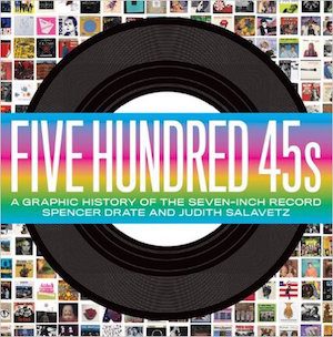 and film will be in the spring of 2016. So far we’ve had over 1,800 films entered, which is huge. The New York Film Festival gets about 2,100 and they’ve been around for about thirty years!
Rumpus: Now that vinyl is coming back, would you have any advice for emerging musicians? How important is it for them to establish their identities visually in the packaging of their music?
Drate: You bring up a good point. There’s a lot of vinyl out there, usually 12 inch, although the runs are smaller than in the past. It’s important no matter the format to have good imaging, not just a picture of a person—which Judith and I don’t like. I mean that’s also where Hipgnosis came from. If a group would come in and want their pictures taken, Storm Thorgerson would say okay, but in the back of his mind he’d plan on using a really incredible concept for the album cover. Art goes on the front cover, a picture goes on the back: when people flip the album over to see the song listing, they can see your picture there.
Salavetz: Yes, today when you go into some of these shops that are selling independent LPs, you see that what Spencer is talking about has finally gotten through to the musicians. A lot of the albums have amazing art that the musicians have chosen instead of putting their pictures on the cover, and oftentimes one or two of the members of the band have even created the art themselves.
Rumpus: Would you have any advice for a young designer who’s trying to break into this field, now that many musicians are releasing independently rather than through labels, and are making their own decisions about design?
Salavetz: I think they already know what they’re doing. The interesting part is the musicians have an advantage when they make their own logos and album designs because they know what their music is about and what audience they’re talking to. They can find the image that best represents their sound.
Drate: The main thing to keep in mind is that concept is always very important in packaging. I want to bring up one more story to illustrate this. We did Lou Reed’s New York album, which was shot by Waring Abbott and based conceptually on a 1932 photograph by Brassai called “Deux Voyous de la a Bande du Grand Albert” where a group of men are standing in an alley. It wasn’t until years after the album was finished that Judith and I actually saw the Brassai photograph in the Metropolitan Museum of Art, but Abbott already knew it and had been inspired by it, so he shot Lou in different clothing styles, and then Photoshopped the figures together. I went in and cleaned up the visual and did the type treatment so that the album title New York appears as a transparent effect. We worked together, and so were able to convey the vibe or “identity” of Lou’s album. You can “see” the album as well as hear it.
https://www.youtube.com/watch?v=7z3TPwOT31g&w=580
***
All images are courtesy of Spencer Drate.
***
This interview has been edited and condensed. If you’d like to recommend someone for “Sound & Vision,” drop Allyson a line here.

