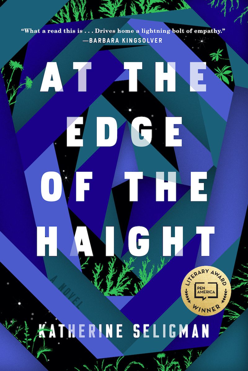
We are thrilled to bring you this exclusive first look at the cover of Katherine Seligman’s forthcoming novel, At the Edge of the Haight, forthcoming from Algonquin Books on January 19, 2021.
Maddy Donaldo, homeless at twenty, has made a family of sorts in the dangerous spaces of San Francisco’s Golden Gate Park. She knows whom to trust, where to eat, when to move locations, and how to take care of her dog. It’s the only home she has. When she unwittingly witnesses the murder of a young homeless boy and is seen by the perpetrator, her relatively stable life is upended. Suddenly, everyone from the police to the dead boys’ parents want to talk to Maddy about what she saw. As adults pressure her to give up her secrets and reunite with her own family before she meets a similar fate, Maddy must decide whether she wants to stay lost or be found. Against the backdrop of a radically changing San Francisco, a city which embraces a booming tech economy while struggling to maintain its culture of tolerance, At the Edge of the Haight follows the lives of those who depend on makeshift homes and communities.
Below, Katherine Seligman shares her thoughts on her debut novel’s cover. Then, cover designer Michael C. Morris shares his inspiration for and process to create the cover of At the Edge of the Haight.
***
Katherine Seligman on the cover art for At the Edge of the Haight (Algonquin Books, January 19, 2021):
There are times I’ve walked into the edge of Golden Gate Park, shut my eyes and then tried to see it for the first time, the way I had years ago, or as the main character, Maddy, in my novel would have seen it: trees, tall, spindly or squat in a range of greens, browns and rust, a lawn that leads to a murky lake and beyond, a playground, more lakes, fields and secret spaces. There are owls and hawks, squirrels, racoons, coyotes. It is an entire world, much of it largely unseen, especially at night when it is also a shelter.
The cover of the book evokes a sense of this vastness, of looking into something with a foreboding sense of both dark and light. It relies on a vivid sense of place without using familiar landscape or images from the notorious Haight Ashbury neighborhood. Even the plants on the book’s border are ones found in the park—California buckeye, bay laurel and others. I feel like I’m looking through a prism, at what is known and what, like Maddy, wants to remain hidden.
Book designer Michael C. Morris on the inspiration behind the cover:
The path to this cover was very natural but also wasn’t especially easy. At the Edge of the Haight tells a story that’s complex to illustrate, but ultimately I focused on one element and expanded on it from there.
Initially, I was illustrating the cover as an intimate story based on the main character and San Francisco. However, even though the story is character-driven and very much a San Francisco book, it has a much wider scope. It has a lot to say about homelessness and while that is a huge San Francisco issue, it’s also a larger global issue. Algonquin’s art director, Anne Winslow, told me the editor wanted something grander to match the scope of the story: “These people are on the outskirts of society, play with that. Something with the edges of the cover maybe.” I’m paraphrasing, but what I took from her notes was to not be so literal, to play with the abstract and see where it leads.
I started by playing with color blocking on the edges of the cover and then I kept adding to it, connecting some, taking away others. I got to a point where it looked interesting but it still wasn’t connecting to reality, which irked me. So I played with color to see if I could make this art something that you would relate to the real world. When I saw a dark blue edge against black I got it; it could be the night sky of the park mentioned in the book. I added a wider range of blue colors, some plants creeping over the edges, and some small specks here and there as stars.
In the end, the cover art is specific to the book but with these edges clashing it felt like it could also be telling the story of many different places. So, ultimately, it was super difficult to think of such a real and present issue so abstractly, but when I did, my mind took the artwork to where it needed to go.
***
Photograph of Kathy Seligman by Penni Gladstone.

