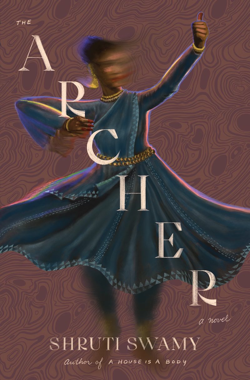
We are thrilled to bring you this exclusive first look at the cover of Shruti Swamy’s debut novel, The Archer, forthcoming from Algonquin Books on September 7, 2021.
As a child, Vidya exists to serve her family, watch over her younger brother, and make sense of a motherless world. One day she catches sight of a class where the students are learning Kathak, a precise, dazzling form of dance that requires the utmost discipline and focus. Kathak quickly becomes the organizing principle of Vidya’s life, even as she leaves home for college, falls in love with her best friend, and battles demands on her time, her future, and her body. Can Vidya give herself over to her art and also be a wife in Bombay’s carefully delineated society? Can she shed the legacy of her own imperfect, unknowable mother? Must she, herself, also become a mother?
Intensely lyrical and deeply sensual, with writing as rhythmically mesmerizing as Kathak itself, The Archer is about the transformative power of art and the possibilities that love can open when we’re ready.
Below, Shruti Swamy shares her thoughts on The Archer’s cover. Then, artist, illustrator, and designer Shyama Golden offers us a glimpse at how the cover came to be.
***
Shruti Swamy on the cover art for The Archer (Algonquin Books, 9/7/21):
I have been an admirer of Shyama’s work since I first saw her stunning, memorable cover for If They Come for Us by Fatima Asghar. Shyama’s website is a thrilling archive of her work, which I highly recommend scrolling through. In it, you’ll see an utterly distinctive sensibility, aesthetic, and vision—a glory in color, pattern, and figures, often women, whose faces and bodies are rendered with such elegance and precision to be almost hyperreal.
All of these are at play in The Archer’s cover image, but what moves me most is how deeply Shyama read and understood my book and translated it into new medium. Look at the subtle, electric iridescence that limns the dancing woman’s body. It’s very beautiful, and otherworldly, like the rainbow in a sheen of oiled puddle, but not just there to be pretty. Rather, it is an ingenious depiction of the central ideas of the novel, one that is quite abstract, and was deeply influenced by Vivian Gornick’s Fierce Attachments. Looking—really looking—at a painting in the Whitney Museum, Gornick is struck by the realization: “I’ve looked often at Nolde’s flowers, but now it’s as though I am seeing them for the first time: that hot lush diffusion of his outlined, I suddenly realize, in intent.”
“Outlined in intent”: to me, that is another way of saying that art makes another’s consciousness perceptible, tangible. My protagonist, Vidya, journeys toward a kind of understanding about the nature of art and of creation that contains this intense, invisible outline. Shyama makes it visible.
Of course, this book cover is mostly a one-way collaboration with Shyama; the book was finished by the time I saw her final image. Nonetheless, it felt deeply meaningful to me to meet her in the space of my art and hers, to find a sense of kinship as women artists of color—and, a sense of freedom.
Artist Shyama Golden on the cover design process:
Before I signed on to create the cover art for The Archer, I received a trove of reference images from author Shruti Swamy, including black-and-white family photographs from her personal archives, links to traditional and contemporary dance footage, and striking photography from vintage Kathak dance books. All of these references gave me a rich visual world of inspiration to draw from, and made it an easy decision for me to want to work on this cover. My own personal work has included imagery drawn from indigenous forms of dance from Sri Lanka where my family is from, and this new challenge to translate the specific energy of Kathak into a still image was especially appealing. My work often depicts women as central figures, and makes use of color in a way that’s bold but harmonious in order to create a mood.
When I read the manuscript, I felt immersed in the world that Shruti brought to life around the story. I knew I was reading a truly masterful work before it made its way out in the world. The reference image that inspired me the most for the final design was a black-and white photograph of Shruti’s mother’s dance teacher, Roshan Kumari, in the pose of an archer. I took some artistic liberties with the pose to make sure it would read well on the cover, and visualized the protagonist with a slightly obscured face to allow the reader some room for imagination. I wanted to evoke a strong feeling of a character who is always in motion, constantly evolving in her journey of self-discovery. I included a few mudras as spot illustrations to use on the back of the book, referencing an important part of the visual language of Kathak. A pattern of bells also lines the spine, giving an association with sound to the artwork.
Art director Christopher Moisan was a pleasure to work with on this, and a true collaborator who brought out the best in my work. He helped me pick the best direction out of four initial options I presented as rough sketches, and gave me space to explore the design and develop it further. He brought me on to suggest the typeface and layout, as he knew that typography is also a passion of mine. He provided great feedback throughout the process, and his enthusiasm for the project did not hurt; I love working with people who are genuinely excited to make something together. The typeface I chose was Cako from VF type, which Christopher and I are both big fans of. The sharp, calligraphic feel, combined with the precise geometric movement between thick and thin, arcs and lines, seemed appropriate to channel the rhythmic energy of Kathak. I hand-traced the Cako lettering for the front cover to give it a brushed, sign-painted look that feels right for the era that the story takes place in: 1960s and ’70s Bombay. The secondary type is done in my handwriting, for contrast. I feel very sensitive to the way that type interacts with illustration, and it was so satisfying to be able to work with Christopher to make sure it was all allowed to sing and work well together.
At the end of this assignment, I felt grateful to have collaborated with both Shruti and Christopher, and as a member of the South Asian diaspora myself, I’m especially proud to have been a part of this phenomenal book.
***
Photograph of Shruti Swamy by Abe Bingham.


