In a world where some book cover designers are known for a singular style or approach, Rodrigo Corral has long remained a visual chameleon. But that doesn’t mean you wouldn’t know his work from a glance—especially when it comes to the authors he has long partnered with, like Rachel Cusk.
His work is synonymous with her output, creating a branded visual language that allows readers to find her work in the kaleidoscopic miasma of a bookstore or in postage-stamp size online … and joyfully curate our shelves back home.
Corral first designed a Cusk cover with Aftermath in 2012. But his work on the Outline trilogy defined all of her output moving forward (and backward into her backlist)—the concrete white borders framing photography or artwork, the all-caps sans-serif text. As Corral described her prose to Aperture, “it isn’t super linear”; thus his visual reaction is “more about being part of the journey.”
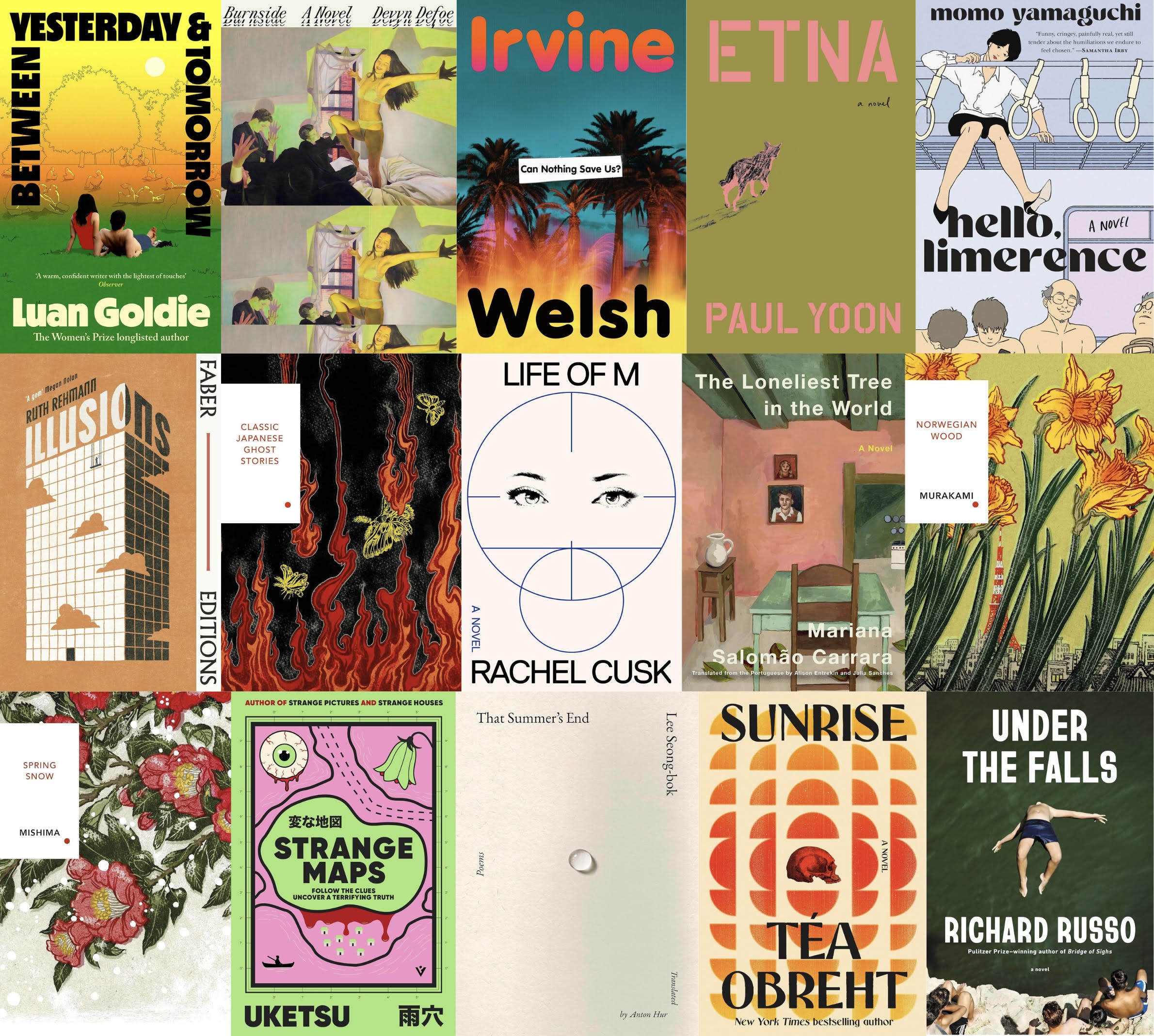
He developed the visual system around her work. And he breaks it a bit for Cusk’s latest, Life of M, which was published August 25. Focused on a film star, the eponymous M, the book is described by Farrar, Straus and Giroux as “an irresistible novel of fame, power, beauty and truth … a thrilling investigation of who we are, and who we pretend to be, at this late stage of modern life when we are mesmerized more than ever by the images we see everywhere.”
Below, Corral talks branding Cusk’s books, and hints at why he broke their shared visual system. The rest of our favorite covers published in August follow.

Zachary Petit: Did you know from the start that you were establishing a design language for Cusk?
Rodrigo Corral: I could see a system and know the power of repackaging as a system, so I thought it was a possibility. That said, when we created the packaging for the Outline Trilogy, it was already a big enough challenge, so I wasn’t really thinking beyond it. The solution needed to be fresh and match Rachel and the audience that loved her. I knew it couldn’t be clever. I focused on the many small moments that Rachel so expertly captures. It became about capturing a tone in those moments and hinting at location, as well.
Petit: How closely do you work, or not work, with her? Is it a collaborative process, or a solo one?
Corral: These days I work directly with most authors, but there are certain authors I’ve never met with or even exchanged an email with, and she’s one of them. It’s not that I can’t reach out; it’s almost as though the process benefits from this distance. In these instances, the jacket designer and author conversations take place through the books and conversations with the editor/publisher. I was aware of Rachel’s taste and awareness of art, which gave me confidence to push toward this approach. It all came together, like many other great outcomes, with the perfect storm of a brilliant writer, a visionary publisher, and a photographer [Charlie Engman] whose work defies definition.
Petit: When it comes to Life of M, how and why did you depart from the format you had established?
Corral: I read each book with an open mind. It’s not in the box until it fits in the box. Life of M was clearly a book that stood on its own. Rachel was trying something new here, and so the jacket design should reflect this. It had to signal that this book is different. Very.
Petit: What was the brief?
Corral: There was no brief. The brief is the manuscript, combined with [her longtime editor] Mitzi Angel’s confidence and our rich conversations.
Petit: The composition is so striking. How did you land on it, especially the geometry?
Corral: It’s about people at a distance. Observing from afar, ensuring no one gets too close.
Petit: Tell us a bit about the relevance of the eyes as a central object.
Corral: I saw Life of M as being about identity. How we perceive ourselves, how others perceive [us], and how we want to be perceived.
Petit: How did you settle on the restrained color palette?
Corral: Something about how perfection and glamor can feel restrained. A goal that, once attained, is not vibrant and colorful.
Petit: The type is a nice echo of your previous covers for Cusk.
Corral: Yes, that’s the connection. That’s what keeps them together. It’s a different book, but it’s still Cusk.
Petit: What other comps did you explore before arriving at the final design?
Corral: There was another one that included two figures that made the letter M. A lot of work with the letter M and reflection.
Petit: Do you feel more authors could benefit from a branded ecosystem similar to what you have done with Cusk’s books?
Corral: We’re often hired for repackaging projects, and as book designers, we especially love these. Just the idea of the books becoming a collection on someone’s shelf. For readers who deeply love an author’s work, creating them as well-designed objects that connect to each other can add another layer to that relationship.