
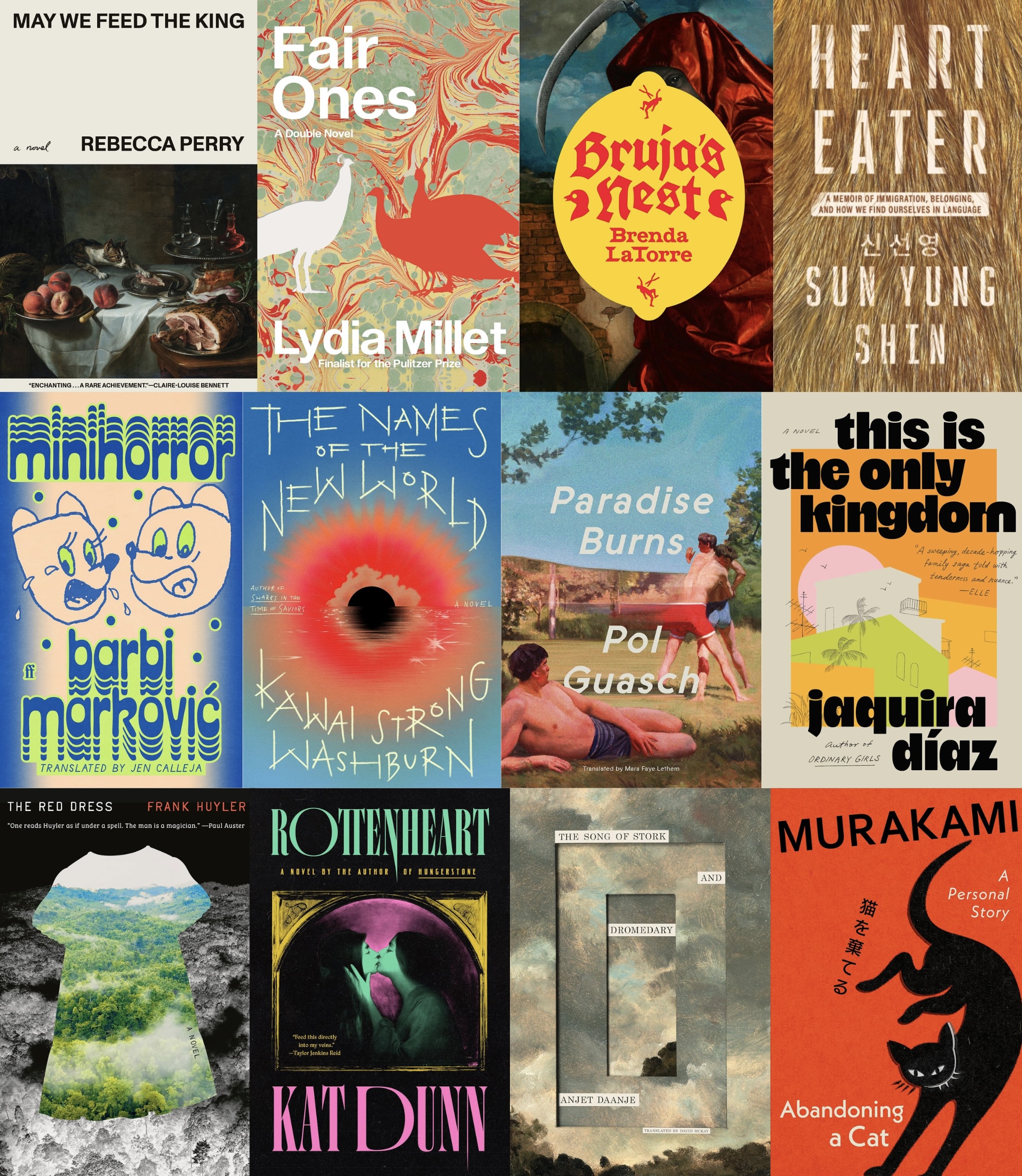
There’s a jarring juxtaposition of modern design moves and classical art on the cover of Rebecca Perry’s May We Feed the King—and for good reason. The Booker Prize finalist weaves an interlocking tale of a modern museum curator who is responsible for staging medieval rooms as they would have originally appeared, and a curious historical king whose quarters she has been hired to resurrect.
And it’s all the work of an unlikely designer: Jared Bartman. The Illinois-based creative spent a decade trying to make a living as an indie musician. Circa 2020, he was burned out and heard about user experience (UX) design from a friend in the field. He took a design bootcamp course and found himself drawn more to the graphic side of the work, book covers in particular.
“I’ve always been a very devoted reader, as well as a mildly obsessive buyer of books,” he says. “I’ve always loved spending hours at a time browsing in bookstores, looking at books and their covers.”
He began paying close attention to the holdings on his shelves and the names of the people who designed their covers—and eventually found himself mentoring under industry mainstay Rodrigo Corral.
Today, Bartman focuses mainly on covers, alongside editorial illustration assignments for major newspapers and magazines. Below, he discusses his work on May We Feed the King. The rest of our favorite covers from the month follow.

Zachary Petit: What creative carryovers do you see between music and design?
Jared Bartman: There are a lot of creative practices I started in music that I’ve continued in some form as a designer. When trying to shape the mood or feel of a song as a recording, my sound engineer friends and bandmates and I would often reference aspects of other songs as a foot in the door to the song, a way to establish a common musical vocabulary. Maybe the reference is an effect, a mood, a drumbeat, or even the sonic flavor of guitar. I make a moodboard of design references when working on a book cover. The references help me remember ideas I want to try, or even things I want to avoid in my design. The references can be as literal or as vaguely related to the project at hand as needed, but I think it’s nice to have a range of relevant possibilities in view when trying to create something new.
Another takeaway from music was the idea of adding personality and flavor to a piece through some analog mode of expression. In music, I often found that the song demos I made on my computer by myself were kind of sterile, especially if I arranged electronic instruments without much dynamic modulation, just to get the idea down. My songs almost always improved when other people playing real instruments (or performing live on electronic instruments) were incorporated into the mix. In this same way, I think a design can often improve and take on a new vibrant energy when elements outside of the computer are incorporated.
Petit: What did you learn while mentoring under Rodrigo Corral?
Bartman: It was such an invaluable experience to have a window into the book design process with Rodrigo and his designers. I loved reading and discussing the books and visual concepts with them, as well as working out ways to distill the essence and tone of a book into a memorable, unified pairing of image and type. It was an amazing crash course in the art of book design.
Petit: What about the craft of design and book covers holds your interest?
Bartman: Reading books is one of the great joys of my life, and interpreting a book into visual language that, in some way, encapsulates or becomes synonymous with the book will always appeal to me. The book jacket, to me, is an endlessly fascinating art form.
Petit: What’s your basic process when designing a cover today?
Bartman: I read the book first. This is important, but especially important for fiction (in my opinion). I take notes and copy passages that I feel might be significant into a separate document I review often during the design process. Often these notes lead to clues for potential images or a sense of the correct tone. Along with my notes, I review the publisher’s tip sheet and any guidance from the art director, editor, or author to make sure I’m staying on track. I gather visual inspiration in a moodboard in Figma. From there, I usually start designing directly in Photoshop, but I sometimes also make things in Adobe Illustrator or make things outside of the computer that I later scan in. While I design, I’m also collecting samples of interesting typefaces, interesting images, and other visual inspiration to catalog on my computer for later use. I often review these collections when I’m designing to see if there’s anything on hand I can use.
Petit: What was the brief for May We Feed the King?
Bartman: The book’s editor, Ashley Nelson Levy, sent me a lovely personal introduction to the book, including notes on the thematic material and suggestions on what the design should highlight tonally. From there, I was given the manuscript and left to read and design.
Petit: Tell us a bit about the color palette and type selection.
Bartman: The book is so much about a whispered conversation between the modern and the medieval and the blurred boundaries between two distinct time periods. I felt that some kind of modern design alongside a very old painting would be striking in its anachronism. The off-white color came intuitively, and I liked the stark, almost gallery space quality of it. I tried a lot of different typography, ranging from medieval blackletter to unadorned sans-serifs, and Dinamo’s Monument Grotesk won out for its spare but idiosyncratic letterforms.
Petit: How did you arrive at the composition for the final design?
Bartman: Among other styles, I’m a fan of gridded, minimalist Swiss design with lots of negative space. I tried a number of different layouts for all the design elements, but the full-bleed painting at the near-bottom of the composition won out, with the all-caps title and author creating a gridded sense of openness, which (hopefully) bears some tonal familiarity to the voice of the author and the feeling of the lives of the king and the curator in a kind of conversation across space and vast quantities of time. There’s also a sense of gaps that form in our collective memory of lives lost over time, and I think the spacious quality of the layout somehow reflects that.
Petit: How did you select the painting that appears on the cover?
Bartman: I had originally been working with different old paintings of extremely opulent dinners, including a depiction of a pig’s head on a plate. The author goes into lavish descriptions of food in the novel, both from the perspective of a medieval king and from that of the museum curator recreating museum exhibits of the castle rooms, to the level of nuance and detail that it might seem to the viewer that the king simply walked out of the room moments ago. The paintings of food I originally chose had a violent quality to them in their opulence, which I now realize wasn’t the right tone. I believe the author suggested the playful cat painting by Alexandre-François Desportes that we ended up using.
Petit: I’m also always curious—is “a novel” in your script?
Bartman: That is my handwriting, yes!
Petit: What other comps did you explore before arriving at the final design, and what was going on within them?
Bartman: I did several rounds. Some of the earlier ideas were much stranger in their experimental methods of collaging and use of type. There were monarchs collaged with heads of pigs, castle exteriors that mingled with medieval illuminated manuscript borders, with eyes in yawning stone windows. Earlier on, I focused too much on the more violent aspects of the novel, while there was much more of an appetite from the team to capture the more tender, even playful aspects of the book. While I did love some of those other concepts, I can’t really imagine the cover being anything else now, and I’m really happy with where we landed.
Petit: Where do you find inspiration, and how does it find its way back into your work?
Bartman: I read quite a bit, and I also buy a lot of books in various genres, including design, art, and illustration. I go to museums and follow other peoples’ work on the internet. I draw and paint for fun, though I would like to spend more time doing that in the future. Inspiration might find its way back into my work as directly as using a typeface or a similar way of setting type that I’ve seen someone else do. I also spend a lot of time simply looking at someone else’s work until I have some sense of how all the design elements come together to make a great cover.
Petit: Who are some of your favorite cover designers, past or present?
Bartman: I admire so many cover designers. Some favorites off the top of my head (and in no particular order) include Peter Mendelsund, John Gall, Oliver Munday, Rodrigo Corral, Alex Merto, Grace Han, Lauren Peters-Collaer, Na Kim, Tyler Comrie, Charlotte Strick, Luke Bird, Jack Smyth, Jon Gray, Jamie Keenan, Alvin Lustig, Milton Glaser, June Park, Jaya Miceli, Arsh Raziuddin, Paul Sahre, Pablo Delcan, Erik Carter, Thomas Colligan, Janet Hansen, Linda Huang, Anna Kochman, Chris Allen, Kamil Rekosz, Matt Dorfman, Alicia Tatone, No Ideas, Violet Dine, Giacomo Girardi, Adriana Tonello, Frankie DiGiovanni and Sarah Schulte. I could keep going, but I’ll stop here. There are so many amazing designers past and present, and I feel constantly inspired by their work.





Click here to subscribe today and leave your comment, or log in if you’re already a paid subscriber.