
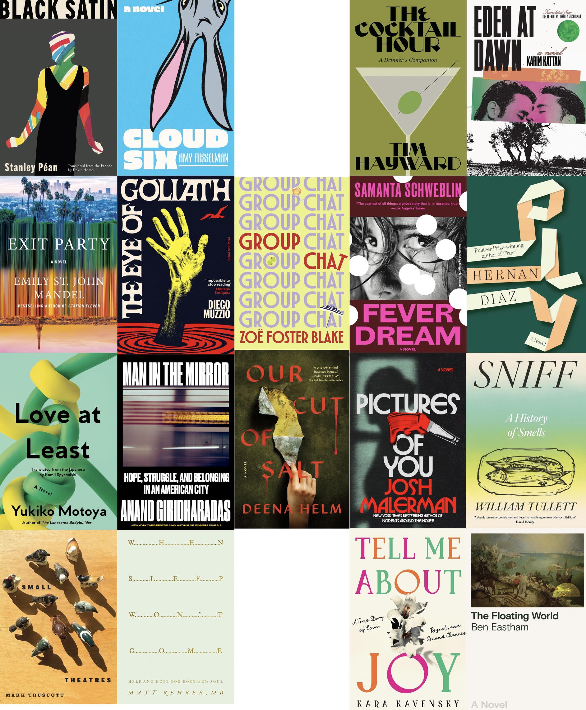

Black Satin by Stanley Péan, translated by David Homel
Cover design by David Drummond

Cover design by Patrick Sullivan
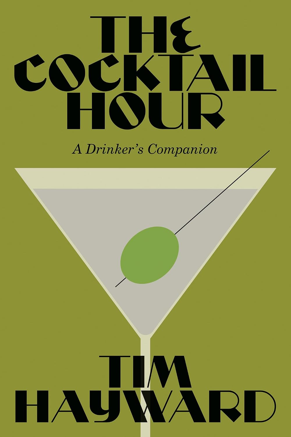
The Cocktail Hour by Tim Hayward
Cover design by Luke Bird
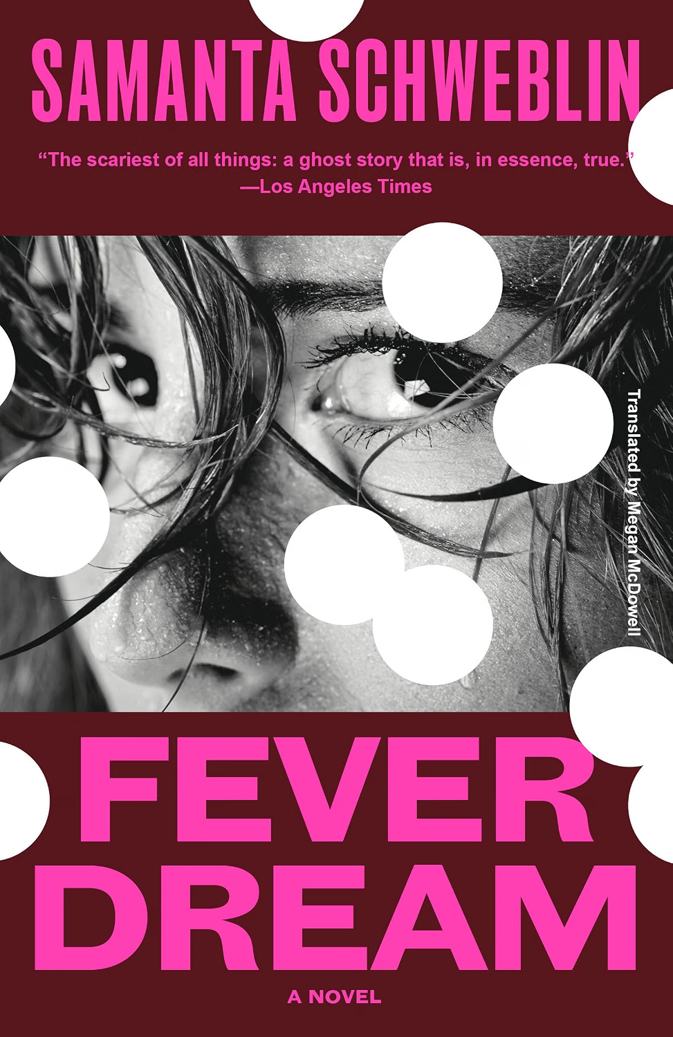
Cover design by Emma Pidsley
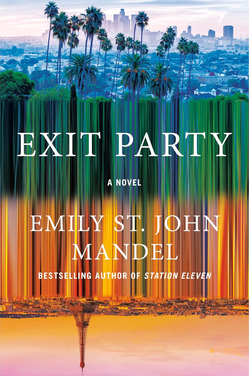
Cover based on an original design by Moesha Parirenyatwa

Cover design by Claire Sullivan

Cover design by Arsh Raziuddin
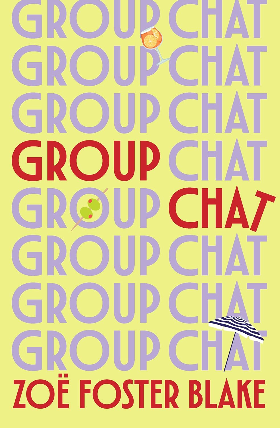
Cover design by Hazel Lam
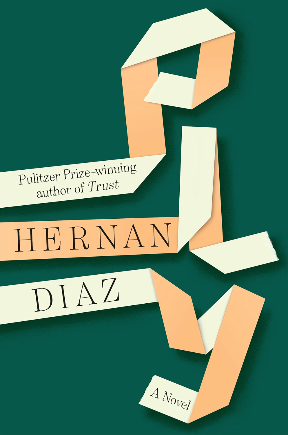
Cover design by Jason Booher
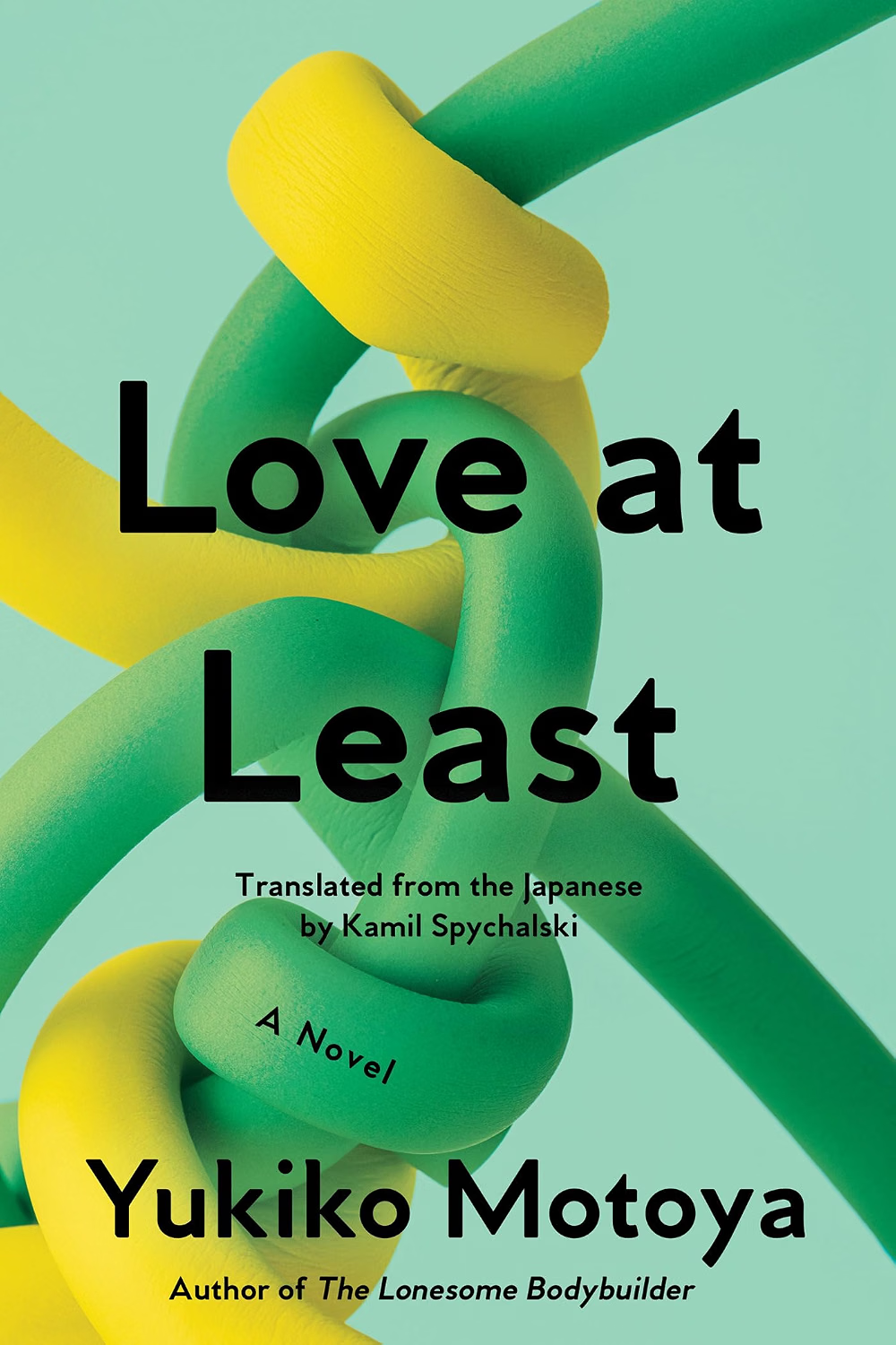
Cover design by Victoria Maxfield

Cover design by Arsh Raziuddin

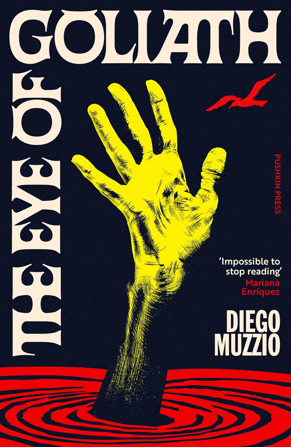
Cover design by Kishan Rajani
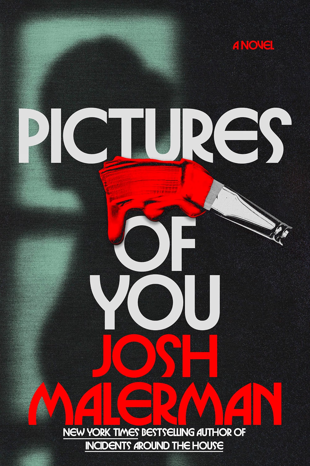
Cover design by Alicia Tatone
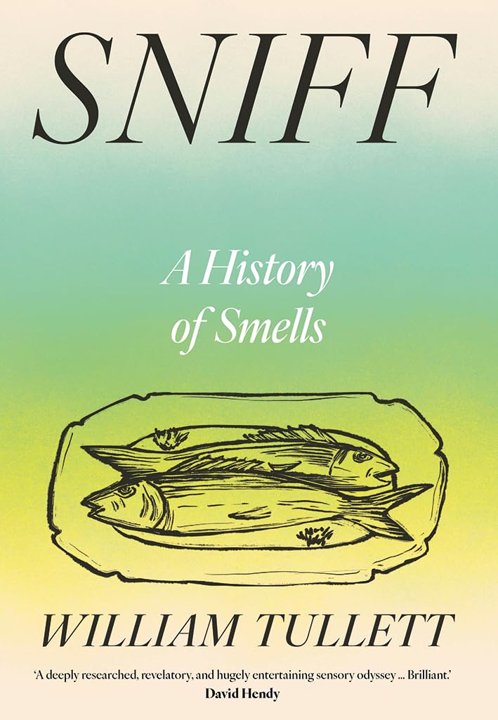
Cover design by Holly Ovenden

Cover design by Emily Mahar

The Floating World by Ben Eastham
Cover design by Adriana Tonello
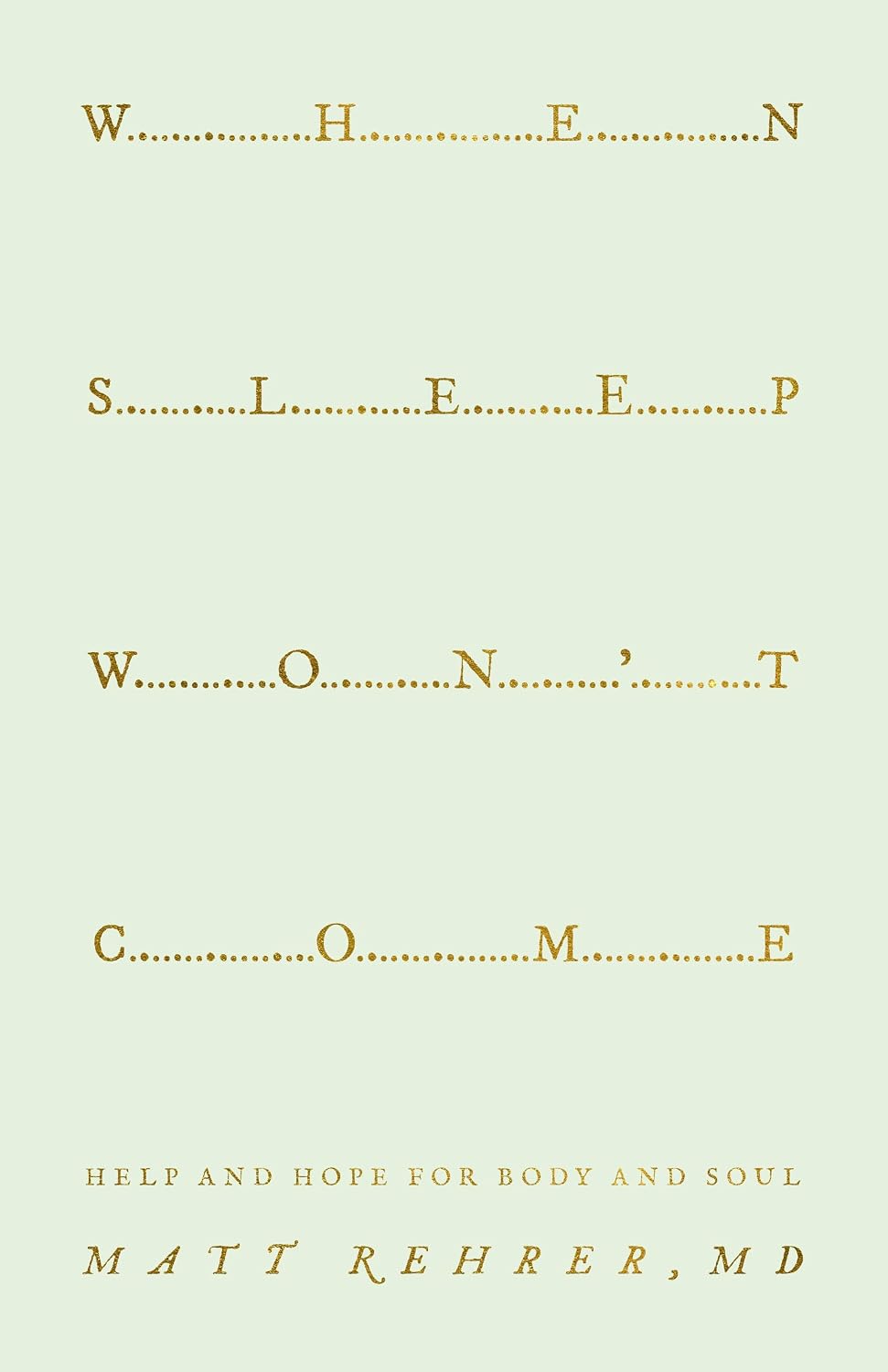
Cover design by Tim Green, Tiny Giant Co
Between the angular cuts of the typography, the searing red letterforms, and the torn wallpaper, the cover of Our Cut of Salt conveys layers of dread—which is apropos for a novel branded “a one-of-a-kind haunted house.”
Deena Helm’s debut has also been branded “haunted history.” And that holds, given the book’s characters, location, and central plot, focused on a family of Palestinian women, intergenerational trauma, and the said haunted house.
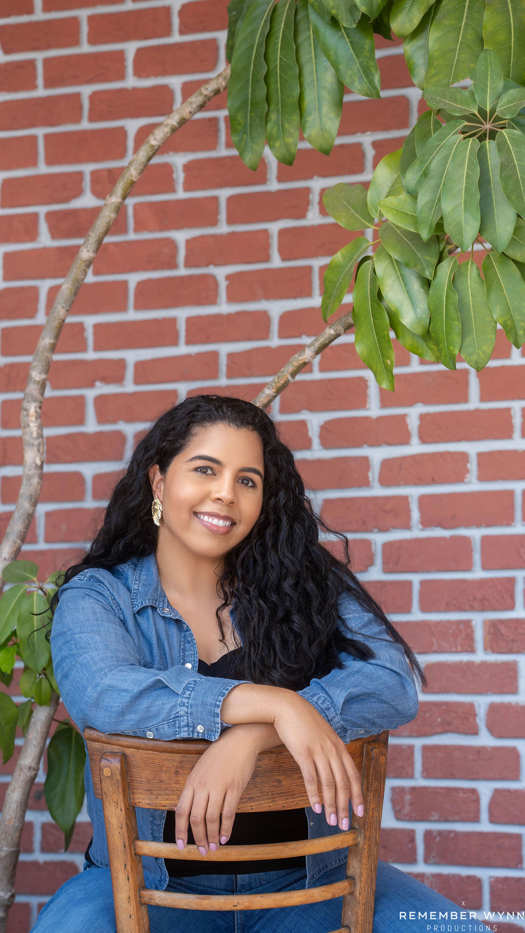
Designer Claire Sullivan held up a visual mirror to the book’s text—below she discusses her process and the cover, showcasing how there’s so much more to a jacket than first meets the eye.
The rest of this month’s cover picks follow.
Zachary Petit: You graduated with a BFA in Fine Arts and Creative Writing from Carnegie Mellon before studying design at Parsons. Did delving into visual art alongside literary narrative pave the way for your career as a cover designer?
Claire Sullivan: While a lot of my background is in traditional art like painting and drawing, I’ve always been strongly drawn to visual narrative, comics, and graphic novels, things like that. When reading as a kid, I was always visualizing the story in my mind’s eye, and I drew the characters and worlds I saw. The progression to cover design felt incredibly natural, and though I didn’t arrive at that until after college, I have a hard time seeing myself doing anything else.
Petit: What about the craft of design and book covers holds your interest?
Sullivan: I see cover design and illustration as almost lateral processes. A lot of graphic design can be systematic and governed by strict principles, but with book covers I think you can get a little looser with the rules. And the fact that a cover is often the first thing you’ll notice about a book [means] you get an opportunity to make a big impression.
Petit: Who are some of your favorite cover designers, past or present?
Sullivan: This won’t be nearly an exhaustive list, but I’d have to shout out June Park, Jenny Volvovski, Oliver Munday, Cassie Gonzales Vu, Alicia Tatone, Jonathan Bush, Jason Ramirez, Jim Tierney, and the great Chip Kidd.
Petit: What’s your basic process when designing a cover?
Sullivan: My process is honestly kind of haphazard. As I’m reading the manuscript, flashes of ideas might start popping into my head, whether that’s informed by a particular described visual or an atmosphere that I’m sensing. I’ll begin collecting imagery, color palettes, and typefaces that I think could work on some level. Often I’ll roughly sketch out ideas before I can forget them. Then comes the process of finding out how it all comes together, which usually involves moving things back and forth, adjusting colors and hierarchy, some of which is governed by those previously mentioned design principles, and some of which is governed by “vibes.” I go through the classic stages of getting excited, then hating everything I’m doing, and then coming back around to liking it. Once we hit on a direction, there can be a little or a lot of refining toward the final product.
Petit: What was the brief for Our Cut of Salt?
Sullivan: The brief was, aptly, fairly brief. It’s a haunted house story, and it’s commercial fiction, so it needs to fit into a certain market in terms of look. But the way it deals with the real, immediate genocide in Gaza that we are seeing unfold and the author’s Palestinian heritage gives it a very raw and personal angle.
Petit: How did you arrive at the composition—and what all is going on within it?
Sullivan: I wanted the central imagery to really stand out, so the type was considered around that. The title itself is a series of short words, which can become a question of scale and placement to balance readability (especially at thumbnail size, which is always a concern!) [with] a sense of movement and energy. Basically, delivering information succinctly while creating a mood that draws a reader in was the goal.
Petit: Tell us a bit about the wallpaper element.
Sullivan: There is recurring mention of yellow wallpaper in the book that ties the past and present, but it could also signal to readers themes of revealing a secret or grim underbelly. I also like that it brings some grit and tactility.
Petit: How about the color palette?
Sullivan: It’s a subtle (or maybe not-so-subtle) nod to the colors of the Palestinian flag. Red and green can be tricky to pair because they can sometimes “vibrate” or intensify when placed together. So I also wanted to see if I could play with that and (hopefully) subvert it a bit.
Petit: What were you aiming for with the typeface? (And the drips?)
Sullivan: It has something of a calligraphic quality, like using an angled flat nib pen. And you could read the drips as blood, but they could also be a painful or violent past metaphorically oozing out of the walls of this house.
Petit: Tell us about the central imagery.
Sullivan: The main image of the hand peeling back the wallpaper is its own photo, but I added textures and color filters along with the decaying wallpaper underneath. I get a lot of enjoyment out of the digital “collaging” process, I think, because it can scratch a similar itch as drawing or painting.
Petit: What other comps did you explore before arriving at the final design, and what was going on within them?
Sullivan: There were a few ideas featuring a more zoomed-out view of the house from the story, and some with more prominent human figures. Water is also an important motif in the book, so there was some of that in the overlays, or things looking damp.
Petit: Where do you find inspiration, and how does it find its way back into your work?
Sullivan: Like most book designers, I imagine, my time in bookstores now is usually spent admiring and poring over the latest covers. But it can come from anywhere; I’ll take bits and pieces of what I see in film or concert posters, art I come across in museums or galleries, even street signs or everyday objects. Whatever sparks a kernel of an idea.
Petit: What’s something that you would note to writers about cover design today?
Sullivan: This has only recently become more of a thing, but please try to avoid giving designers AI-generated mockups. More often than not, it only muddles the process. We love what we do, and the best results usually come from exploration!

Click here to subscribe today and leave your comment, or log in if you’re already a paid subscriber.