This post was sent to Rumpus members in our biweekly newsletter. If you’re reading this, and are not a member, please consider signing up to become a member or making a tax-deductible donation to keep our magazine independent.
By Rumpus EiC and peony enthusiast Alysia Sawchyn
imogen xtian smith is a poet & performer living in Lenapehoking / Brooklyn, NY. Their work has appeared in Baest, B L U SH, Folder, The Rumpus, The Poetry Project Newsletter, & Tagvverk (among others), as well as in We Want It All: An Anthology of Radical Trans Poetics. A 2021-22 Emerge Surface Be Fellow at The Poetry Project & MFA graduate from NYU, imogen’s debut collection, stemmy things, is out from Nightboat Books in fall, 2022. They will be giving readings from this collection in Asheville (and elsewhere!) in the coming months. Pre-order your copy!
The Rumpus: What are some of your early memories of book covers, either positive or negative, and how did those impact your ideas about the cover for stemmy things?
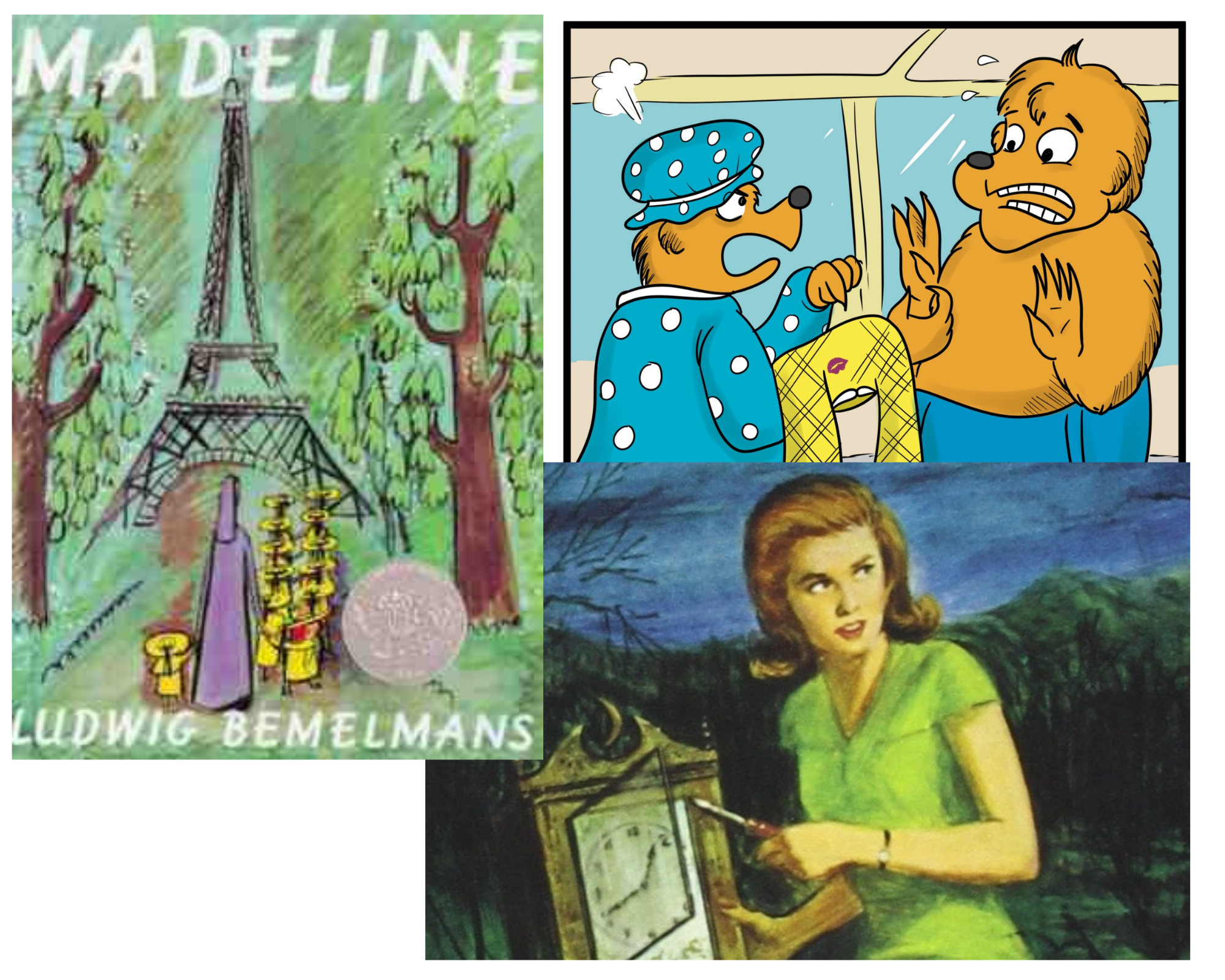
imogen xtian smith: My earliest memories of cover art are probably the Madeline books by Ludwig Bemelans. i must’ve been drawn to the vivaciousness of color, the starkness of the nuns in contrast to our girl M. i think about these books a lot as a major queer-of-gender root for little me.
i was lucky enough to have a lot of encouragement as far as reading was concerned, & remember being captivated by The Berenstain Bears (again, color, movement, a different obsession in each installment), Hardy Boys & Nancy Drew (with their ominous scenes—i always wanted the more gothic ones, the ones with night imagery), & other series, from the Boxcar Children to R.L. Stein.
Long before the words get us (or we get them), there’s the cover with its vibe cast before the pages. Setting this vibe early feels crucial, both in children’s literature as well as so-called adult.
i remember so vividly a sort of book that felt out of the 1940’s or 50’s in terms of design—usually a storybook involving knights or princesses or some such, where the colors were vibrant & the images a bit blocky, but i can’t think of an example, just impressions. Those sort of covers (which i can only be vague about here) definitely informed ideas concerning the mood i wanted stemmy things to portray—something darkly lush, a bit ethereal or other worldly.
Growing up in the 80’s & 90’s, there were also plenty of gaudy paperbacks around—think giant, gold & embossed font like on a Danielle Steele cover. Love those!
So while none of this (with the exception of the style that i seem incapable atm of fully articulating) felt at the forefront of my mind in thinking through my desires for stemmy things’ cover, there certainly has been a quality or through-line in tastes.
Rumpus: At what point of the manuscript submission/acceptance/publication process did you start discussing the cover?
ixs: At the very beginning! i’m a huge nerd about record covers, show posters, book covers, etc., & see the visual element as inseparable from considering the body or medium of the art-object. It’s really important for me to have a major say in all the elements of the book—from cover to layout to font. To be my bratty self about it, i wasn’t about to have an unsexy or boring book cover!
In my first conversation with Stephen (Motika, Nightboat Director & Publisher), i asked how much input i could have, & stressed how important that feels. He was so open, explaining that while Nightboat has a team of house-designers, i could get started early gathering images / obsessions / concepts to share with them.
Lol i made a pinterest account & began making albums of cover directions that interested me, ultimately sharing them with the designer (probably along with an excessive amount of explanatory notes but who remembers anything?).
Q: Who actually made the cover design? Were you familiar with their work beforehand?
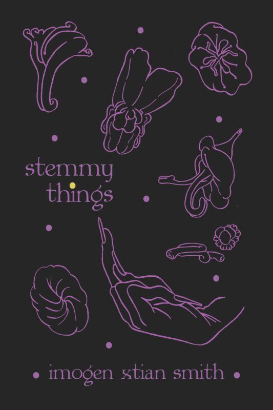
ixs: stemmy things’ cover was designed by Somnath Bhatt, with art by Elias Chen. i was unfamiliar with either of their work but couldn’t be happier about the way it all turned out! i received something like 8-10 different options from Somnath, all of them brilliant, all of them taking on one of the various directions / inspirations i’d shared. So i felt really heard & engaged with, really from the start, & that allowed for a kind of total trust in whatever the end results would be. & so yes—i’m a big fan of & really grateful to both artists now!
Rumpus: Can you describe the cover design and how it relates to the manuscript?
ixs: A bit earthy, a lot flirty, playful, scandalous even—if you really look / read the book. i loved the black / purple / yellow color scheme from the start, but it wasn’t until i held the book (just the other day!) that i realized how much gothiness that added. stemmy things is very gothy—in what i call a garden-goth kinda way.
So yeah—it’s dirty & queer & moody & silly, much like the work therein.
Rumpus: Which doodle/symbol on the front is your favorite, if forced to choose?
ixs: Hmmmm . . . that’s really tough because they each bring their own hot / mischievous take on the orifice. But i think the finger definitely, & probably the “budding” to its left, which perhaps gets the point across most bluntly . . .
Rumpus: Some favorite book covers other than yours 🙂
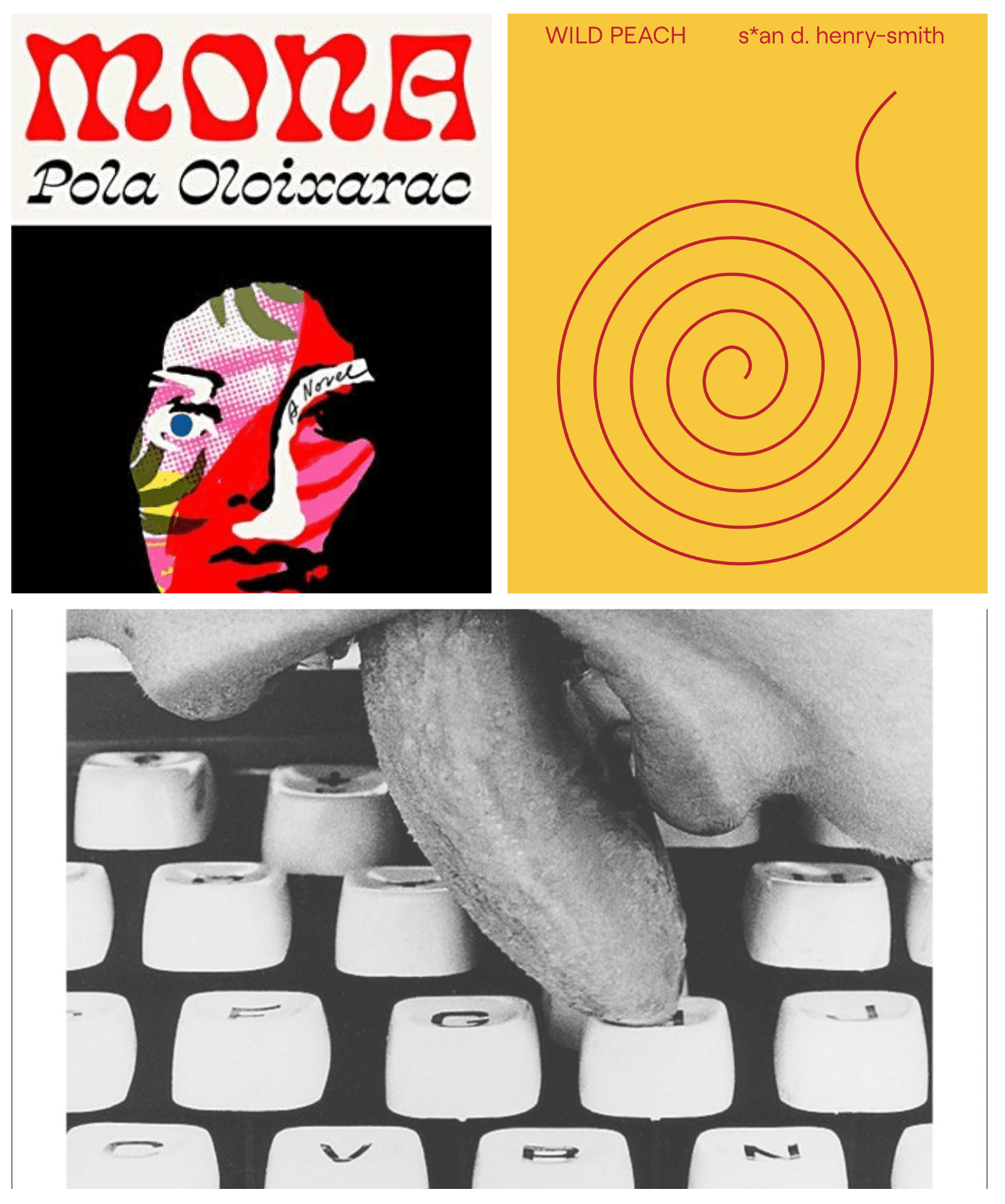
ixs: Oh lord, this could easily turn into an essay, so i’m just going to keep it to books of poetry, but i so often love Nightboat’s covers, particularly Wo Chan’s Togetherness by Aldrin Valdez, as well as Chia-Lun Chang’s forthcoming (don’t know the designer unfortunately). Three all-time fav Nightboat covers of mine are Stacy Szymaszek’s a year from today, Etel Adnan’s SEA and FOG, & Asiya Wadud’s No Knowledge Is Complete Until It Passes Through My Body—they’re all incredibly gorgeous as art-objects, let alone as works. Futurepoem and Wendy’s Subway have flawless covers, without exception. i love the old United Artists covers (particularly Mayer’s Poetry, with art by Rosemary Mayer), as well Black Sparrow & New Directions (old & new editions). Song Cave covers, particularly since they’ve shifted to the black backdrop, really do it for me as well. Some Action Books covers too—they’re so color saturated! City Lights are obviously classics…i could go on & on. If i must choose a favorite though, it’s clearly the use of Lenora de Barros Poema as the cover of Women in Concrete Poetry: 1959-1979. & is any book as all-around gorgeous as s*an d. henry-smith’s WILD PEACH? i think not.
AND AND one fiction shoutout that was influential: Pola Oloizarac’s Mona.
Rumpus: Anything else you’d like to add?
ixs: Yes—a bit about my process. i had several ideas as to how the cover could go & presented image examples accordingly. Vibes were Tropicalia / Brazilian psychedelic rock posters from the late 60-early 70s, dramatic 70’s paperbacks (think a painting of a femme in a flowing dress running away from a mansion, lightning in the sky above), 50’s paperbacks (like old copies of Camus or something with geometric shapes / patterns), Virginia Woolf’s early printings (font & image kind of minimal & art nouveau), or older hardcovers with embossed florals. In the end, i think there’s a little of everything in stemmy things, perhaps leaning more towards the psychedelic. And the gay.