

This post was sent to Rumpus members in our biweekly newsletter. If you’re reading this, and are not a member, please consider signing up to become a member or making a tax-deductible donation to keep our magazine independent.
By Rumpus EiC and peony enthusiast Alysia Sawchyn
K-Ming Chang’s second book, Gods of Want, was released this past July. The stories within are each small geodes—even though you go in expecting wonder, the jagged crystalline structures within still awe and amaze. I got to chat with Chang this past weekend on the phone, and we talked about maximalist aesthetics, wanting other people to be in charge, and book siblings. Her little conure provided an excellent backbeat.
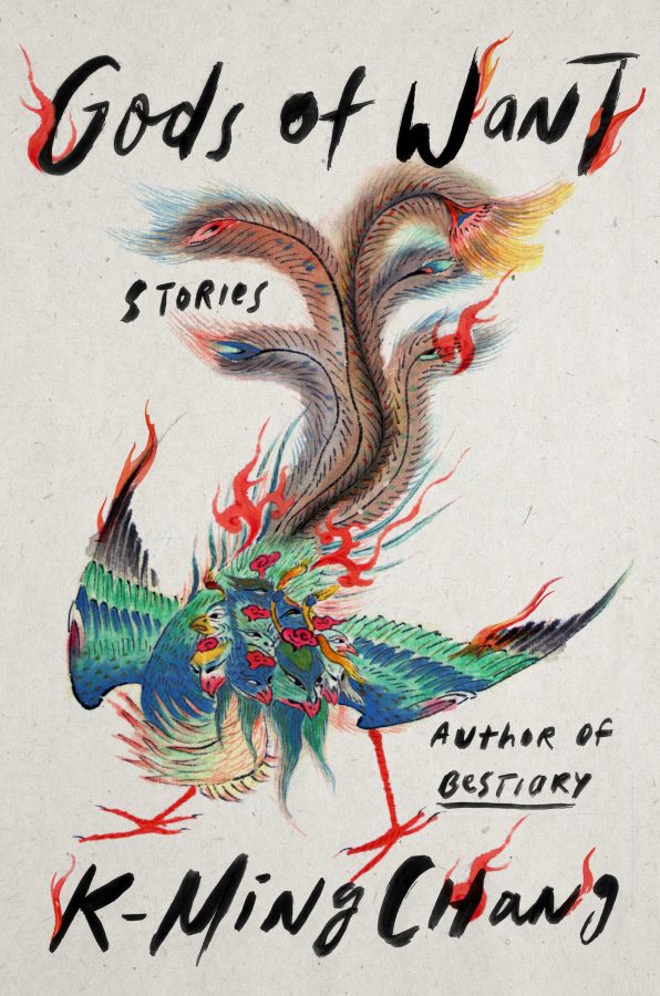
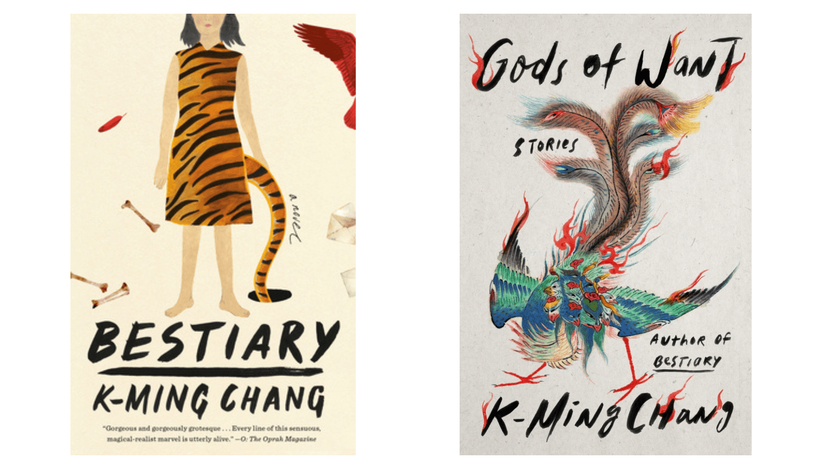
The cover for Gods of Want was illustrated by Grace Han (who has also done the covers for books by Lauren Groff, Brandon Taylor, C Pam Zhang) and is based on a Qing-dynasty era image of the nine-headed bird from mythology. When I first saw the cover of this book in my email inbox, I literally gasped. There was something about the saturation and color palette that I found so arresting.
Chang describes herself as having no visual literacy and is very, very happy to have art departments putting together her covers. Once it’s time to start designing, she makes a Pinterest board and sends it along with a note like, If this is helpful great! But if not! It’s okay! I imagine that the design teams are immensely grateful for this equanimity.
If you’ve read anything by Chang (if you haven’t yet, let’s go; there is a quiz next newsletter), you will probably be unsurprised to hear that her taste in book covers sounds a lot like her writing style: illustrative over photographic, color and brightness over muted, a tendency toward beasts and meats and things slightly grotesque, a sense of “too muchness,” and dynamic movement. She mentions in particular the feathery-and-flamey vibes that carry from the bird itself into the font of Gods of Want.
For this book, she received a packet of 4-5 very different designs, and of those possibilities, everyone was drawn to those with a sense of movement. Michael Morris, the illustrator for Chang’s first book, Bestiary, provided the direction for Gods of Want, and his fingerprint has created a cohesiveness between the two covers in their dynamic compositions: there’s handwritten font, movement and off-centeredness of the illustrations themselves, and rich colors. Chang calls them siblings, sisters.
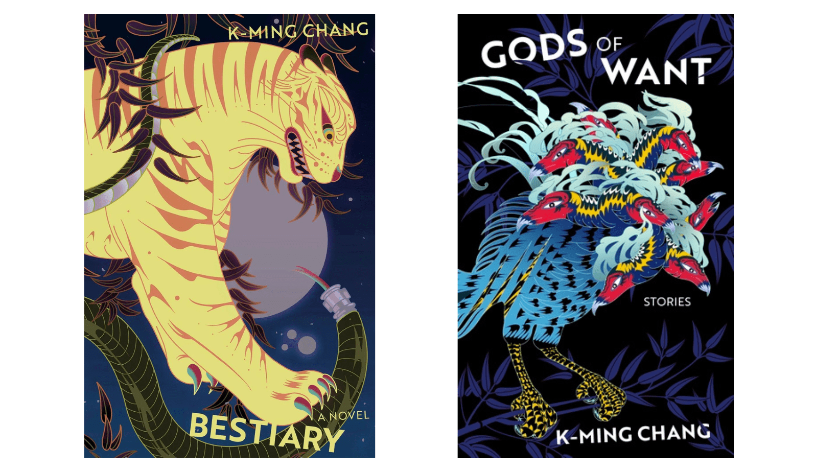
And while her US books inhabit the same cinematic universe, I was delighted to learn that the same illustrator has made both of her UK covers, which makes them appear like part of a series.
(We are all now breathlessly waiting for the K-Ming Chang Collector’s Edition Box Set to be released in 2055, yes?)
As we were talking about our favorite book covers, Chang mentioned the old Harlequin regency romance novels: foiled lettering, human figures stylized like oil paintings, a tagline on the front that reads something like, He needed to be tamed—dot, dot, dot—She needed to be embraced. And this is, I think, also speaks to one of the reasons I love Chang’s writing so much: However magical and strange, her characters and stories are always fully embodied, in the goofy, gross, awkward business of being a human—an oil painting with foiled letters, the juxtaposition taking on a life entirely of its own.
I hope you enjoy the turquoise and the flames and the feathers.